There is no way to find new posts without going to each sub-forum! I feel it is a backward step ... someone please tell me I am wrong! ![]()
1 Like
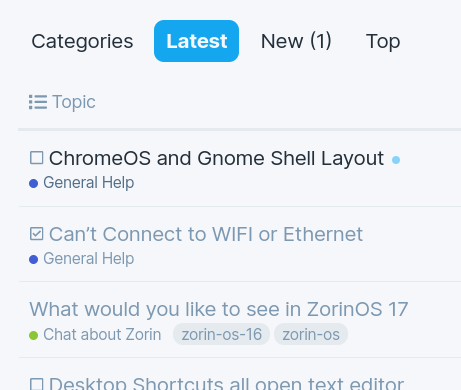
You should be able to see new posts across all categories by clicking the "Latest" item in the navigation section, just like before:
3 Likes
Hi, I didn't think it was showing/used to the right hand drop-down.
Guess I will get used to it ... eventually! ![]()
I notice the Quote Button now differentiates and highlights blue - which is a very nice and aesthetically pleasing change.
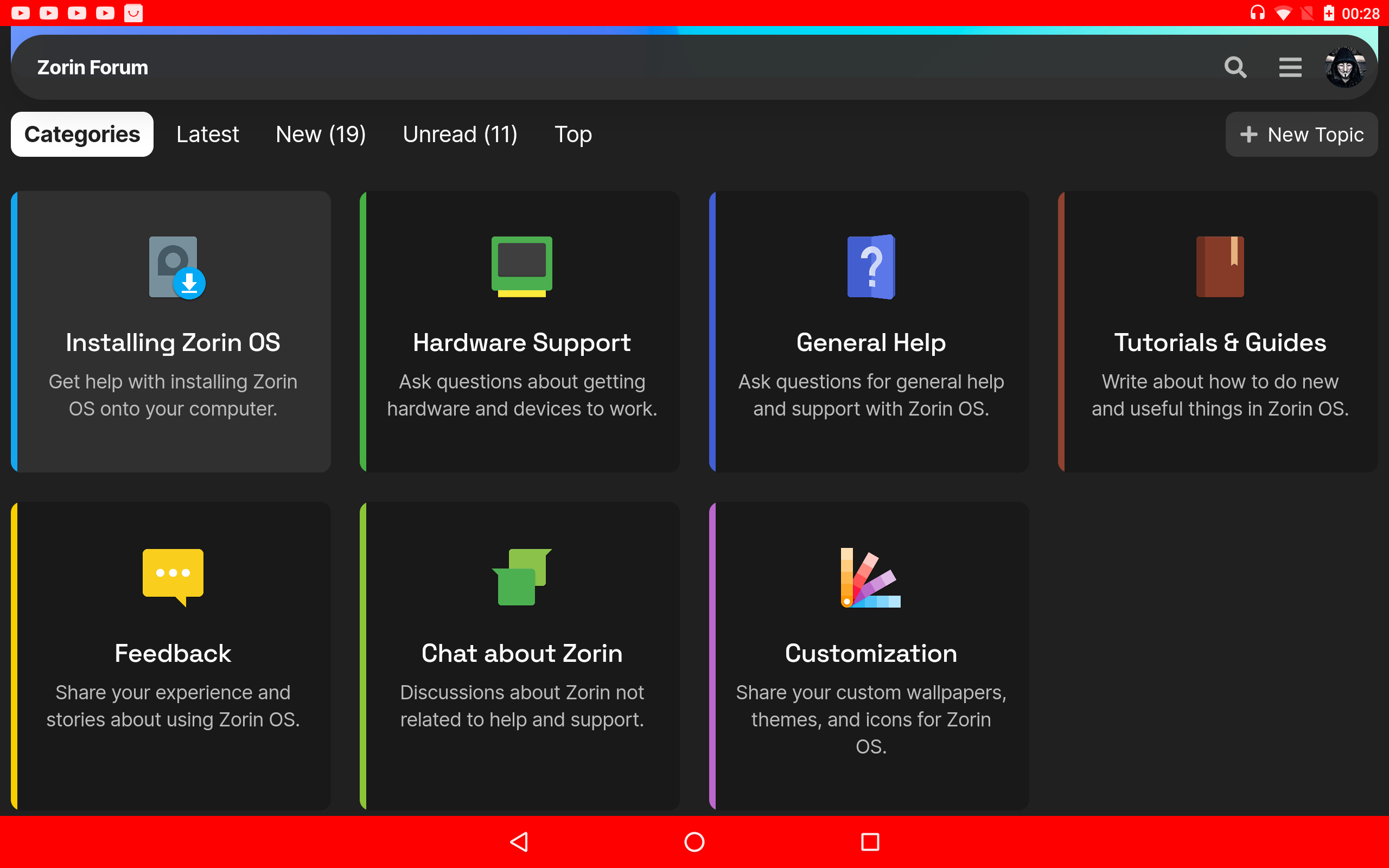
I liked categories. Propably now more clicks to go something.
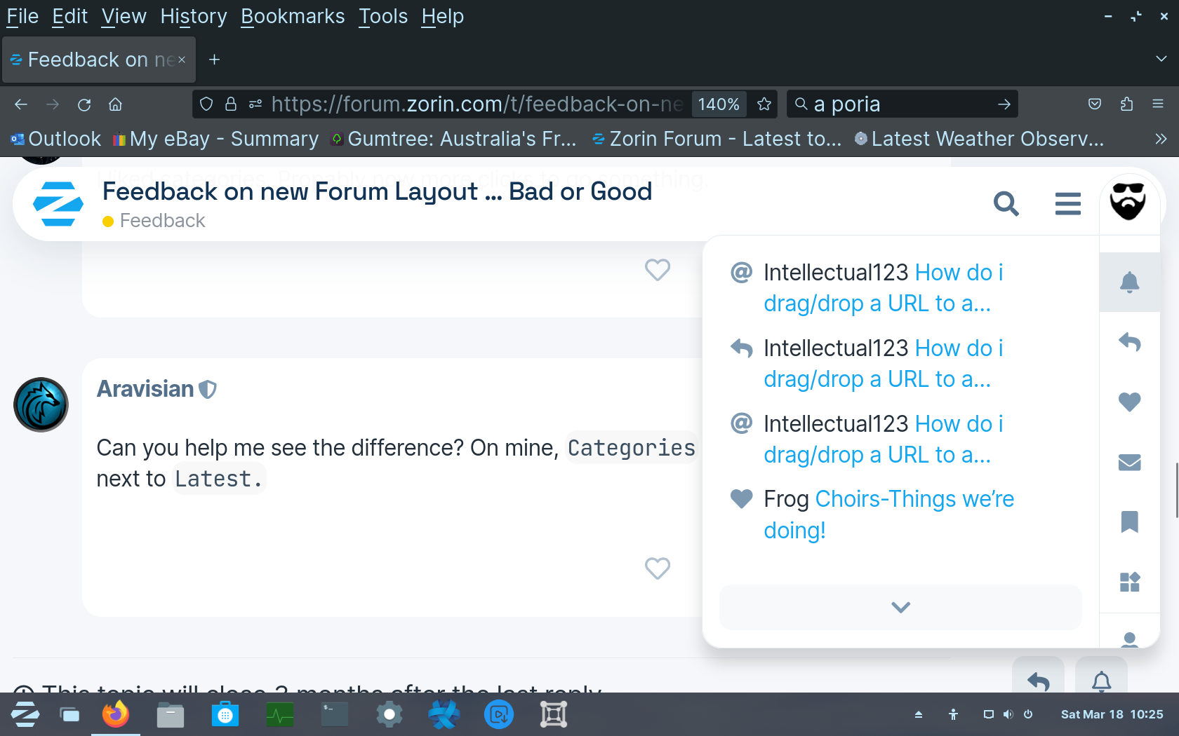
Can you help me see the difference? On mine, Categories still shows as an option next to Latest.
Not keen on the drop down menu,
it is a strain on the wrist to move up & down to select.
Secondly: i noticed it indicates 12Solutions. I know im on 13 (As it's the unlucky number ![]() ), & you can see 13 solution listed..
), & you can see 13 solution listed..
I tried another members profile, indicating 7 solutions yet there is only 6 listed.
This keyboard is something new and mobile.
Yes i seen, the Site enlarge Twice. As i'm 4-6ft from screen i normally have it set to 140% zoom...
Now i can use 130%.
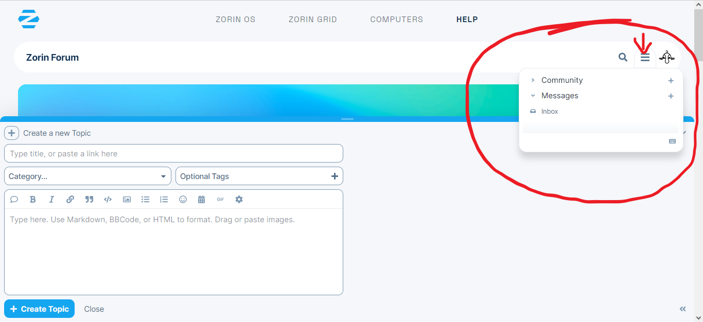
OK call me old and set in my ways but to me it was much easier to use the drop down menu and it was right next to my avatar for checking out other items .... I don't have to jump all around trying to open something ....
Vote one for ....... BAD
2 Likes
Sometimes we resist change even if it is an improvement. The Drop down menu change caught me off guard and I am undecided about if I like it or not.
1 Like
Improvements are always necessary, but I would have liked an explanation of the changes.
I like the improvements. I no longer zoom out so far as to see a blank border on my mobile. The categories in the profile drop down help me see what I need to attend to better instead of sifting through likes to find responses. It no longer spans the entire screen... when replying the message window isn't hidden and the reply button doesn't drop behind my keyboard forcing me to scroll(all of this from my phone, which I'm sorry to say is how I attend to the forum the majority of the time). I need to test some of the moderator actions, but I'm liking the improved mobile friendliness.
1 Like
I used to be able to Right Click on my Profile Icon on the right side and "open in new tab." I can no longer.
I have no idea what this highlighted icon is:

Logging in, I had something like 47 million new alerts... I had to dismiss them all in order to retain sanity. It seems changing the settings caused Discourse to set all alerts as new, even months old ones.
That is the new topic icon, although direct mentions are there also. Looks like it was borrowed from vs code which used it for extensions.
I noticed I don't have to scroll to the top of a thread to access the title and copy for a link anymore either... NICE!
I'm not sure I like the new hamburger menu... it removed the latest, new and unread buttons. The everything button lists all unreads... then there is the my posts and more which gives quick access to groups (moderators & community_moderators), badges, review, about and faq.
I do like that there is an individual message box and moderator message box (all the dm's that moderators have been tagged).
Could we get a gaming forum? So we can gather all information regarding gaming on Zorin?
1 Like
I made a alternate new topic icon to try it out.

1 Like
The new layout of hamburger menu has totally messed my workflow.
It has taken me some time to stumble upon this thread having to do many extra clicks and page loads instead of using the hamburger menu to get to unread then new posts.
As I hadn't found this thread, I created one in Lounge https://forum.zorin.com/t/forum-hamburger-menu-issue/25846/1. I thought there was a forum fault or error. I will copy that content of that here.
MY VOTE = BAD
......
I logged into the forum this morning and did my normal workflow of checking any personal replies etc then clicked the hamburger menu to see how many unread, new etc posts to look at.
The hamburger menu did not show the normal menu items and has thrown me completely.
Is it a forum fault/error or a "new feature" ?
If the latter, I don't like it at all.
I will tag devs: @AZorin @zorink
Zab
These changes have been consistent across different Discourse forums online, and all appeared around the same time, so it's likely a "new feature" due to an update. Ideally, there would be an option to choose the preferred layout for each user...
The svg icon is vaguely named "discourse-other-tab"... again another case where this shortcuts could be customized to fit one's needs.
Overall, I'm not particularly fond of this change but it only costs me an additional click to open my profile which I don't do that often.
1 Like