Yeah I agree. Personally, I hid it with a browser plugin. Even on a PC, anytime I wanted to check the forums out, I had to scroll past it.
2 Likes
So I'm unveiling the first revision of the Forum redesign.
For now, I've only made changes to the Threads. I'll get to the forum landing page as well.
This is the first revision so I'll change things based on your feedback.
I made a snapshot of the current thread that we are in so you can easily see and compare the changes between the current design and the overhauled version.
Old version (Current version)
New version
Changelog
- Changed the colors to match Z16 Website and OS
- Drastically enhanced contrast. (The elements pop-out more and are much nicer on the eyes)
- Posts now take more horizontal space. (It's nicer and less visual space is wasted)
- Hid the top bar for Zorin website (Let's be honest, no one ever uses it)
Note: This is a snapshot and is not the real Zorin forums. The buttons and forum functions don't work. It's like a screenshot but more interactive.
Additionally, it's best to view it on a PC. I tested it out on various different screen sizes and it worked fine, however in order to see the intended way, view it on a PC.
I'm really looking forward to hearing your thoughts and opinions on it. Hopefully Mr. Findus isn't too harsh on it 
3 Likes
I hope the zorin forum has a mobile mode display so that when opening the zorin forum via phone it is neater and lighter.
1 Like
DUDE, I like it a lot more! Its a nice 
You mentioned that you enhanced the contrast, well, you get no disagreement with me there, consider it increased, and most certainly easier to see!
I agree, nobody needed the top bar on the forum. I was also happy to see that the giant welcome message was gone, that thing is so big I could sit my butt on it and it support me.
I also like that bluish hue around the dialog boxes, which also looks nice when viewing in dark mode. Also, the info boxes below the text are highlighted better now too, I like that.
Overall, I consider this a welcome improvement. I can only hope that the Zorin team agrees with me. I don't think one can afford to be too picky about mobile view, if they are looking on a 5" screen lol.
2 Likes
I'm just loving it ![]()
4 Likes
Oh I do like a bit of shading in sunny weather
4 Likes
That Dark Mode looks a lot better in my opinion, as well.
4 Likes
I am liking the look on laptop, but have an issue with the mobile version of the new. All the text is blue, which isn't a bad thing, names and mentions are white, making them easy to pick out... but the view isn't full screen... there is a lot of black and it's like 80% zoom. I have to zoom in to see it full screen. I do understand your changes were mainly for desktop, but this is how it effected the mobile (which i use regularly to keep a presence and help wherever i am).
4 Likes
For those of you who are enjoying the dark mode that I use, its a Chrome browser extension. Look up... Dark Theme Everywhere
It can be turned on or off for each website your on, which is important, as some websites don't work good with this extension. Amazon Prime Video just to name one example, you can't view the videos stream if the extension is on.
But I still recommend it anyways, cause if you got a light sensitivity, this extension will save your eyes. And as you guys obviously saw, the dark mode extension works excellent with MCP's new page look!
2 Likes
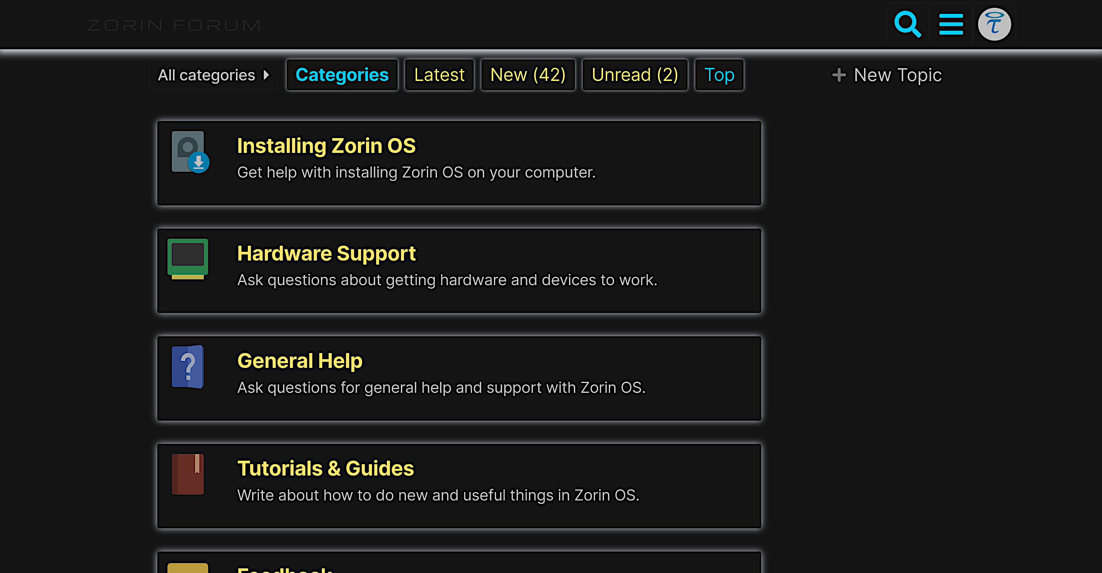
This is the first revision of the landing page redesign.
Please note that everything I said in the previous post applies here too.
Old version(Current version)
New version
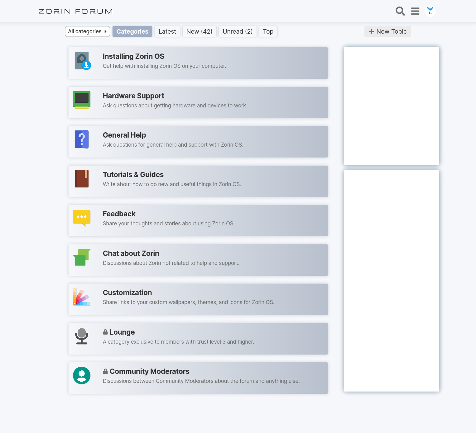
Small note: The sidebar is not visible in the interactive demo. It's a mock-up design as anything could be placed in there (search bar, active members, latest blog posts, etc.).
Changelog
- Changed the colors to match Z16 Website and OS
- Drastically enhanced contrast. (The elements pop-out more and are much nicer on the eyes)
- Now the landing page uses all of the usable horizontal space. (This allows users to access more information and navigate more easily and quickly)
- Moved the gigantic welcome banner to the the sidebar. (Now its there when it's needed and not in the way)
- Hid the top bar for Zorin website (Let's be honest, no one ever uses it)
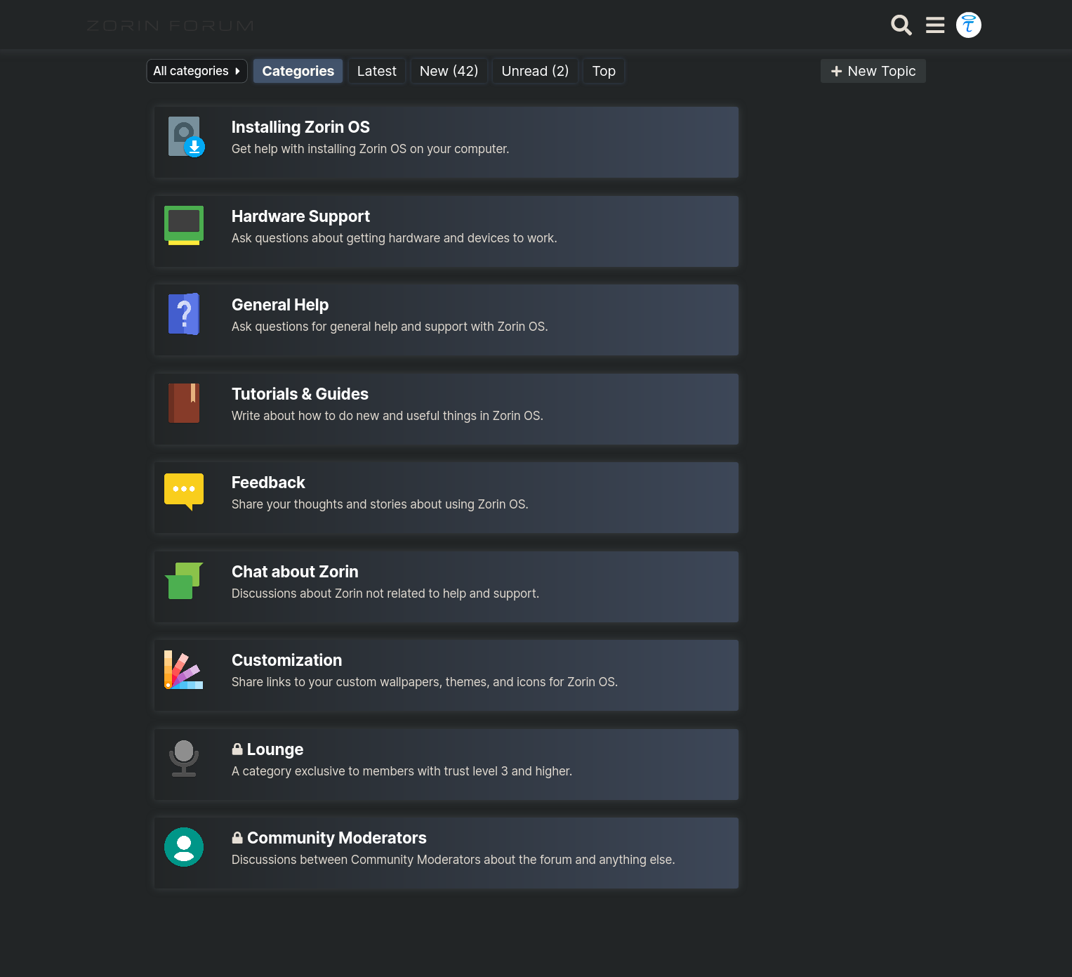
In my opinion, this looks specially good in the dark theme variant. The layout is still not responsive and doesn't look good on mobiles, however that is easy to fix. I'm looking forward to hearing your thoughts and feedback on the landing page redesign 
I'd like to note that all of the changes made are CSS only. This means that the Zorin devs are able to replicate all of my work, with ease.
I'm happy to see the positive reception form the forum members. Looking forward to hearing the Zorin brother's thoughts as well.
4 Likes
LANDING PAGE IN DARK MODE:
I like the look as well. FYI, I am running in 4K resolution, and I am only running a 125% zoom on forum pages. It would be neat if you could fit the categories from left to right sides of each other, so less scrolling is needed on Desktop.
However, having said that, its only a suggestion, and what you have done so far, is most indeed, looking good.
Wait a minute, I am sensing something with the force. Its love for Taha_MCP's new forum overhaul themes. HEHE 
2 Likes
The addon that you are using for dark-mode simulation is not simulating it as intended.
Here is the intended look:
That is a very valid point. With this design, I wanted to include the side-bar so that various sorts of information have ample room to be shown. It would be information that's useful both for newcomers and for the regulars.
5 Likes
Would it be possible to keep the Zorin welcome image, but resize it to about the size of a category height, maybe using the icon svg scaled, centered above the welcome instead of a really wide flat z in the background?
2 Likes
This topic was automatically closed 90 days after the last reply. New replies are no longer allowed.