I am working on a Modernization and remake of GT3 and am at that part of theming in the Gnome Made Applications.
And this is one of those cases where Gnome really shines through the layers.
XFCE has switched to CSD, as well - but on all (every single one), the titlebars and elements within all stay consistent.
Not so on Gnome.
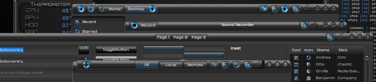
You can see in this image, the right separator takes on a different position and size in Gnome-sound-recorder than any of the other apps (partly due to sound recorder having notebook stack).
Gnome-boxes has TWO left headerbars.
Only one of them follows the margins. And in this app, the transparent background of the separator gets miscolored, though on other apps it is... transparent.
When you look at the code of Gnome- you see how shoddy and sloppy it is.
And when you theme it, these unpolished inconsistencies become very apparent. No Wonder Gnome repeatedly demands that independents, like me, do not theme their apps. It shows their flaws.
And why Gnome pushes hard for LibAdwaita - as flat monochromatic themes hide all their blemishes.
Since I have covered this before, I figure an illustrated demonstration may carry more weight.