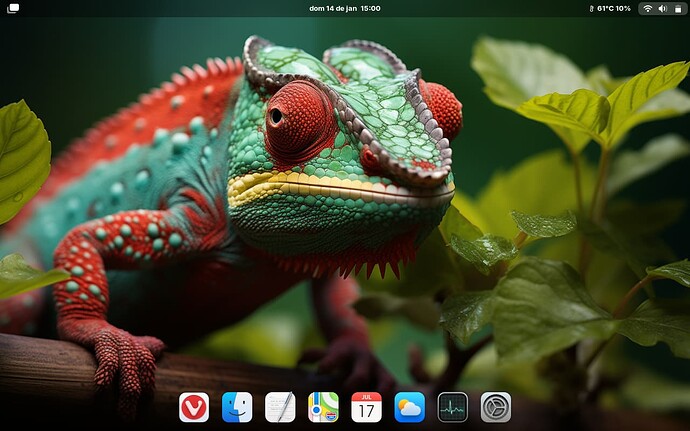
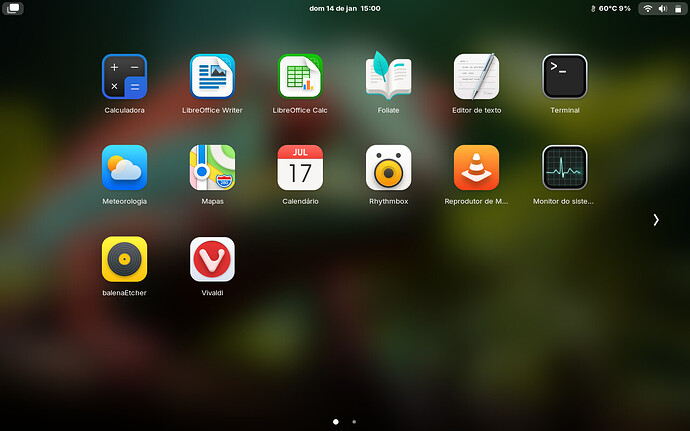
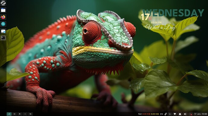
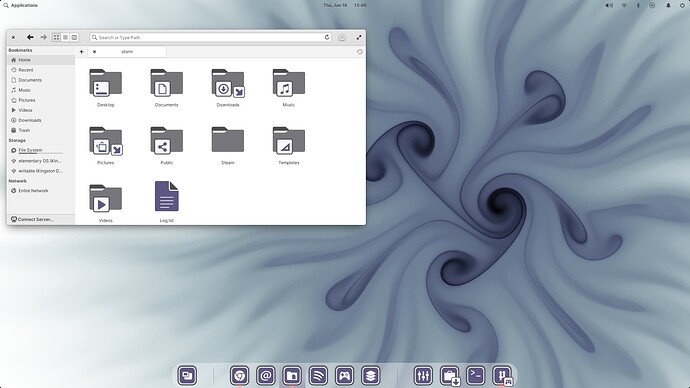
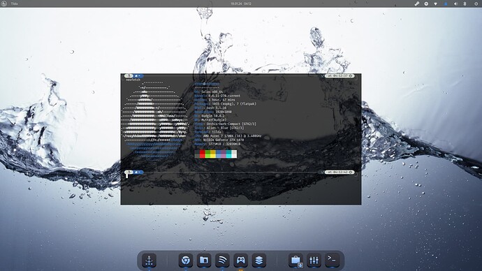
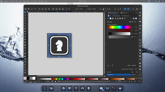
Will get available when I get the time to wrap it up. ![]()
Elementary OS has a weird Layout at the Top Window Bar. The X is on the far Left and the Maximize Button is on the far Right.
Looks amazing.
Can you share the wallpaper?
Thanks, @littlekun ![]()
You can select the best resolution for you.
What icons are those?, I do like Vivaldi
@djsedaw The original icon theme is this:
But, I changed some few icons.. Vivaldi, Virtual Box etc... and the folders theme. You can download "my" theme here:
Superb! @littlekun
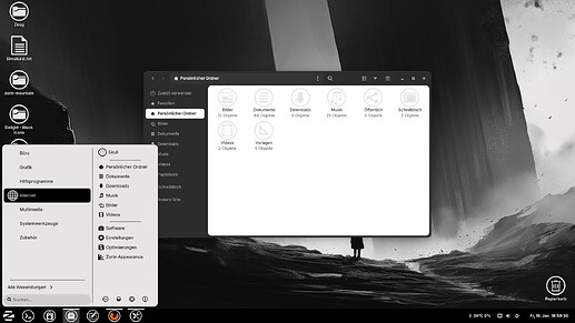
I have a darker Look now. I've found the Wallpaper and really liked that, so I had to change the Look, haha! But the Icons are not finally.
Oh, that looks really nice with the Background Picture!
I have a Question when You allow: When you make your Icon Sets and you have different Color Versions. How do you change the Colors of the svg-Files? Do You make that manually one by one or do You use a Terminal command for that? Or do You use a Program?
I script it. I can change the colors of thousands of icons in seconds.
Did you made The Script by yourself or it is some Open Source Stuff that is somwhere downloadable?
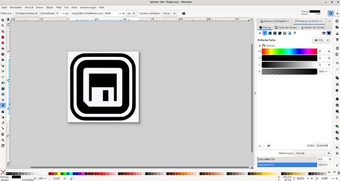
I ask because I want to change the Color from Your Delight Grey Theme. If you see my new Desktop Design above it is more black and a grey-ish white. So, I tought, that I could simply keep the white Parts of Your Icons and change the grey Parts to black. I installed Inkscape but there ist no Function to make Groupchanges. So I started to manually change the Color one by one. It is a pretty ... It is not the funniest Work, haha! To show You what I mean with the Change here are an Example:
Your Grey Icon:
The changed black Version:
Homemade script ![]()
I suggest that you do not use pure black, but 80-90% black in Inkscape. Inkscape hex: #333333ff or #1a1a1aff. The outer ring of the icon theme I think should be grey (50%) to give contrast, but it's up to you.
I can convert a delight 2 icon theme for you if you want?
This is 80% black
That is realy nice! Thank You!
I use really 100% black (Hex #000000) to have the full Contrast with the white Parts. Look here:
It is an interesting Idea. But I would say the black outer Ring can stay because: Even when it ''disappears'' at a dark/black Background you have the inner white Ring with the strong Contrast. But when You think it would be a good Idea to make that outer Ring in grey for Contrast it is totaly okay for me.
One Contrast Thing could be a little Problem: the Folders. When they are simply black it could be difficult to see them on a dark Background. Maybe You can make a thin white Frame around them. That was an Idea that I have in my Head but I'm not sure if this will work and looks good. And I don't want to make any more Circumstances to You.
Alternative is to use white folders. It still looks good with black app icons.
Yes, that is true. But the Problem is that Nautilus and other Stuff have a lighter Background. So it wouldn't work good. Look here as a Proof:
So, if I would use white Folders I couldn't see them good in Nautilus. A black AND white Design can be a little bit tricky. It is challenging, I know. I'm realy Sorry for the Circumstances that I am making you. I mean you want help me and I make it only more complicate.
