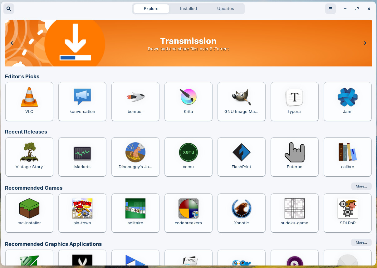
For my taste the Software Center need a little bit of redesign, it look somewhat old. I think if the gray borderline of the app icons are removed it would look more modern.
I didnt change the screenshot:
For my taste the Software Center need a little bit of redesign, it look somewhat old. I think if the gray borderline of the app icons are removed it would look more modern.
I didnt change the screenshot:
Yes and remove the borders that show a clickable button and then someone else will post saying they think there should be borders so that it would look more modern.
It's a no-win situation trying to meet whatever vague standard of what "modern" is.
Think this is Feedback not Customisation, but what would I know.
Yes agree. "modern" ![]() ...that was so yesterday. hehe
...that was so yesterday. hehe