Not Cinnamon. Well if the Zorin brothers could unbloat it and clean up a bit.
1 Like
Yes, Cinnamon out of the box is the ugliest of all the desktop environments I've tested without any customizations, straight from the Debian repositories. But if it makes it easy to apply themes then it's a good candidate for Zorin OS, I think.
At least with how it looks and feels in Mint, I would be comfortable recommending it to people new to Linux. And I think Mint has a good track record in being up to the standards of many.
1 Like
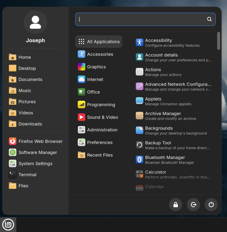
My beef with Mint - Cinnamon edition is that they have everything and the kitchensink installed. Navigating their menus is like navigating through the nine hells and as you said Cinnamon skin predates the dinosaurs. ![]()
Is it that bad? I find it even soothing, it reminds me of the times of Windows 95 ![]()
1 Like
I had a hard time finding what I want, because of all the bloat links they putted in. I could ofcause use the search option, but that would defeat the purpose of having links in the menu.
Ha. Linux Mint 22.2 is supposed to introduce a new Cinnamon menu redesign. I've seen a couple pictures of it. It does look better than the current design. Not sure if you'll agree. Here; I've attached a picture of it. Feel free to share your thoughts.
2 Likes
Does it comes with a minimal installation or do you get the full blown bloat bomb? :D. Funny they haven't figured out that some people doesn't want the whole repositories installed by default.
Edit: It would be a great fork of Mint = Mint Minimal. And a designer to set it up.
1 Like
I'm always going to go to bat for XFCE, any chance I get. You really can make it look fantastic, given a little bit of grease. That's definitely something I wish they would update however, is the default look of it. It still looks like it did decades ago (a default, vanilla install), which just isn't true with a bit of work.
3 Likes
I suspect most distros has a lot of programmers and no designers - if you look at most distros. OR afraid to stand out and go for bland look.
1 Like
This is true of every Desktop Environment. Gnome is hideous in its vanilla state. Indicated by how vastly different it can look on different distributions. Unlike more flexible environments like XFCE or Cinnamon, GNOME is tightly constrained. Built on GTK4, it's minimal by design: flat, monochromatic, and intentionally restrained. While this may suit current trends, it limits future adaptability. If design tastes shift away from minimalism, GNOME will date quickly and struggle to keep up.
XFCE out of the Debian Repo's is hideous.
Yet, it takes very little effort to turn its edges from clunky to sleek.
There is a life lesson in that, I think.
Carpe Diem.
For me, the Cinnamon Menu resembles the Windows OS Start Menu closely. The new one, not the old one.
I use the Stark Menu (Mate layout, not default layout) on one monitor - the Cinnamenu on the other.
And both of these allow better organization, with layered optimization for simplifying and separating the categories and entries.
It feels more like an expanding chest of drawers. You go to what you need rather than seeing anything you might need.
1 Like
I was listening to a podcast the other day where they were talking about how minimalism is starting to fall out of style. I can't remember what was the exact context (I just had it playing in the background) but I think it had something to do with icons.
Looking forward to that new trend, just hoping is not something too fancy like the "liquid glass" thing from Apple ![]()
1 Like
So what if it is? Use something you prefer - as long as our desktops allow us to.
Well, the thing with minimalism is that it applies to more than just icons or desktop philosophy so it was particularly annoying when I saw it everywhere I went. Liquid glass will be less of a hassle, unless they start selling shoes made of it.
2 Likes
I agree 100%. No question. It's like, "what the ... ?" Yeah. For sure.
I hope it IS falling out of style. It's ridiculous how we're getting fewer options to customize what we pay for, what we choose to use, and what we support with our donations. I do not use an iPhone because of the silly lack of customization (unlike what you can find on Android). GNOME in its default state is no better. ![]()
1 Like
The one thing that I really dislike about Gnome is they disabled the desktop... this is something I will never understand. But otherwise, I really don't mind it even out of the box; I usually never customize things much beyond the wallpaper and whatnot.
1 Like
I saw that, too and I immediately liked the Buttons in the bottom right Corner. But then you have there 3 Columns - when You would see the Separation on the first one as 2, it would be 4.
You get the full Pack. They don't have a minimal Installation Option. And I'm not a big Fan of cinnamon, too. It is functional, yes. But I don't like the Menu Structure. Not my Thing. Like like that what you have on Gnome and KDE with the Settings Menu and left the Menu Points and on the right Side the individual Settings for the Menu Point - but Gnome makes that visual more decent what I prefer. KDE is for me in this ... how can I say that ... too fancy, hahaha!
But the Downsite is, that the decent Look comes with less Settings Options. I mean, when Gnome would implement the gnome-tweaks Settings in the normal Settings, they would still have the same Look but simply more Options. And it wouldn't break the Look when they would have AppIndicators be default. But at least on this I've read a While ago that they work on it.
What I like about Q4OS's rendition of Plasma is its Look Switcher. So instead of a new user struggling to get to grips with Global Appearance and the rest of it, it provides various Windows themes and one mac theme split into light and dark, then once tiled menu is installed you have an easy migration for Windows 10 users come 14th October. I've changed my Vote to KDE (Plasma) in respect of Core. As Lite is being dropped in 2029 I suspect Lite users would move elsewhere, PCLOS Debian xfce looks quite nice and no systemd. Devuan default install is xfce, again no systemd, and finally MX-Linux xfce. If Plasma became the new Core, then any Lite version should be based on LXQt as it shares the same Libraries with Plasma. Trinity reminds me of 95/2k depending how you theme it. As the 32-bit version can run on one processor and 256 Mb of RAM it will keep really old kit running for some time, notwithstanding component failure.
1 Like
When choosing a D.E., but also a Linux distribution, do you guys take into account its number of developers/maintainers ?
The more, the better?
Currently, I try to choose distributions that are systemd free and pulse audio free, and for me that means PCLOS Debian. The one exception I make is for Q4OS.
1 Like