Dark themes are difficult to read because the text is a similar color to the background. As with the light theme, the text color of the dark theme would be better unified with white.
I know that the theme can be customized, but I am afraid that it will give a bad impression to those who are experiencing Zorin OS for the first time.
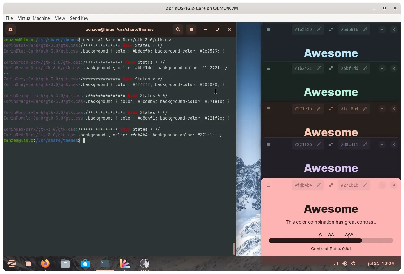
Dark theme (whilst trying Z16.2 Core Live USB yesterday) default text colour is blue (e.g. Panel date/time etc). If you select black then text changes to white. I agree with @Hackgets , white on black should be factory default not blue on black.
I also agree with HackGets and zabadabadoo.
I find it odd that the Font Color gets tinted the same color as the background and depending on screen and display settings, for some users this issue could be less minor and more pronounced.
In other words, it is difficult to see how the background color is fixed at white in light mode, while in dark mode the background and text colors are linked.
Interesting, I always appreciated that the dark-theme had a dark background with light text.Made theme more cohesive and pretty looking.
This reminds me of the study (not read very thoroughly,can't comment on its reliability) That precieved contrast for light mode is more because our brain is more used to that plus more light from light mode dilates the pupil.
And I know this is not exactly what this topic is about but from the few anecdotal discussions that I have been part of it seems like darkmode user are a loud majority And the less eye strain from dark mode doesn't necessarily apply for everyone, but people use It because 'everyone' claims that it is better.[I absolutely swear by dark mode,but looking at a white car on a bright day hurts my eyes, so I guess it's different for everyone]
So if you don't suffer severe strain from light mode maybe it's better than dark-mode for you?
Is it possible that the monitor's settings are playing a role here? It's clear that the text is tinted with the accent color a bit, and while I personally don't like it too much, it's not hard to read for me.
I think what he ment was the post is not about his personal need hence no need for a discussion about what he might like or an individual solution, but rather a broader discussion covering the average user.