Hi,
Though I really love the Dark mode available for Zorin desktop…
- I would enjoy it even more by having some way/option to further improove the distinction between…
-the active window, - the very next one below (latest opened)
…and the other remaining not activated windows.
Using some dark mode, large window body offers a better way to read (as for me)
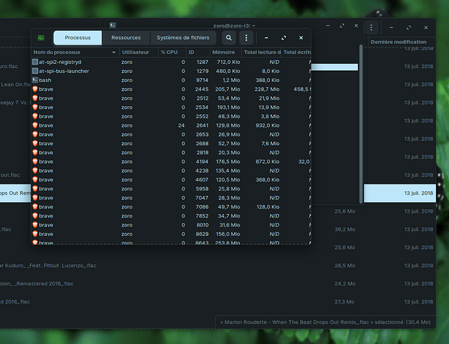
But identifying then the correct Menu bar upon many others existing window’s previously opened can be tricky …or confusing.
See picture joined.
Though keeping the Dark theme activ, it would be nice to have some options to improove this identifying step.
-
An extra white frame line surrounding the Active window.
This external box white or yellow frame including the mini/maxi/close buttons could help focusing the right buttons quickly -
An added external box “clear shadow” could also help in that goal…
-
Another “orange frame” could surround the previously activated window.
One usually use - at least - the latest 2 windows to work between them…so yellow and orange could quickly help you identify those two windows. -
Other windows …in the background could use just a regular Gray or Red Frame clearly identifying them as the background windows.
By leaving all of them with the same dark/black external frame just add more confusion since existing frames AND existing body also often share the same dark/black color…thus, removing any chance to identify their limits just by the color.
Once you’ve identify one window limits you also know for sure which buttons “+ - x”…belong to it…And decide to close directly without mistake…or need to focus on it.
Beside using 3 (…or more) External FRAME colors/shadow…
each Window MENU BAR could also receive some brighter background color in the same way… yellow(active), orange(previous), red(all other in the background)…
For…wanting to use a darker background for day to day uses does not have to mean that all windows Frame/menu/shadows ALSO have to use the same black color…(at least not if its a Technical Design limitation)…for it does not help much in the identification process…
Thanks for your reading, hope it could make sense and could make some improvment in this already great Dark theme features !
Sample capture : showing 3 completely Dark Windows displayed with no easy way to quickly diferenciate them !
Hope other users will like this idea,
Any suggestion is welcomed too.
Thanks to all !

