I had actually never really given it a chance but it really is pretty neat in how it works. Looks good and very functional while preserving some screen space. If you have not tried it might be worth a look.
@KittyUZutty brought it to my attention
I had actually never really given it a chance but it really is pretty neat in how it works. Looks good and very functional while preserving some screen space. If you have not tried it might be worth a look.
@KittyUZutty brought it to my attention
That's how I actually prefer it but with the stacked applications, à la Windows 7, to make the taskbar much more concise.
I’ve been thinking about this a while trying to under exactly what you mean and just can’t. Can you show me?
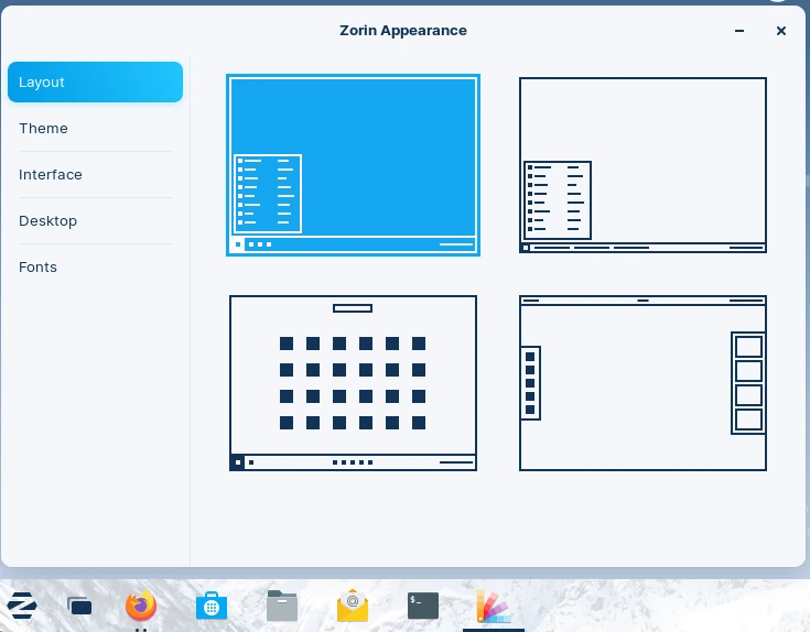
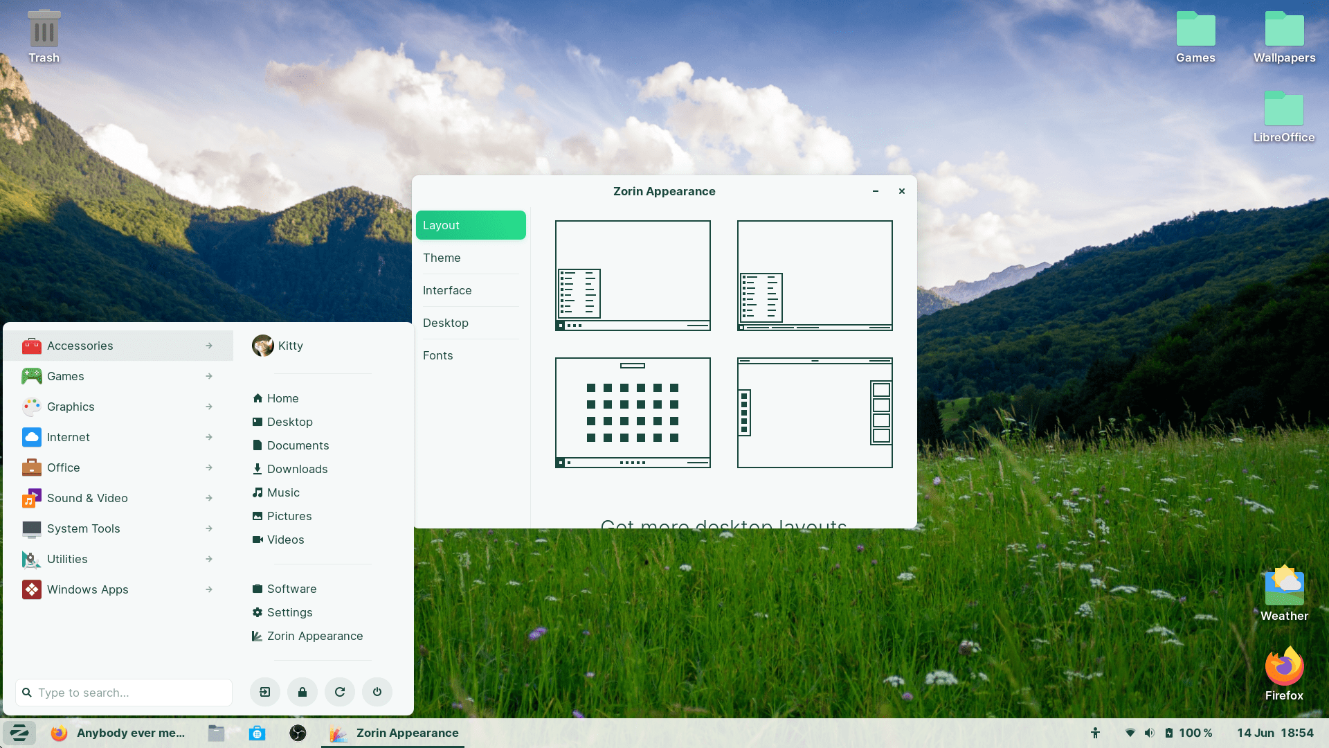
Maybe stacked is not the right word? I mean this layout where each opened program appears as a single icon, and further instances of it simply "stack" on top of it. The first layout on Zorin Appearance instead of the second.
Got it, I have been bouncing between the 1st one and Stock Gnome.
But I have found I do kinda like the “Windows Classic” as well. It saves some vertical pixels and I like the way it acts and looks.
I've never tried the "Windows Classic" layout before (as I don't have Zorin Pro)
I use the "Windows List" one. Still looks interesting though, I have messed with Windows 95 in the past.
(Windows List still has the default start-menu, but it has the listed appearance at the taskbar.)
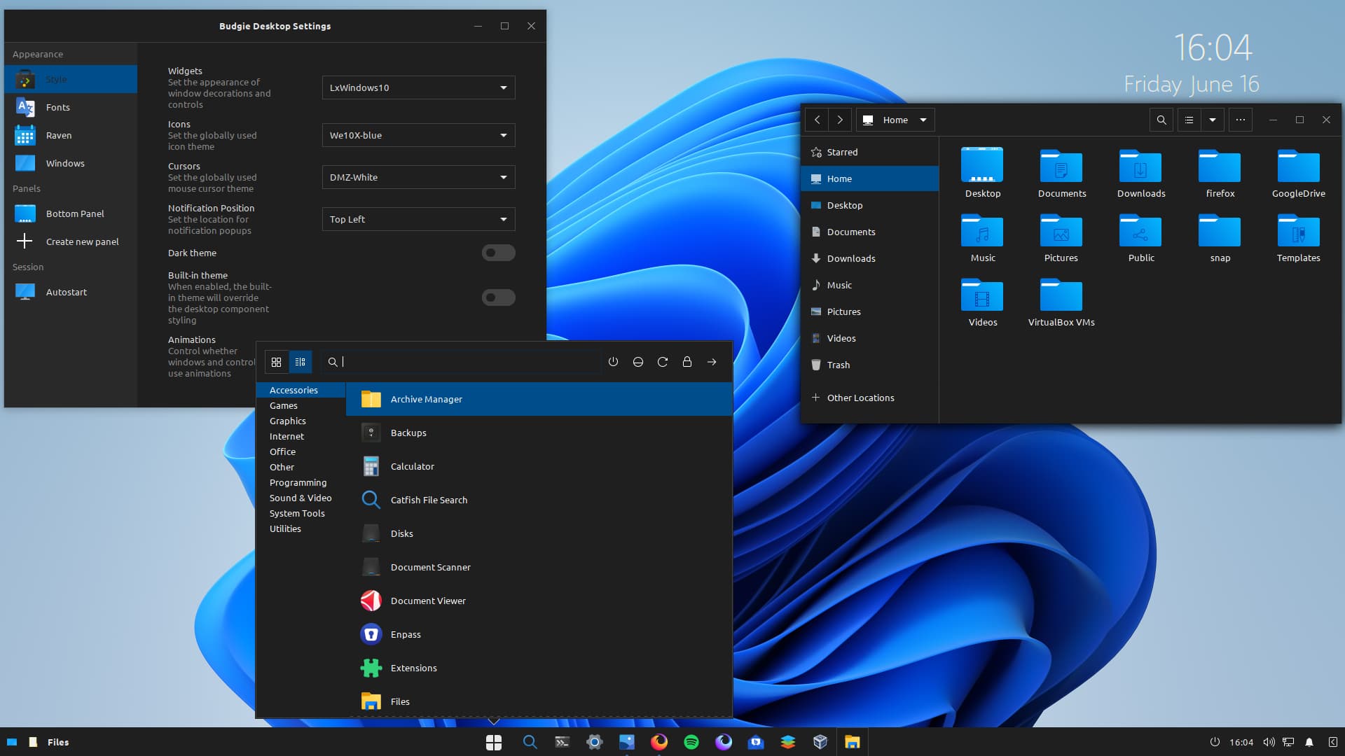
I work with Win 11 and am used to the centered menu , so I setup my Budgie DE on Zorin the in a similar fashion. I don't normally use this theme, wallpaper,and icons. ![]()
This topic was automatically closed 90 days after the last reply. New replies are no longer allowed.