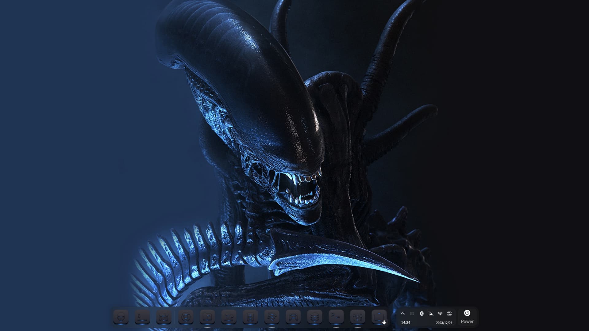
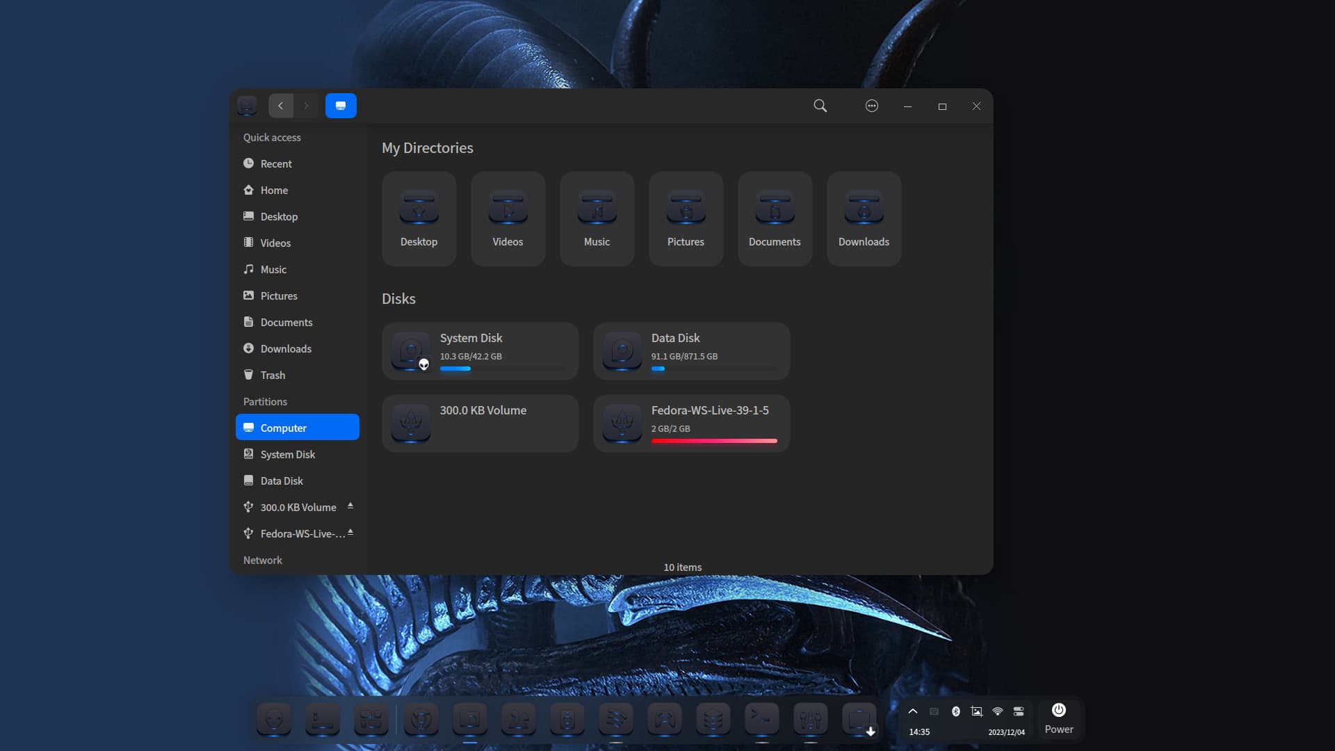
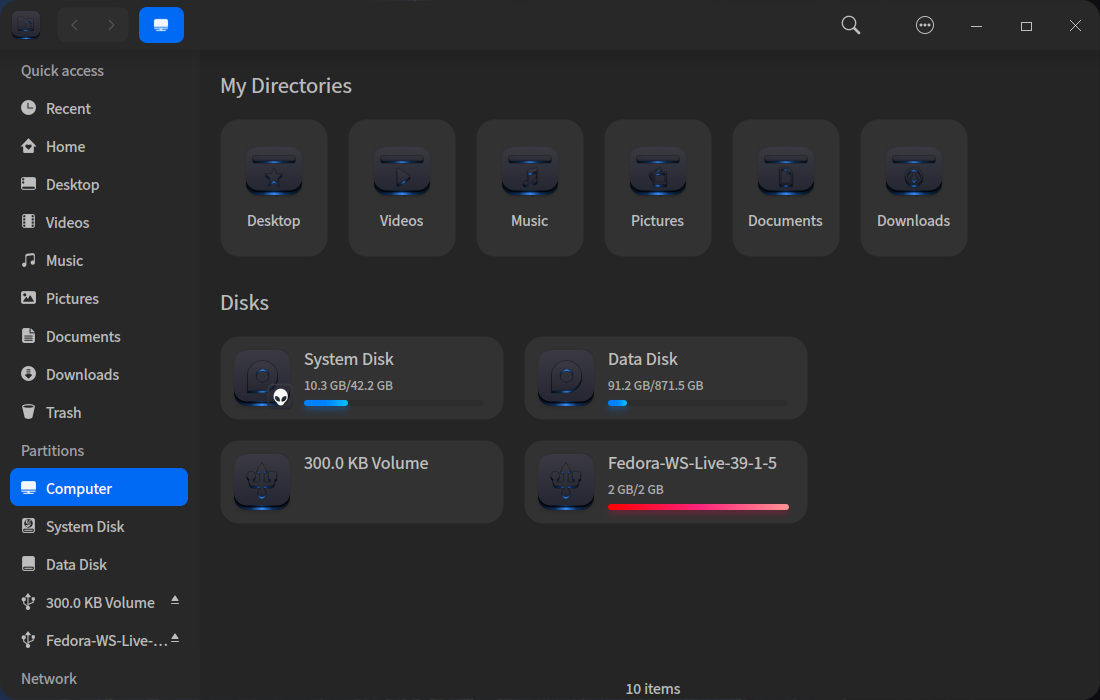
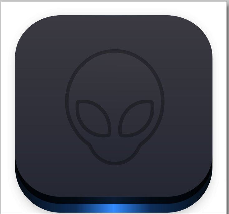
This is a request from @Aravisian who wants dark on dark icon theme. I know he likes blue color as well, so I mixed it with the blackness.
Is it too black?

Click the picture to get the real feel 1:1.
This is a request from @Aravisian who wants dark on dark icon theme. I know he likes blue color as well, so I mixed it with the blackness.
Is it too black?
Click the picture to get the real feel 1:1.
For me, it's too dark. It's hard to see the symbols.
Maybe you can use some more light... or some kind of contrast with the symbols.
Let's waiting Aravisian's opinion.
Looks PERFECT to me love it! ![]()
I agree with the two conflicting statements made above.
The screenshot that got my attention the most was:
Also these two (One is a post down from this link):
The color is a good one, and it being more blue would also be good.
Dark on Dark is tricky to say the least.
One thing about asking for input while building is that a creator will get so much input and feedback that is varied, it will feel like riding in Bumper Cars rather than Free Creation.
The thing is I like the black metal vibe it has - It's tricky to make it lighter without loosing that vibe. I can try with some more blue glowing.
Yes, I spend more time on that square than any other...
Or should it be "Black to square 1!” Then someone from the back shouts "That's not how you announce your Chess moves!"
A little too dark for me, hard to see the icons at a glance. Maybe it just needs sources of light, or more powerful one, to stand out the silhouettes?
Killer wallpaper to go along the icons as always...
Just do like I do and point your desktop lamp at the screen. ![]()

Instead of a gradient in the outline, if you use a solid black line, maybe with a really dark gray, the image you are trying to display will be more visible.
Your first attempt in this thread has blue highlights that aided in contrast. If you utilize that, increasing the brightness slightly, so it's noticible but not overwhelming, it would work.
I like this design and that you continue to utilize that blue I shared.
I really like this overall. I love dark themes. But the images or icons, like others have said, are too dark for my old eyes to pick out. I want to like them as is. But would appreciate them being easier to pick out. In any event, much better than I could do.