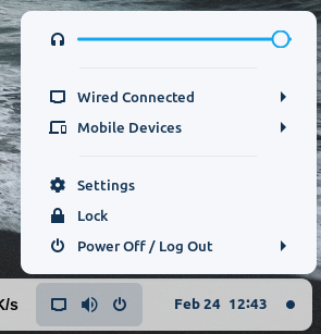
So basically I feel like these three icons should have been separate buttons but it is actually a single one. And then you have to see more options above it. Having all those options side by side as separate entities on the taskbar would be better, with the ability of adding or removing more tools. Also, the notification and date time panel appearing when I hover over the date should be better in my opinion rather than clicking there everytime. And for some reason 'super+v' option that I set in keyboard shortcuts doesn't seem to bring it up either. I have to click it once, and then if I activate the shortcut, it seems to work.