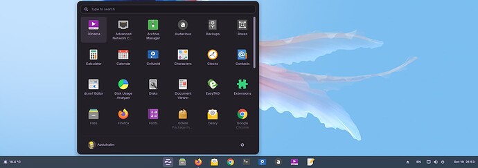
Tray on the left, then Z button, apps, Activities button, clock. I switched the Super key to R-Ctrl using Tweaks (no R-Win key) so having the Activities button on the right makes sense. Also using Panel Scroll.
Protip: Never move the clock to the left side. It will take you months to get used to it.
2 Likes
It would be good if the Zorin menu could be popped completely in the middle of the monitor, just like Arcmenu, I think this one is the only weakness of the Zorin menu.
Naw, people just like it not having to be on the far left. That made sense when monitors were almost square.
Today, Windows, Mac OS and Chrome OS all put the taskbar apps in the center. I think any Linux distro which is trying to attract converts should put it there too.
1 Like
I disagree with this. I do like the classic start menu on the left.
4 Likes
I like the classic menu popped on the left, but when start menu is in the center (Windows 11 layout), the menu layout should pop in the monitor center too.
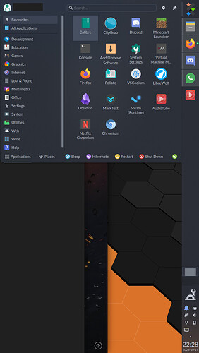
All these people debating whether the launcher and application icons should be in the middle or on the left, even referencing aspect ratios to justify themselves... not yet reaching the enlightenment that is putting the taskbar on the right edge of the screen to maximise vertical space 
If I watch a movie or play a Steam game, it's in fullscreen anyway so taskbar placement doesn't matter. Pretty much all other content is vertical, or at least benefits more from an extra inch of vertical space than horizontal on a screen that's already far wider than it is tall!
Obviously: launcher and applications at the top, system tray and clock at the bottom.
You might not admit it, but this is what peak taskbar looks like:
Honestly, on top of all the telemetry and "AI" and general Macrohard scumminess, removing the option in Windows 11 to reposition the taskbar was a huge turn-off for me. I've been right-aligning my taskbar on widescreen monitors for as long as Windows has had that option. I have to use Windows 11 at work and tried the "autohide" setting to compensate for the stolen vertical real estate and can't get along with it, so that sucks.
1 Like


