I've been trying to love Zorin since 16 and paid for pro on 17. The only hangup (and I've installed Microsoft fonts) is the fonts ALWAYS look pixeled. What am I doing wrong? Is the problem not zorin? Do I need new eyeballs? GNOME tweaks doesn't seem to help, Windows 11 for all its horrible tracking looks better with the fonts reading X.com for example.
The fonts in what look pixelated? Is it everywhere or a specific application? Can you send us a screenshot of the example if possible? And I would say make sure your resolution is set to the correct setting as well.
1 Like
Very good questions... how do I know what "correct" is?
16:10 ratio on Windows 11 at 125% scaling vs 16:10 with 125% scaling on Zorin Pro 17.2. 1920x1200 on both, is that a fair comparison and within what you are calling "correct?"
Ok that's basically what I was confirming. Fractional scaling sometimes doesn't like to render very well. The defaults being 100,200,300. Can you post an image of exactly how bad it is? From my understanding this has been a known issue in GNOME for a long time, and MAY have been addressed in the most recent 47 release. But as Zorin is at 43 currently, it probably wouldn't be until Zorin 18 at the earliest for that to show up in Zorin.
Maybe there's a fix someone has? But that's as far as my understanding goes of the fractional scaling issue.
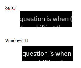
I think that makes a lot of sense. It does seem to be "better-ish" when I stick to 100... but it's still not as good as Windows 11. I realize it's not fair to compare as from all my research Windows just has put more resources into this type of "fit and finish." I guess until 18 comes, I'll just have to cross my fingers. The quality isn't great after I captured it in both OS ... but you might get the idea.
You might be able to fine tune this using a custom gtk.css file.
In your home directory (what you Files manager opens to by default) tap ctl+h
Open .config, then gtk-3.0
Create a new document and name it gtk.css
Paste into it
* {
color: #FFF
text-shadow: 1px 1px 2px rgba(0, 0, 0, 0.8),  -1px -1px 2px rgba(0, 0, 0, 0.8);
}
Save the file. Duplicate this in ~/.config/gtk-4.0 folder.
Reload your session and test...
You can re-hide those system files by tapping ctl+h again.
Thanks Apple and Arav... I'll give that gtk.css a try once I do a little reading on "what" I'm doing with that file. ![]()
The really "old school" solution is just leave it at 100 and ... even though everything is HUGE I can try zooming everything in the browser out to %67.
2 Likes
Well, if you are up for reading, you might check antialiasing and font subpixel rendering to see if these other options might help you.
I guess this begs the question, am I overly sensitive, or does everyone else just live with the type of behavior I'm noticing between the two OS?
You are definitely not the only one:
Technology-wise, I agree it would be better if this worked the same on all operating systems.
On the other hand, while I understand that 4k displays are all the rage, there's a point where it doesn't make sense to use such a high resolution for everything. Personally, for day to day use, I still often scale down the resolution to 1366x768 even when my screen can handle more than that. I do have pretty good eyeballs myself, it's just more comfortable and efficient this way; for me anyway.
1 Like
Agree... making things bigger aka 4k is great... but if you start with cr@p and blow it up... you just end up with huge cr@p. Thus, I suppose once you go fractional scaling and 1920x1200 or whatever... it looks funky.
This topic was automatically closed 90 days after the last reply. New replies are no longer allowed.