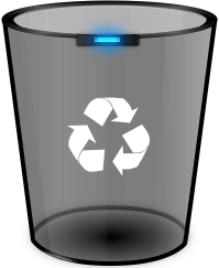
Not too realistic. More of an icon. Works in light and dark mode.

Honorable mentions:
Who threw away mountains?
Let me at 'em. Let Me At 'Em....!
Law office.
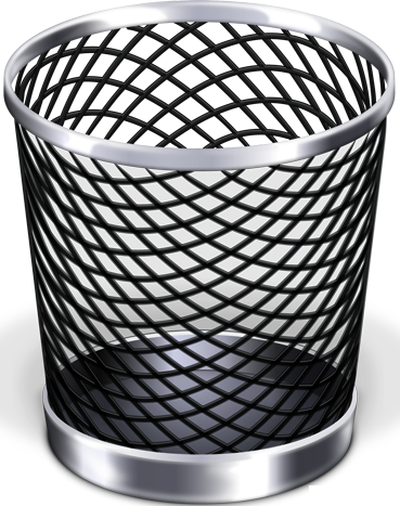
Beats a corrugated metal one. Took one of those apart once to fix a hole the size of a watermelon in the floor of my original Ford Fiesta.
Nope. Look again, they are the Pyramids.
I thought they were piles of sand... ![]()
Although I'm pretty skeptical of that other trash can with a chip on it. Though not a terrible idea in real life to detect when people threw away non-recyclable or toxic materials like batteries.
Nooh! Someone's trashed MX-Linux Wallpaper!
Plus they did not do a good job on the arrow heads.
Now filled with piles of salt and pepper ![]()
Triangular "Recycle" logo three arrows may look nicer than the circle. e.g. Mobius Loop recycle symbol.
Ironically, it looks like litter.
I've just enabled the trash icon on my desktop and the default icon really isn't very pretty. But I also don't know how to improve matters within GNOME's current icon style. I think the honorable mentions all look 100x better than the flat ones, but they just don't fit in at all.
Agreed. Flat paper cutouts as icons is not everyone's style.
I prefer depth and skeumorphism.
Seeing some trends in Themes and Icon sets gives the appearance that Desktop Developers would prefer it if all clothing stores carried only Polo shirts in a variety of different colors.
Yes, I think the differences between the themes are so small. At first glance, it's only the color or the dark/light mode that determines the look.
Icon sets often lack icons for certain programs, so the look is not homogeneous. There is often only the choice between colorful icons, where the colors often clash with the next icon, or monochrome icons, which guarantee a uniform, coherent look and adapt well to different backgrounds, but are not as memorable and concise as a colored picture.