Is the Application icons over the top?
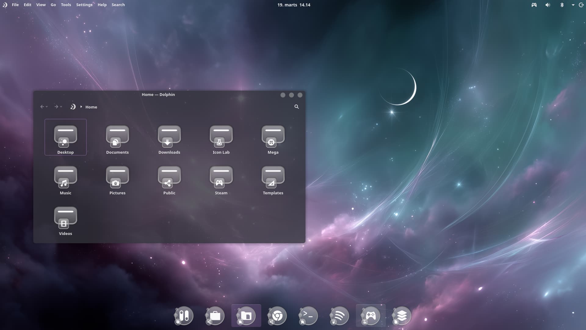
You mean these little Bubbles? Hmm ... it looks a bit like Soap Bubbles. It fits to the Circle Icon Form but I would like it more without these.
1 Like
One bubble OK, but think 3 is a crowd. Zab
2 Likes
You asked for critics.
I think that the translucent overlay bubble showing the image behind it is confusion, especially how often many apps force tiny icons.
It also reuses an already used design with only slight change or variation. Considering how creative you are; I think you would be better served exploring whole new Icon Backdrop Designs.
1 Like
I think the three little bubbles on the left side distracts a bit from the center icon .... well you asked for it ..... LOL
The thing that would MAKE this is a wallpaper design that starts with yours as background and adds three heavenly bodies - detailed in texture and color, and following the same slight curve as their "icon echoes" do.
(No three body problem here... ![]()
1 Like