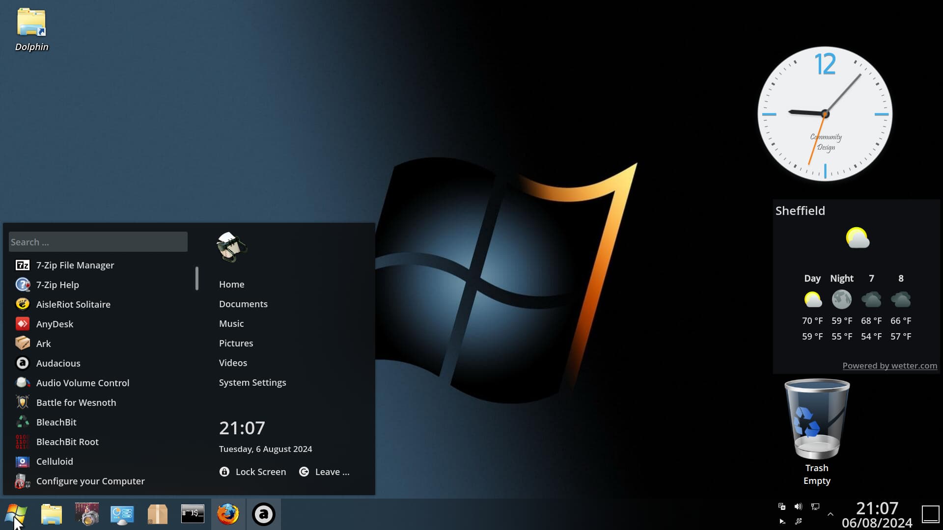
Yes, why not. Should fit to my dark Design well. It could replace my Simply Circles Icon Set. And when it helps You, too to see if it runs well, it is a win-win Situation I guess.
3 Likes
love that ![]()
2 Likes
@14nd You can see the similarity, no?
2 Likes
i can sure do yes
2 Likes
Hey, then I'll at least say thank you ![]()
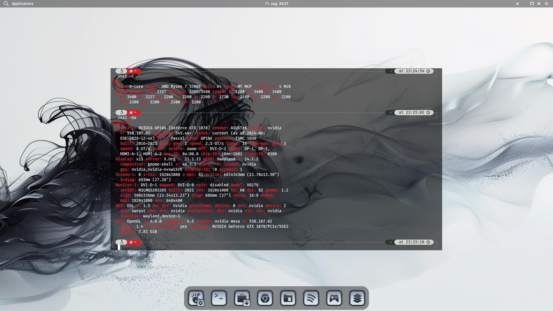
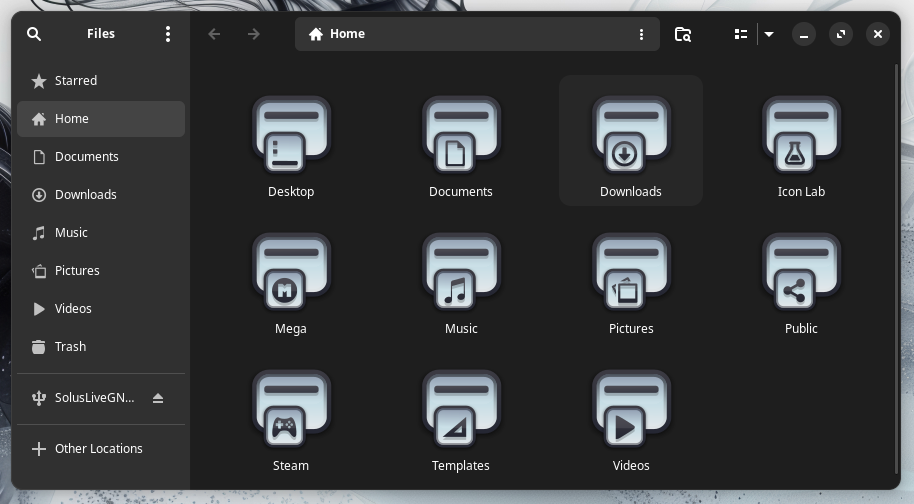
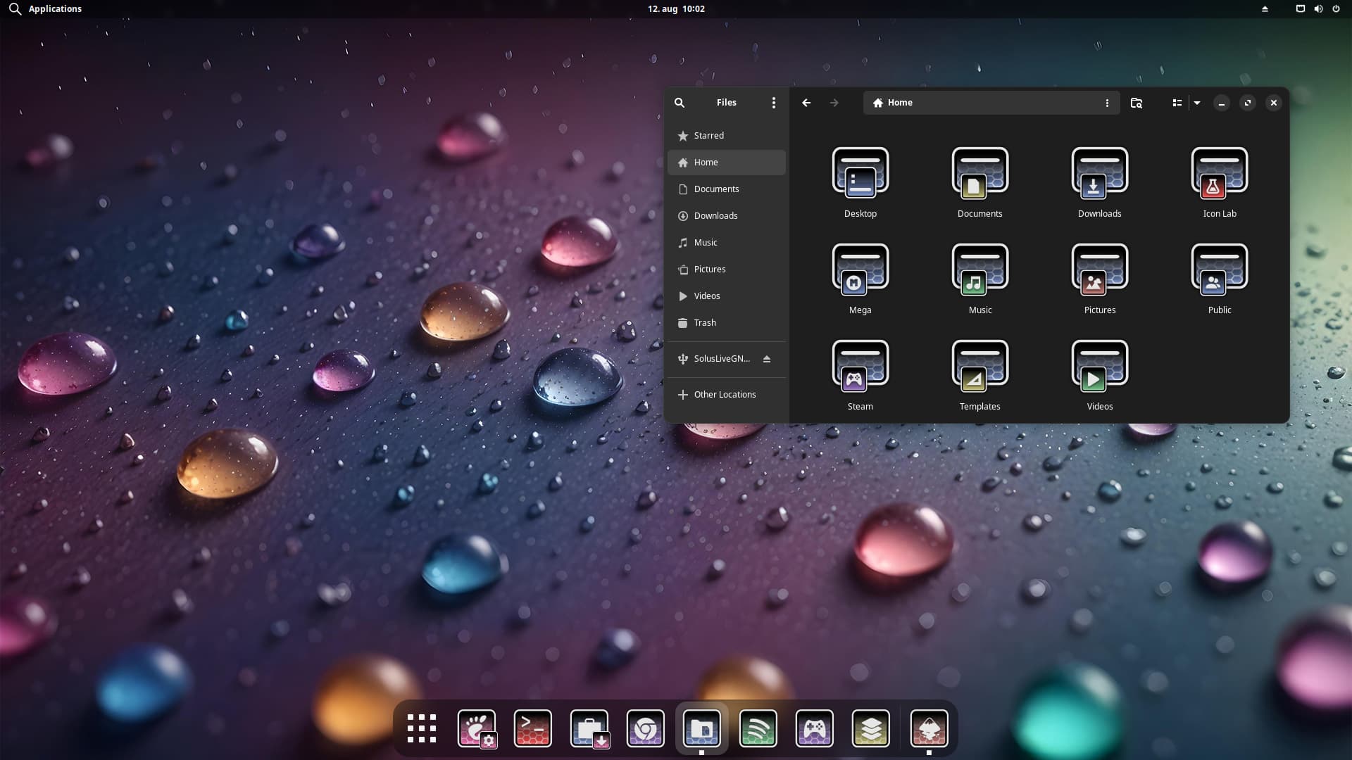
So far it's working. But I haven't fixed a few small things yet. I'm still looking for the following adjustments:
Remove the Hoover effect to white.

Background color, transparency, background of the buttons.
3 Likes
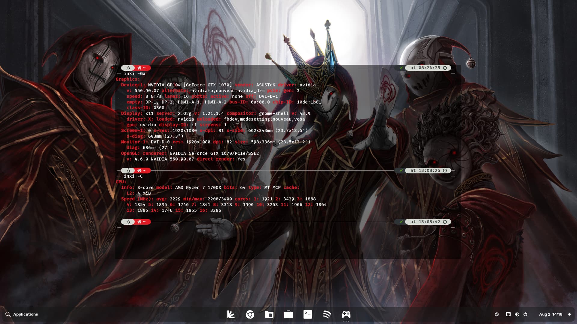
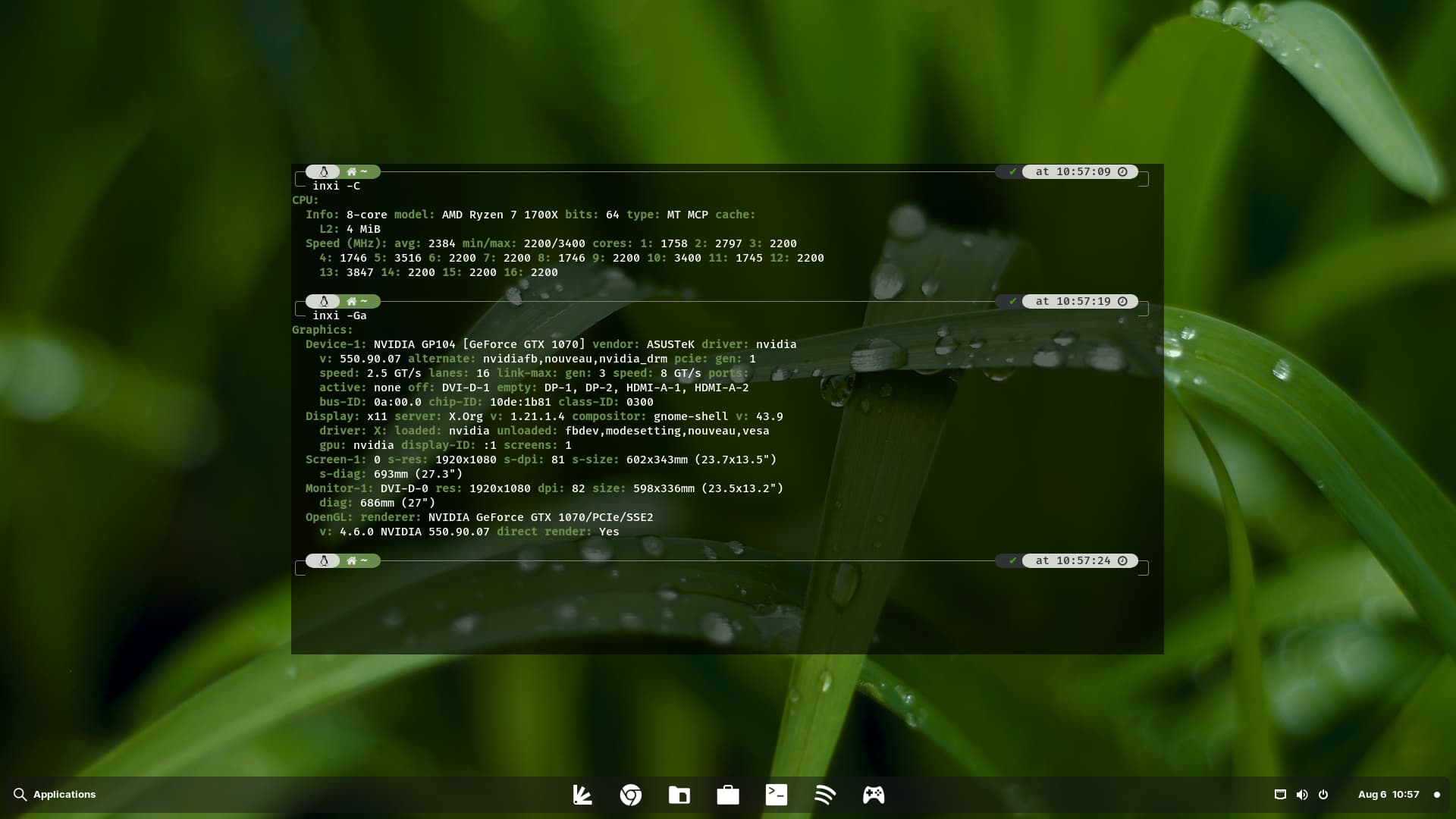
PCLinuxOS KDE (Plasma 5.27):
Global Theme: KeepinDarkGreen
Application Style: Oxygen
Plasma Style: KeepinDarkGreen
Colours: KeepinDarkGreen
Window Decorations: KeepinDarkGreen
Icons: Windows7
Cursors: Win7Build-dark Cursors
Splash Screen: Green-Honeycomb
Wallpaper: fonwall.ru-black-illustration-logo-yellow
Menu: Avalon Menu
5 Likes
Not overdone as far as I am concerned. Great job!
3 Likes
I think, that is an individual Point of View. I would call the whole Thing colorful. Maybe these Hexagon Patterns ... but when you see the Symbols over them, I would say that it not interfere. The Symbols look for me clearly recognizable.
3 Likes
The beauty of being a creator. Someone out there is going to love it.
And someone else will absolutely hate it.
2 Likes
Others are on the fence.
1 Like
Nah! Too many splinters! ![]()
1 Like
They have a Love Hate relationship with it ![]()
1 Like
Depends which side of the fence you sit on.
1 Like
Or aren't bothered either way.
1 Like