The Sweet Icons themes are also available on Plasma.
I wrote a review of this OS under 'Other OS's' in The Lounge. Don't know if you have permission to access yet. I was not impressed.
You could try to copy the Theme Folder from Garuda and put it in Zorin in the Theme Folder in the home or usr Path.
Start doing a live streaming how you creating themes,icons on desktop diffrents linux distributions. More people will be watching. More fun.
Hi Bourne, I don't create themes or icons - I just use what is in Plasma! Will look at showing an install of Q4OS as a VM and how to install the Look Changer that is downloaded from the Welcome screen Software shortcut. ![]()
Hello @swarfendor437 , I liked visit this forum and people.
Well because I spend many times with you all.
I wish you all to be healthy and warm in winter.
I reciprocate your good wishes to you, and all forum members, past and present.
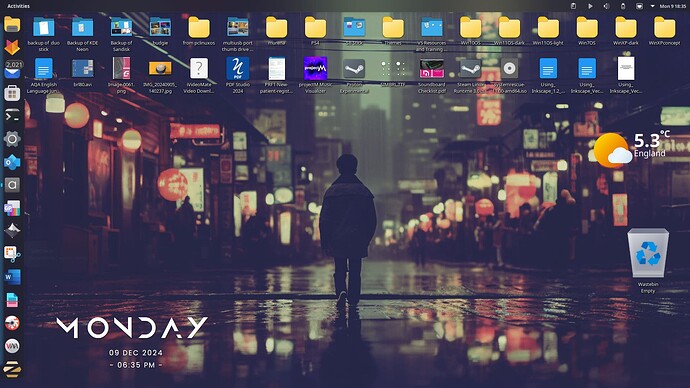
Q4OS now at Aquarius 5.7 (rolling release). Plasma 5.27.
Global Theme: Ayopalli
Application Style: Oxygen
Plasma Style: Frosted
Colours: From current colour scheme
Window Decorations: deepin-dark
Fonts: Noto Sans
Icons: Windows-Beuty (not a spelling error by me!)
Cursors: Apple-cursors
Splash Screen: Ayopalli -
Wallpaper: busy-street
Weather widget: Chaac Weather - uses IP Address - just gives current weather and temperature.
SoftMaker Office default icons not compatible with theme so had to us MS icons respectively from the icon sets available to the system.
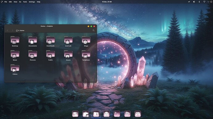
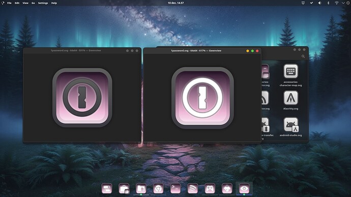
Yes, I think a bit of contrast is always needed to make the actual logo or the emblem on the folders easier to the eyes.
Maybe the light and dark Effects a bit too hard. I mean at the Top it is really dark and the form the Bottom it is really bright. Maybe a bit too much. But that is only my personal Opinion.
Thanks, but I think I keep it that way. The screenshot doesn't give justice to the icons. I have noticed that the forum is killing the screenshots ![]()
But I could switch the white with dark and keep the white glow.
Like this:
Could you make a light and a dark version, where the only difference is like the screenshot, where the logo would be white (light) or black (dark)? It seems like, depending on the situation, you might like either.
With the Icons bigger I find it better because the Transition from dark to light has more Room. And with this bigger Icons I must say, I like both Options.
You couls offer both Options like @applecheeks37 suggested. Depending on the chosen Wallpaper and Theme one could better work that the other.
To me that's too much black and empty space. If you were going this route, I might even suggest that doing the logo that gradient with like, a border around just the logo itself of black may be a way to go. It would be more work per icon, though
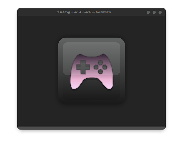
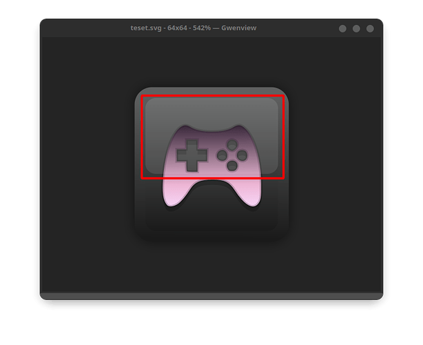
Looks not bad for me. One Idea for this: You have in the upper Area in the inner Space a slightly lighter Space behind the controller Icon:
Could You expand that to the bottom Half, too? So, you would have the Frame, a common colored inner Space withe the Icon - in this Case the Controller - that ''shines'' with his Color as the Centerpiece.
What program(s) do you use to make those awesome themes ?
