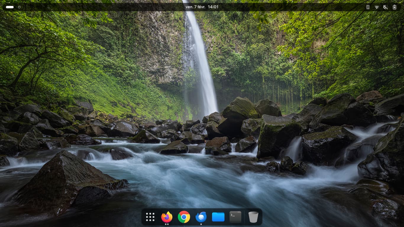
Pop OS - Cosmic DE alpha 5

4 Likes

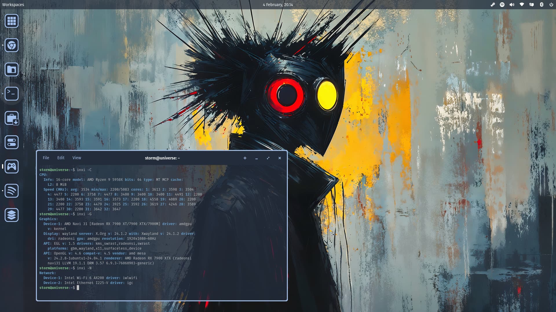
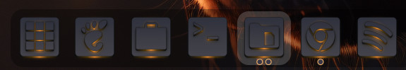
Star Labs theme package, with ILP Icon set from Storm.
Star Labs Theme:
https://support.starlabs.systems/kb/guides/star-labs-theme
ILP Icon Set:

3 Likes
Very nice, although the location of those power buttons looks very dangerous! ![]()
@StarTreker I think I already asked about this... but what is that font you're using again?
1 Like
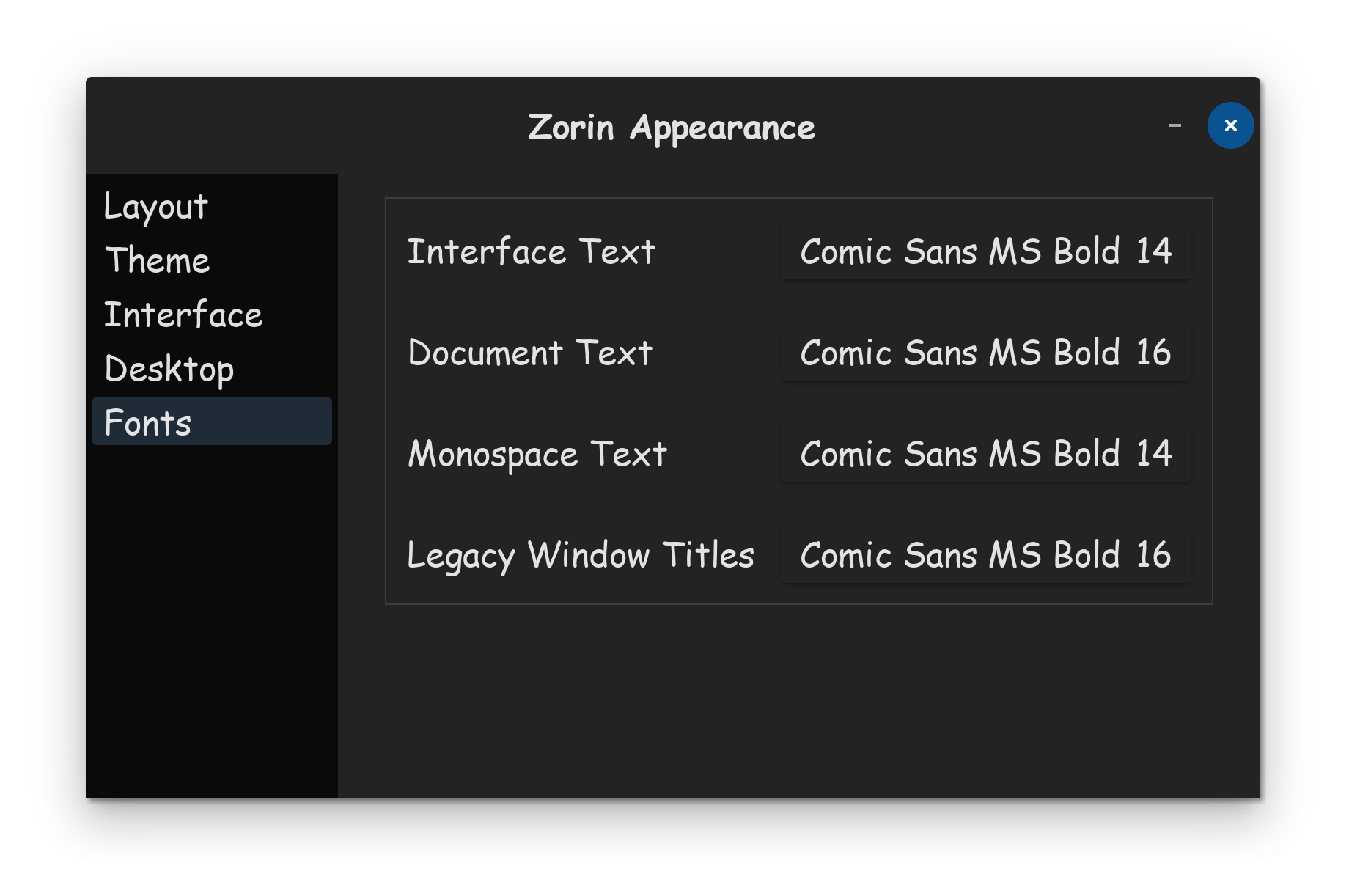
Ah, good old Comic Sans, of course!
1 Like
Whats funny, is all the people I talked to, always hated that font, said it was for kids, and that I should only use the default font, that every business has used for decades.
But I never listened to them! I'm sorry, but the moment I discovered Comic Sans, I fell in love with it. Unlike the other fonts people said I should use, Comic Sans is not boring, its fun!
Another font type I often used when I was young, were the cursive based fonts, but these days I rock Comic Sans Bold.
1 Like
A bit like a song that people initially liked, but then it got way overplayed on the radio... Comic Sans got way overused for a while - around the time the Dot Com bubble burst. (Which adds to the negativity, as people associate it with amateur work and failed business attempts).
It was used in settings where it really should not have been, including gravestones and professional documents.
It was used in Legal Documents.
CERN used it when they announced the Higgs Boson being confirmed. Which... I agree that they should have not.
This led to a lot of cultural backlash against... an inanimate font. There is even a website devoted to the banning of the font.
That said... There is much to like about ComicSans, in spite of its flaws in design. People with Dyslexia find it the easiest font to read - which makes it an essential inclusion for Accessibility Features.
2 Likes
I'll admit that I don't particularly like it, but it's interesting for some things. I remember watching this video a while back; the title itself is quite shocking but the reasons are very much understandable.

This highlights the importance of the font being used, how comfortable we are with it, just like with things like the light/dark theme debacle. But, by extension, it also implies that fonts have their own place in a more broad sense, as @Aravisian says. I wouldn't use something like this for my resume, for example.
Simple is often the right way to go!
3 Likes
maybe it's my way to preserve against external chaos ![]()
1 Like
I learned about MSComic Sans on my first RNIB (Royal National Institute for the Blind) training course which advised that students should not be regimented into using one font (in my field it was predominantly Arial). At the end of the day, I feel students should be given the option to choose the font they are most happy with. I personally could not understand why a student insisted on Calibri, but then I did not have his low vision, so who am I to dictate what anyone prefers? My eldest has Lupus, this affects her vision and she can only tolerate MSComic Sans. I gave her the Notebook work donated to me which I had updated from 2 Gb to 8 Gb RAM, replaced the dying CMOS battery, and upgraded the DVD/CD-RW to a DVD-RW. I installed MX-Linux Plasma. Made MSComic Sans the system-wide font, in white on a black background. Dyslexics have two fonts to choose from, Dyslexie, a paid for font, and Open Dyslexic which is free and present on Zorin 17, as is Comic Relief, the Open Source equivalent of MS Comic Sans. Everyone has or should have the right to access texts in a format that meets their visual needs.
4 Likes
Default font on Microsoft Office
Could be a coincidence, but I doubt it, given how powerful defaults can be on opinions


Whilst that is correct, the de facto font the Vision Support Service always pushed for Arial Bold. I did question the choice, but I was informed that that is what they preferred.
Oh, and for clarity, the reason why Vision Support opts for Arial font is because it is the closest match to the one used by Opticians when having your eyes tested, principally Snellen. We did invest in another font for early learners, Primary font, and Primary Cheynes, the latter mainly used for vertical one (no additional tails), rounded 3, open number four, straight angled tail on six, and vertical tail on nine. Now the thing is with the opticians charts they cannot have the font replicated due to how they are constructed, but in trying to find the name of the chart I have discovered a free font called Opticians Font. I need to look into this (pun intended).
Findus is going to get jealous ..... LOL
1 Like
Findus have to learn to stand still if I ever should have him as a background on my computer ![]()
Now back on gnome;


3 Likes
Thanks Storm I corrected the spelling of the poor cats name .... didn't want him getting upset and coming to my house .... I couldn't afford to feed him besides he looks kinda mean ..... LOL