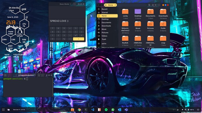
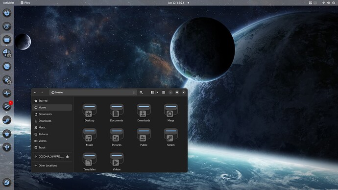
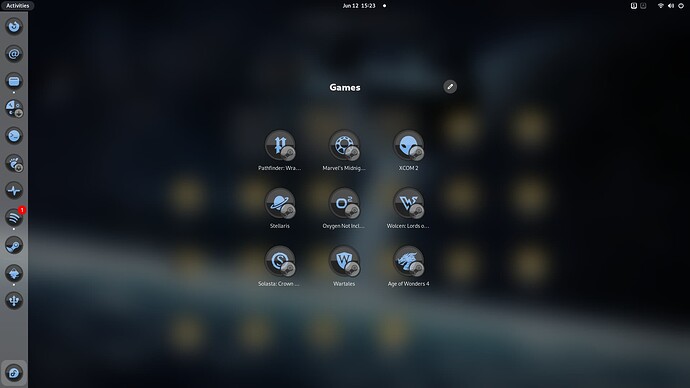
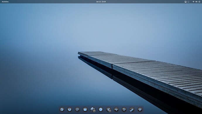
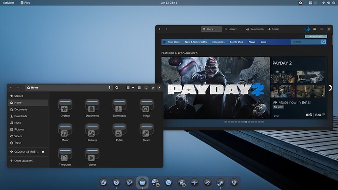
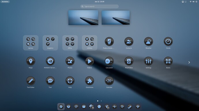
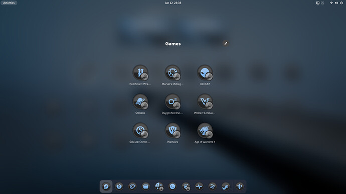
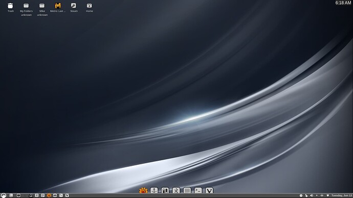
I modified a bit now after inspiring by others. This is how it now looks:
Qogir icons & cursor ::: Flat Remix GTK Yellow ::: Victor Conky ::: Zorin Purple dark Shell
Fun, ins't it?
It is sad that many do not feel inspired and stick with a Drab Desktop.
If your D.E. is drab, then drab is how you will feel while working.
Poor Windows users ![]()
Windows for work
Linux for life
![]()
No offence to you but in my whole experience in software world the people who doesn't give a heck about GUI are always better developers. Of course few people are good at both.
I'm a developer too but not hard core. I take my time to get my code working.
I think he was speaking more in general. Developers really care about GUI quite a bit honestly. Their definition of "beauty" is just different.
I am not a "developer" but am a programmer. I definitely like something that is easy on the eyes lol
I love Linux but I love windows too equally. I got introduced to computers and softwares with windows. I don't remember how many times I installed a pirated version of windows and softwares. I thought windows is the only operating system until I came to know about linux during windows 7 time (I knew that Mac OS exists but never bothered about it a bit). Then I learnt about the whole software freedom, open source and volunteer contributors etc.
I'm full time linux user now but I open windows as and when I miss/need it.
What desktop environment is that? Kinda looks like budgie but I see ArcMenu settings? I could be wrong but I don’t think they make ArcMenu for budgie.
Edit: I see the removable drive extension as well so it must be Gnome.
Did you change fonts on the panel? Idky just looks very budgie-ish to me
I went back to (mostly) stock Gnome on mine. I can never decide if I prefer it or a more Windows like layout lol. They both have advantages I like.
Main theory I have on advantages for Gnome is it keeps what I am working on front and center with limited distractions.
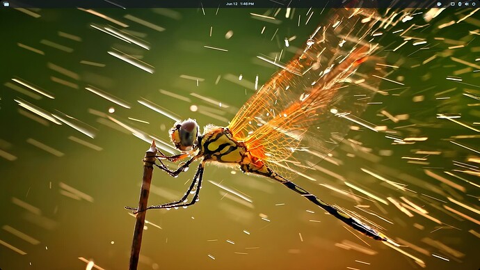
That's a very nice wallpaper, do you know where was that picture taken?
Uh, same for me actually. While I normally prefer dark themes, it just feels wrong not to use the default light theme. It just seems all too well "handcrafted".
I just did a reverse image search on it and it seems it was something to do with National Geographic but the links arent being super helpful
A couple of the links do say Snares Islands some maybe there?
I like this look quite a bit honestly. Not a fan of the window theme but everything else is awesome
If you're on Gnome, you'll get use to it - Libawaita in all it's glory. Though there's an app to switch colors on it.
I would honestly switch to Cinnamon before I would use that theme lol.
It is my #2 environment. But it has a lot of little things about it that do not quite click with me unfortunately
![]()
![]() ..... just poking you .... this is why Linux is so much better than Windows because we can change thing to suite ourselves ....
..... just poking you .... this is why Linux is so much better than Windows because we can change thing to suite ourselves ....
By the way liked your original reply better before you edited you post ..... ![]()
XD. I decided it was a little harsh for your comment
