
That blurred background is an interesting touch, I like it. Budgie is coming together quite nicely it seems.
Very nice @Turtle11
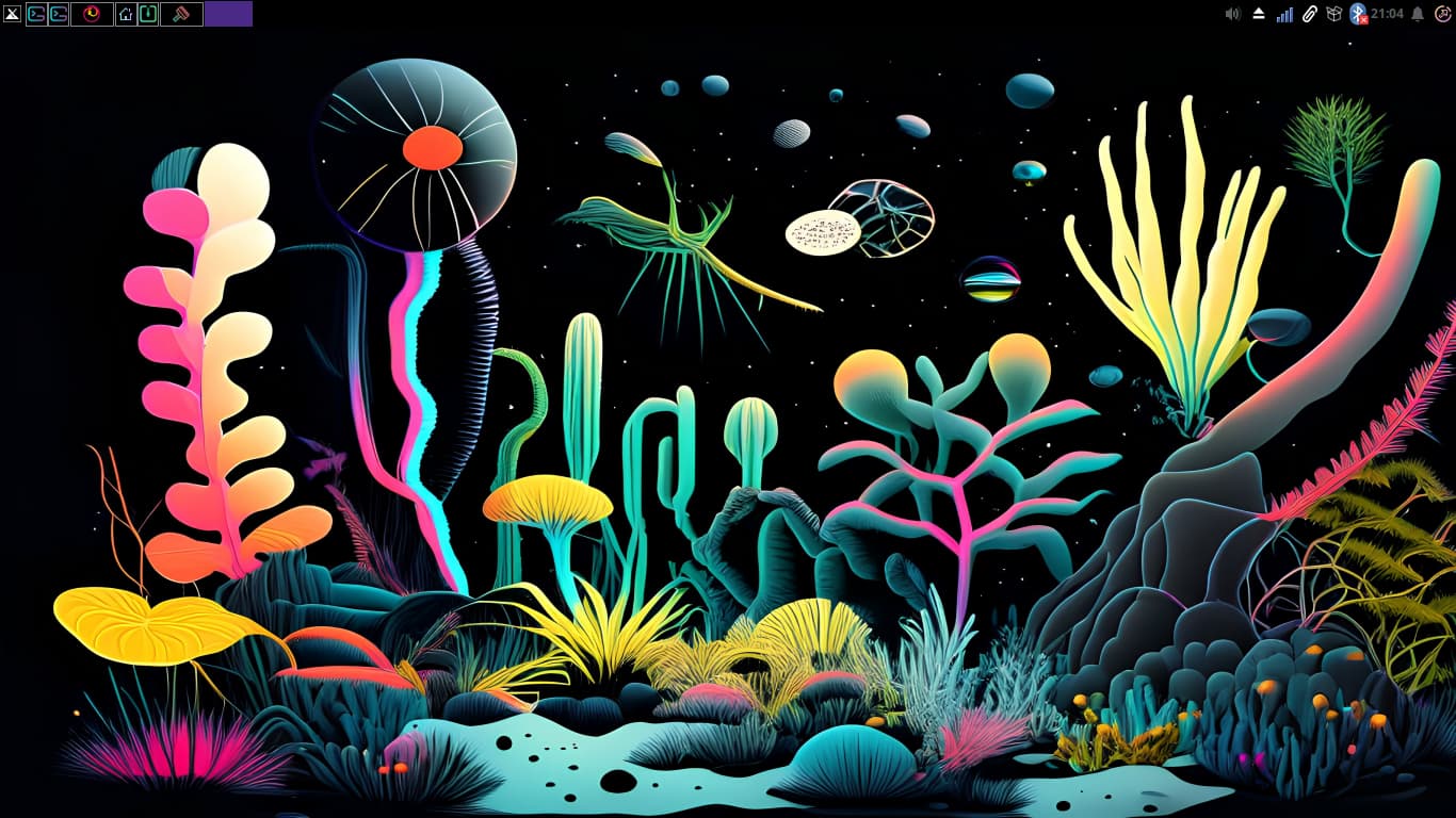
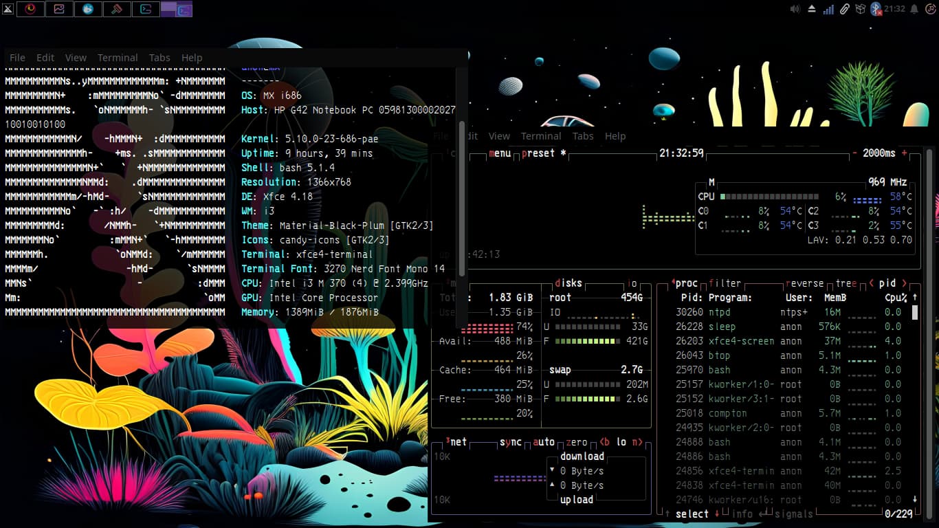
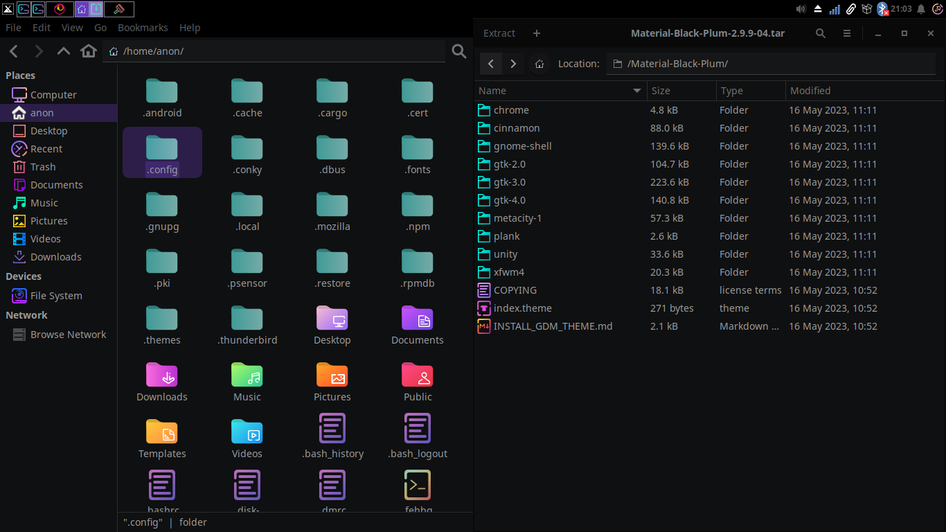
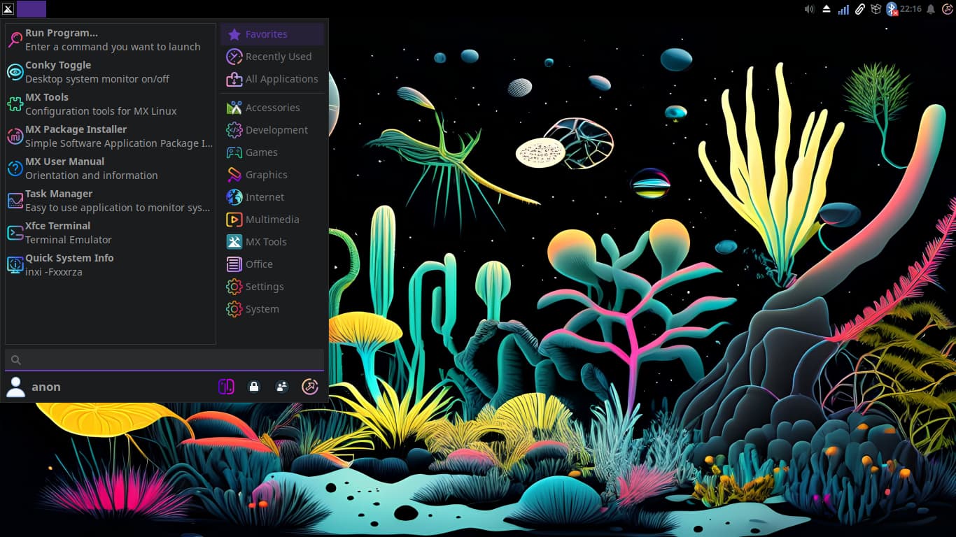
MX Linux +i3wm + Material BlackPlum theme + Candy icon
Also any suggestions for an easy and/or efficient way of changing widgets icons are much appreciated ![]()
Groovy, love it!
Thank You!
That definitely is a colorful and bright wallpaper ..... nice set up .....
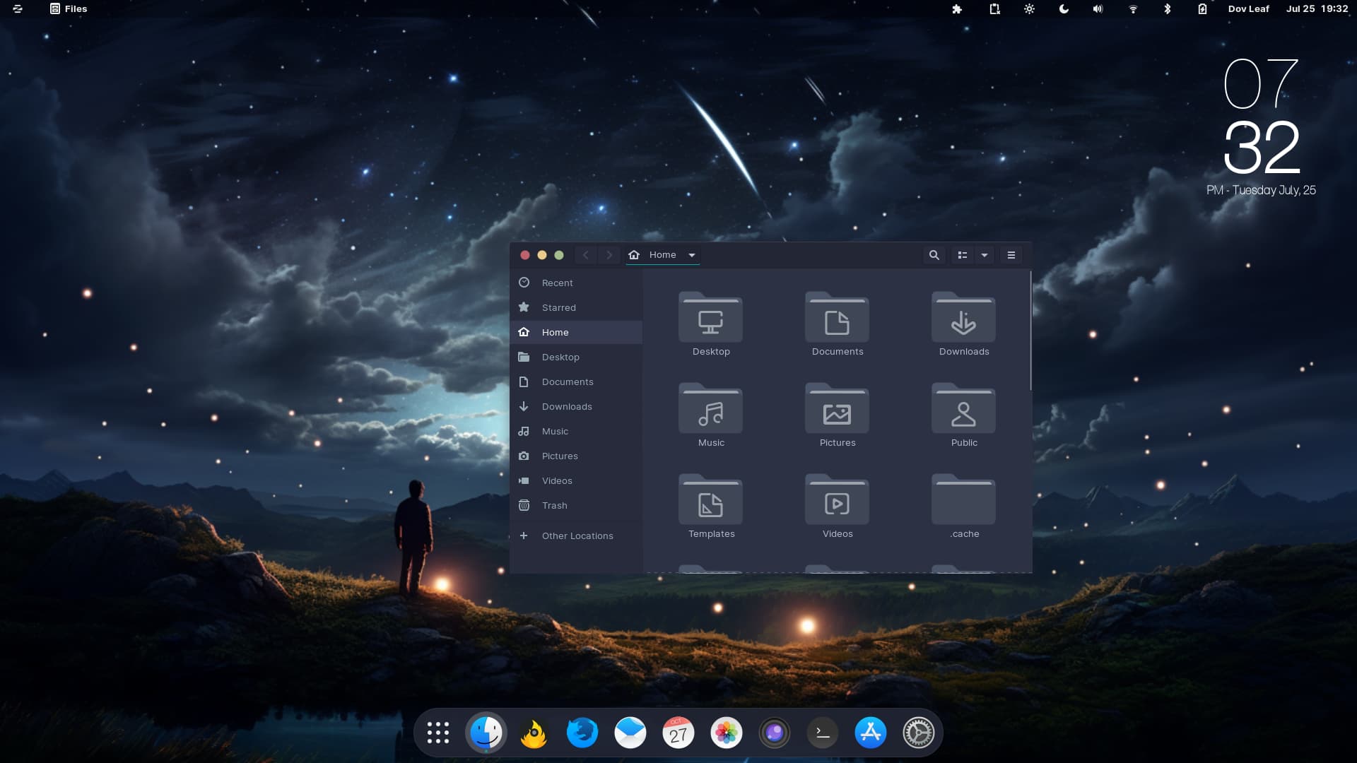
ZorinOS 16.3 Pro
Juno Palenight Theme
Nordic Darker / McMojave Circle Icons
Reminisce Wallpaper
Phone Clock Conky Widget
Really liking the design philosophy here.
What clipboard manager is that?(assuming it is a clipboard manager)
If you're asking me then idk what you are asking.
Cool looking.
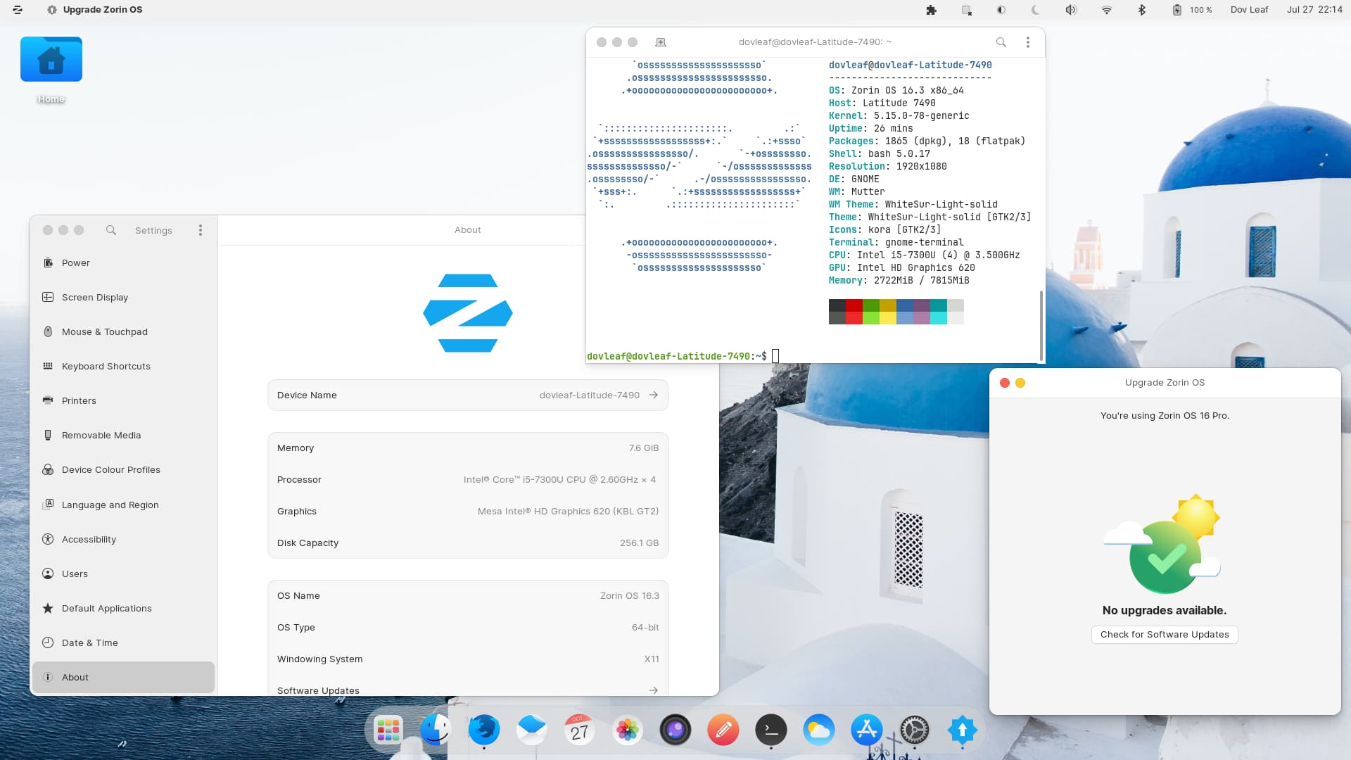
I just did a flawless fresh install of ZorinOS 16.3 Pro ![]()
No issues whatsoever ![]()
![]()
![]()
Screenshot just showing my upgrade, nothing special otherwise.
ZorinOS 16.3 Pro
WhiteSur GTK
McMojave Circle & Kora Icons
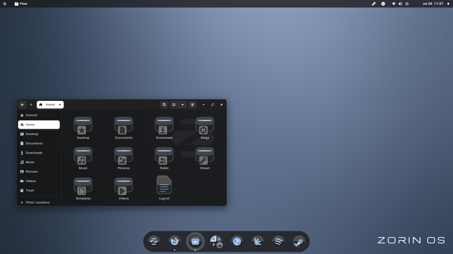
LInux MInt Stock Wallpaper
Love your wallpaper @Turtle11
Zorin-OS with Vertex Applications looks, Fluent Icons, And Dark-Olympic Shell.
Let me know if you want to what extension I use.
Is that horst3180's Vertex?
Vertex Dark has long been a standing favorite of mine.
I Think So, I received it from A website. install through the terminal.
"Why do you even bother coming around me? yeah i got nothing to give and you know that I'm unclean. Why don't you just come right out and speak, speak to me?"
The Black Peppercorns - Come To Me
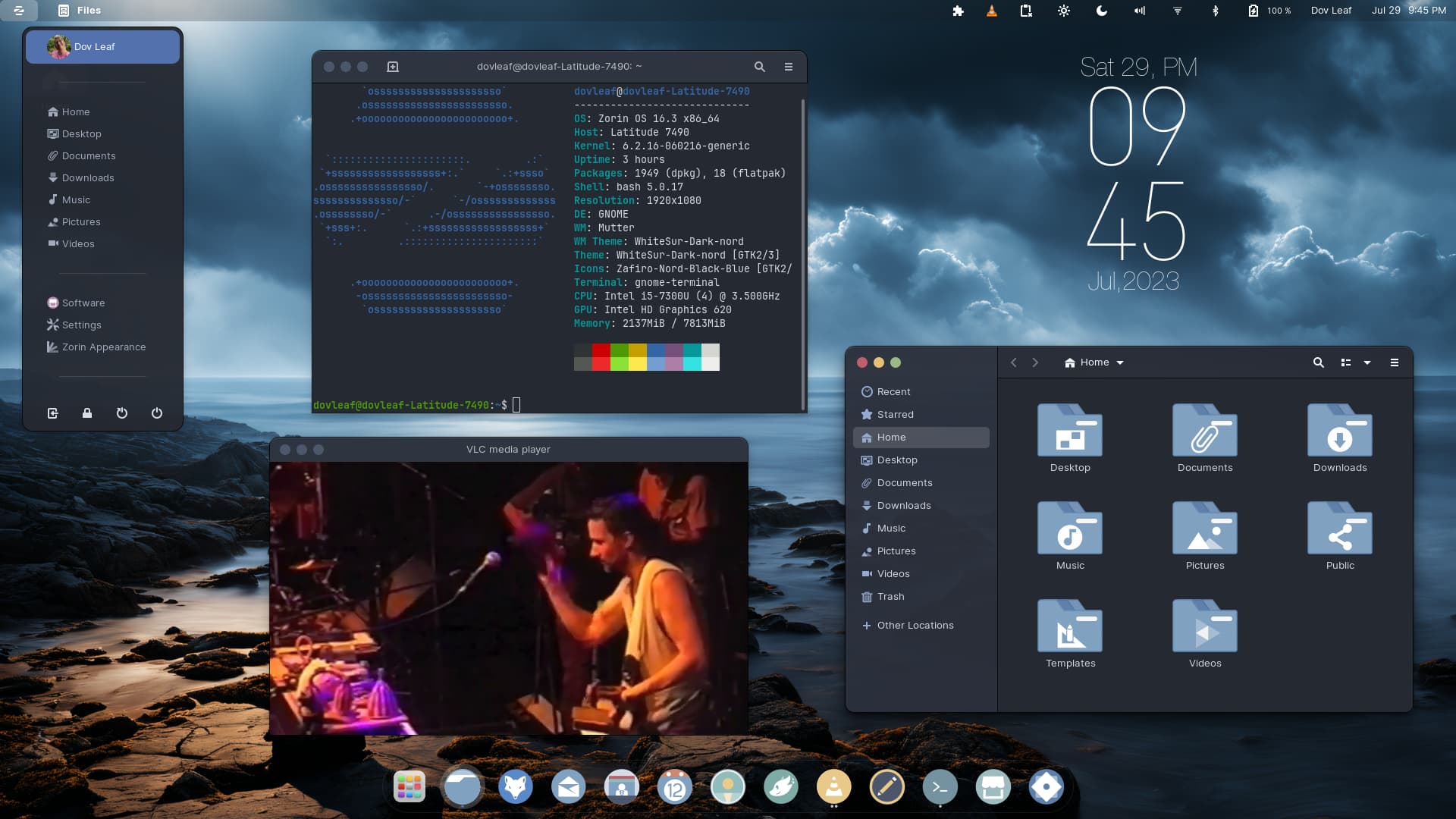
ZorinOS 16.3 Pro
Kernel: 6.2.16
WhiteSur Dark Nord GTK
Zafiro-Nord-Black-Blue Icons
To The End Of The World Wallpaper
Light Flair Conky Widget
That's the name of the song, I though it was a response yo my post for some reason.
New setup of my desktop with live wallpaper.
