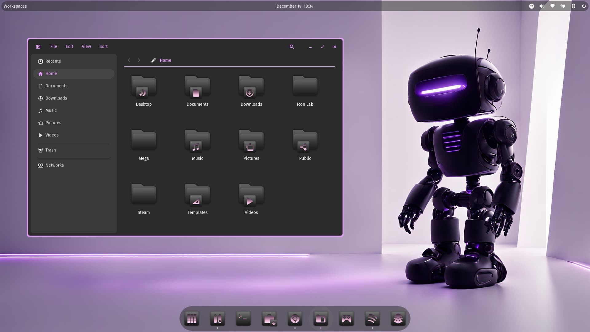
Storm, thats so pretty! ![]()

1 Like
Thanks. I went purple this time. I could make it blue, but maybe when it's done I can convert them via scripting.
2 Likes
The purple is perfection, maybe tweak just the grey folder icon to be a dark purple, to go as a backdrop to the light purple portion of the folder icons. Also, I especially was impressed with the light purple window borders, I wasn't expecting that, and I am really happy with what I am seeing.
Also, I'd love to have a robot like that, I'd call her Molly, and she could play with my cat, it would be utterly hilarious. HEHE ![]() I love seeing what you accomplish in your icon theaming. FYI, after all these years, I am still using the MLP icons you made for me.
I love seeing what you accomplish in your icon theaming. FYI, after all these years, I am still using the MLP icons you made for me. ![]()

Storm, you are positively stellar.
2 Likes
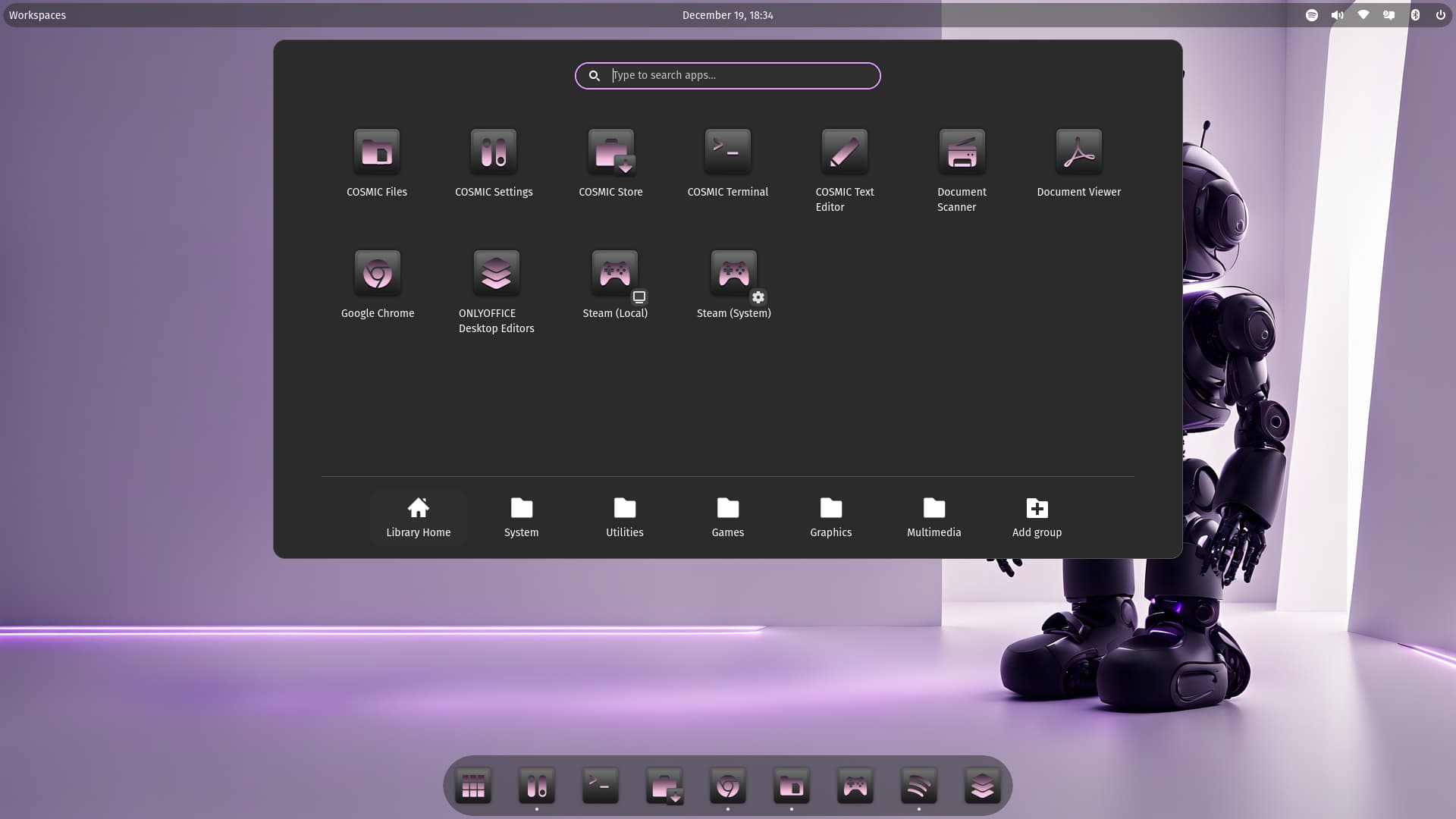
Could You try it with a bit lighter Top in the violet Symbols? Only a bit. For the smaller ones in the dock at the bottom it could be an Improvement I would think.
1 Like

Cosmic will get alot of theming i bet, your already one of them. Awesome work!
2-3 months and cosmic will be fully out ![]()
1 Like
That looks nice with the decent Lighting.
1 Like
Aye, it's a keeper. But first I need to finishing my Forest icon set. ![]()
2 Likes
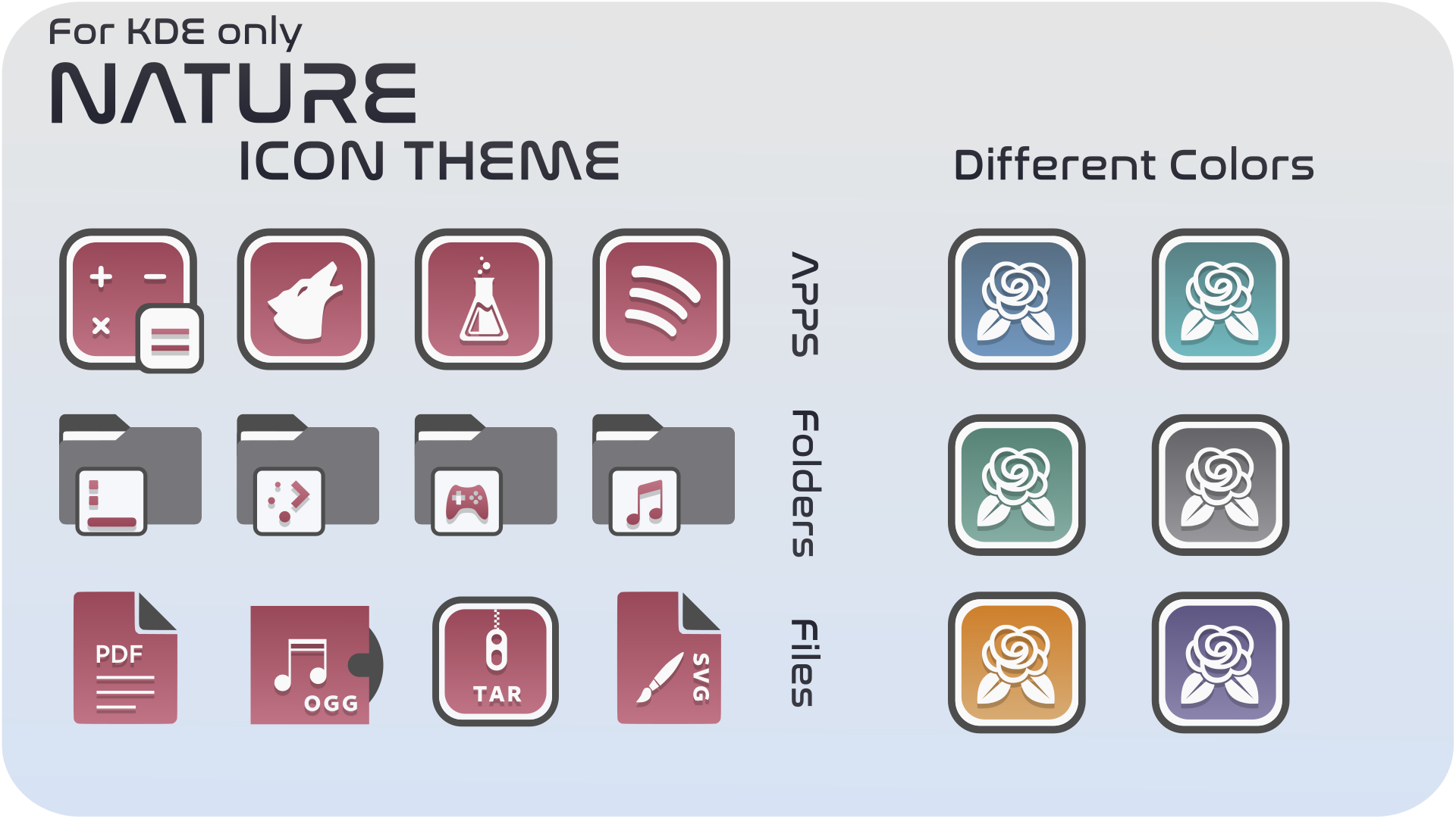
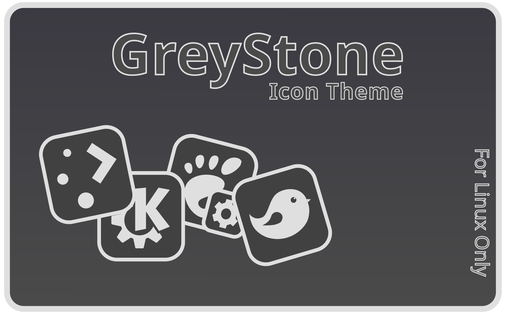
I have released Nature icon theme version 1.4 and GreyStone icon theme version 1.10.
Nature: Nature Icon Theme - KDE - KDE Store
GreyStone: GreyStone - KDE Store
3 Likes
Thanks for the new Nature icon sets Storm...... looks like Santa was busy last night ..... Ho Ho Ho ....
1 Like


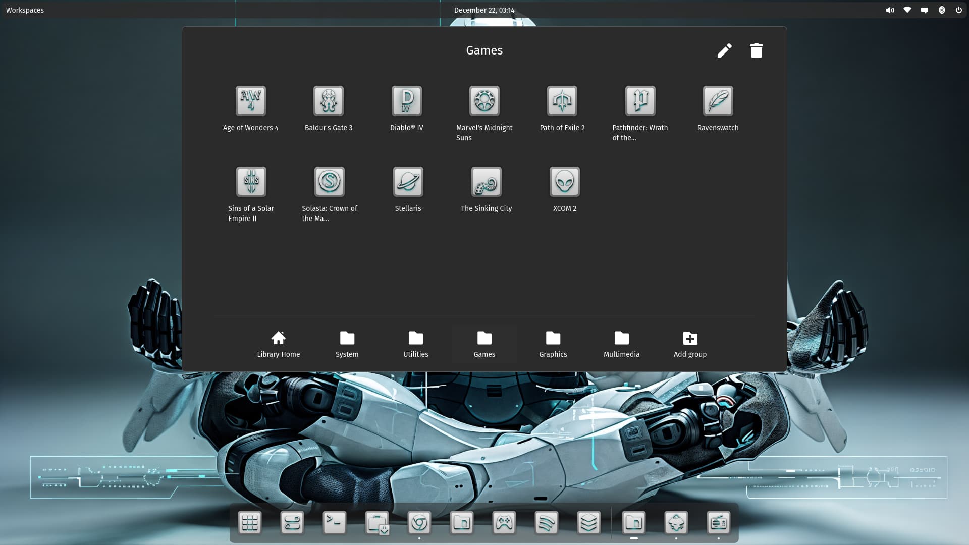
Very cybernetic Storm, and its one of the colors that I enjoy, deep blue. Almost Lost In Space like.
1 Like
Blue is the most chosen color of all. I could go for red as well.
1 Like
I like the Symbol-only style.
1 Like

Dude! I love them way more Storm! Way to go outside the box, (literally) and invent your own icons from scratch, with a more rounded physique, I love em! ![]()
1 Like
yeah, I'm more happy with them now. But damn it takes time.
I have the Feeling that it is a bit lighter, too. And to You use as Desktop Symbol a Heart? Hahaha!