Not to pollute our "Show us you Desktop" thread. I'll put my experiments in this thread.
Thoughts on this one? I made the logo contrast to stick out.
Not to pollute our "Show us you Desktop" thread. I'll put my experiments in this thread.
Thoughts on this one? I made the logo contrast to stick out.
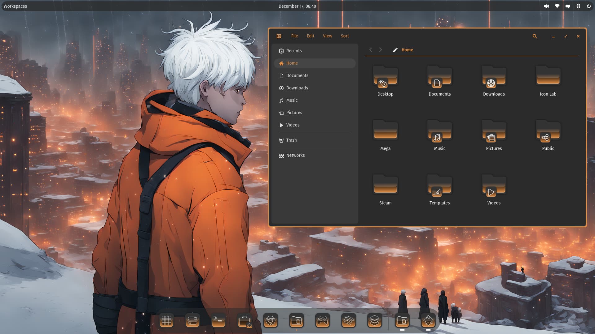
I like the white Framing around the Symbols on the Icons. So, it offeres a clear View. And the Colors there from the darker Top to the lighter Bottom is nice too I think.
But on the Folders this Design isn't mine I must say. It looks for me like some kind of Mixture between a flat upper Half and a 3D bottom Half wher this Section stands up. It looks for me too much seperated.
Agree with the above. The folder/app design isn't for me, though they look like you're inside some sort of RPG. ![]()
Deus Ex vibes, I like it
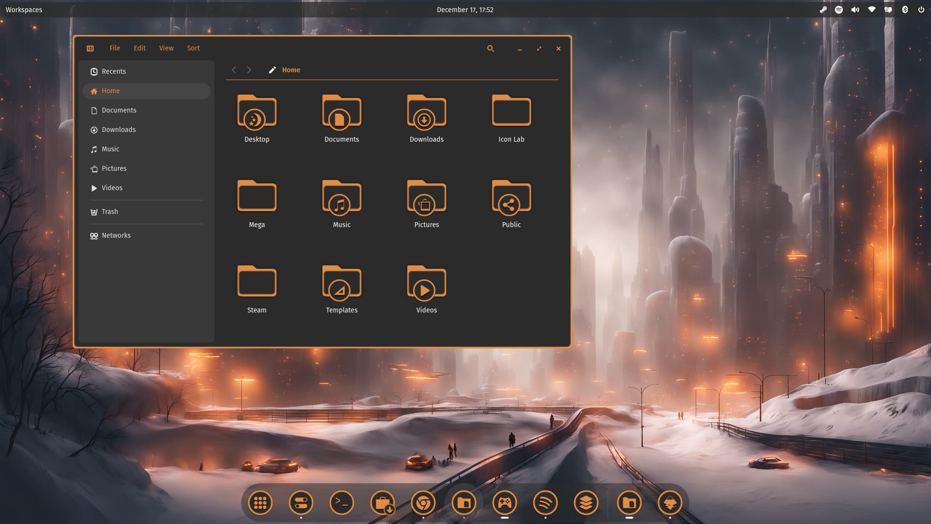
That looks nice. Interesting Color Choice.
But I hav a Question to the Desktop Folder Icon: there is a round Icon with a Moon and Stars. Why did You decided to use that as Desktop Symbol? I'm curious to hear that.
Yes, as I seems to can't to get better ideas for it. ![]() So I thought moon and stars.
So I thought moon and stars.
Hello Storm, I just found your post!
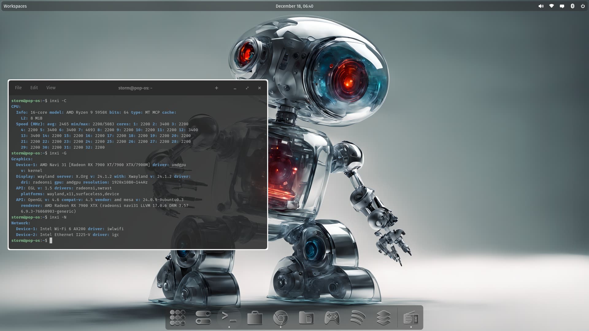
Cool robot in the background.
I personally would feel, that this theme would look far better, if you matched the bluish hue of the robot in the background. So instead of a grey variant, do a blue/light grey variant. But I like the overall direction you are going, just tweak the colors a bit.
Were living in a time where AI is the new norm in today's society. Robots are already being made with rudimentary AI running them. It would not be so far fetched to have an AI robotic theme.
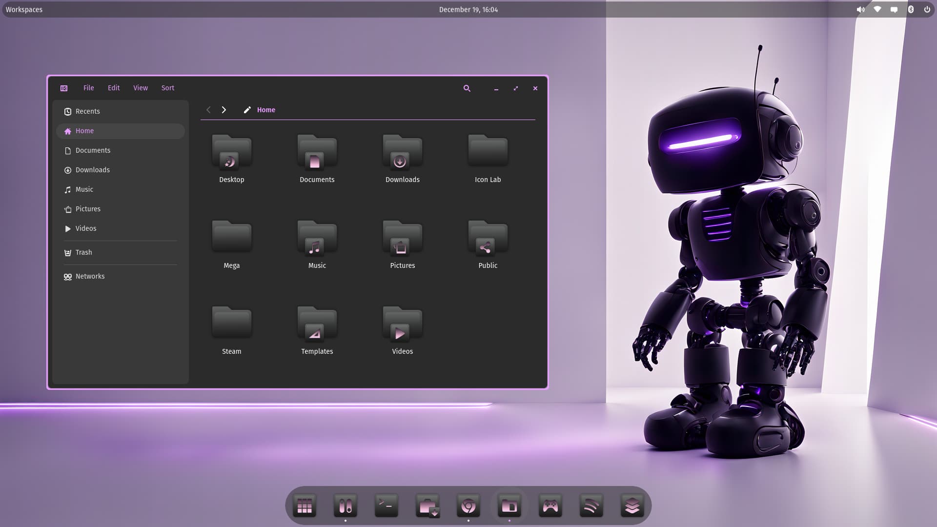
I love this one!
@Storm
I enjoy your White circle theme.
May the Force be with you.
Okay, interesting. Then I would make a suggestion: When You maybe make a Light Version of it, use a Sun as the Icon for it, hahaha!
That is an interesting Look, too! You call it ''Black Glass''. I would describe it as some kind of polished black Metal. You could try differend Accent Colors like @StarTreker already suggested. But I find this Version pretty cool.
I'm in Awe ... The CEO and Founder of System 76 is following me on the social media now.
So, You are now ''official'' famous, hahaha! Maybe he saw Your Wallpaper and Icons and is interested in them. Who knows ...
It was this post: Storm: "I have released Robot icon Theme v.1.9 - Robot Ic…" - Mastodon
This is the perfect excuse to ask them for a top of the line testing unit for review... ![]()
Please remember us tiny people when you become rich and famous ..... LOL
PS ..... you really do deserve something for all your hard work and creativity ......
Storm76 ![]()
Will be the Name of the coming default Icon Theme from Cosmic, hahaha!