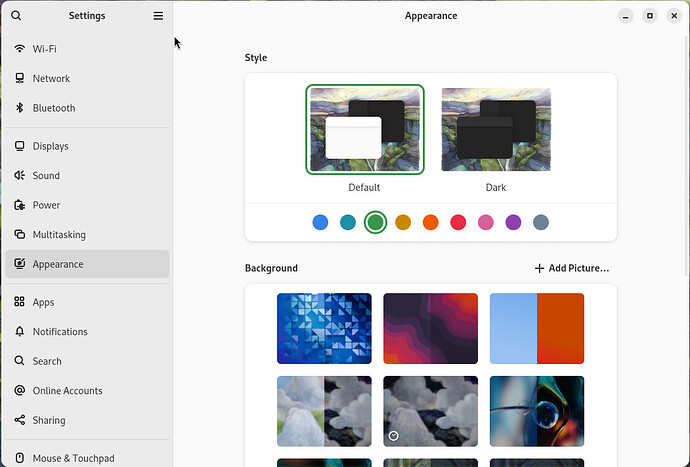
Although I understand the desire to create an interesting appearance, I would suggest disabling the tinting of the application background color, or at least including an option to disable it.
The global tint, rather than making the theme feel unified, makes it feel like the display colors are miscalibrated, and is also a reduction in contrast. I believe applying the accent color in toggles and menus is enough to create a unified and pleasant look.
Compare vanilla GNOME (47) with green accent color:
and Zorin OS:
For that reason I only ever use the grey accent color, which is a shame, as I really like how the accent has been applied in more places than vanilla GNOME!

