Yes I did extract the files .... later today I'll do some more digging around and look at the link you posted .... thanks
See I told you my spell checker wasn't working .... it knew what it was supposed to type but refused .... kinda like AI in reverse .... LOL
I love this idea
1 Like
That's why I have removed spell checker. You have to check your spellchecker to check if the spellchecker didn't make a fool out of you. A conversation can quickly turn awkward in an instant.
1 Like
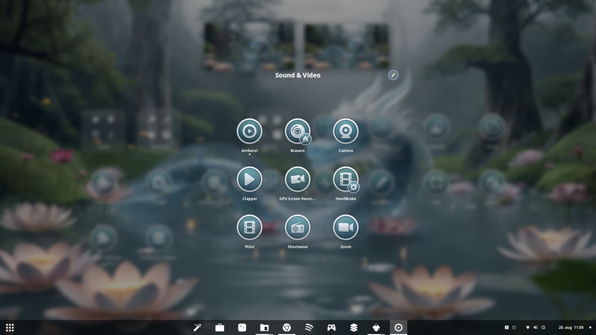
You can get the themes from cinnamon-look.org:
gtk theme:
Icon theme:
They should be the same as on gnomelook or github but when you see them in cinnamon-look you know that the themes are suitable for cinnamon.
2 Likes
Thank you I will download these later on today the Papirus download has some 24 downloads and may take some time .... LOL
You don't have to download all of them. That are only Folder Color Versions. You only need one.
2 Likes
Yea I know but I always like to see what colors go with what desktop backgrounds so I generally download them all ....
But that would only work when You use the Papirus Icon Theme directly. When You use the GreyStone Icons, Papirus serves as a Backup and fills the Icons what GreyStone not has - for Example symbolic Icons.
But do how You want. Papirus for itself is a good Icon Set.
2 Likes
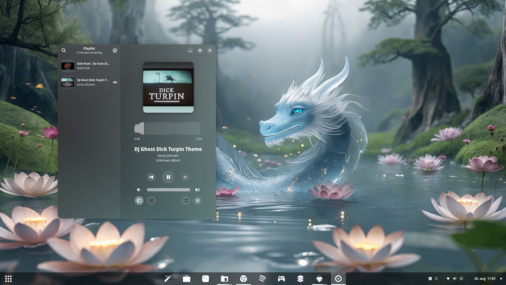

Here are the Icons transparent:
and here they are solid (except the small Additions):
Do You plan 2 Versions? Or You are undecided?
1 Like
No, they are made transparnt in both, but the colors are thick behind the last screenshot so they look solid.
1 Like
Ah, okay. I understand.
Alast the Applications icons are done also its counterparts monochrome version.