One of my other projects is called Ghost. It's a bit solid and bit transparent. It' will be available for Gnome, XFCE and Budgie DE. There may come a KDE version in the future in a far far galaxy from here. but one step at the time.
3 Likes
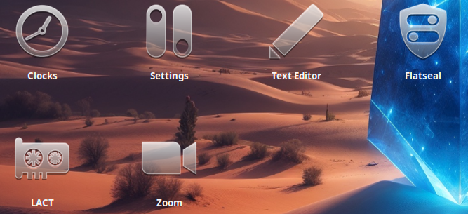
Interesting Icon Concept. But it seems to be best working on dark(er) Backgrounds. Even with the blue Cristal in the Back the Icons lose a bit - the smaller ones more that the bigger ones.
1 Like
Yup, it doesn't work so well on bright backgrounds.
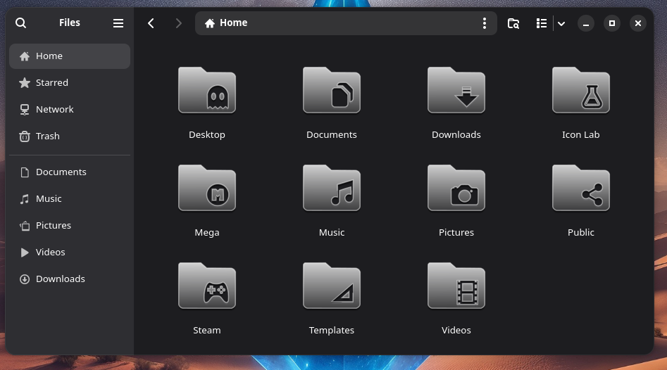
Here's how the compressed files going to look like:

3 Likes
Looks fine I would say. Someone could say that there is a bit much Space on the Icons left and in the middle lost butI think it is okay. You so have the Option to play a bit with the Font Size for better Visibility.
Icons can look great when large during creation.
But many applications really push for 16px icons.
And even 24px can be a problem with detailed or spacious icons.
1 Like