
Wasp icon theme is a black and yellow icon theme for Gnome, XFCE, Pantheon and Budgie DE.
Screenshots



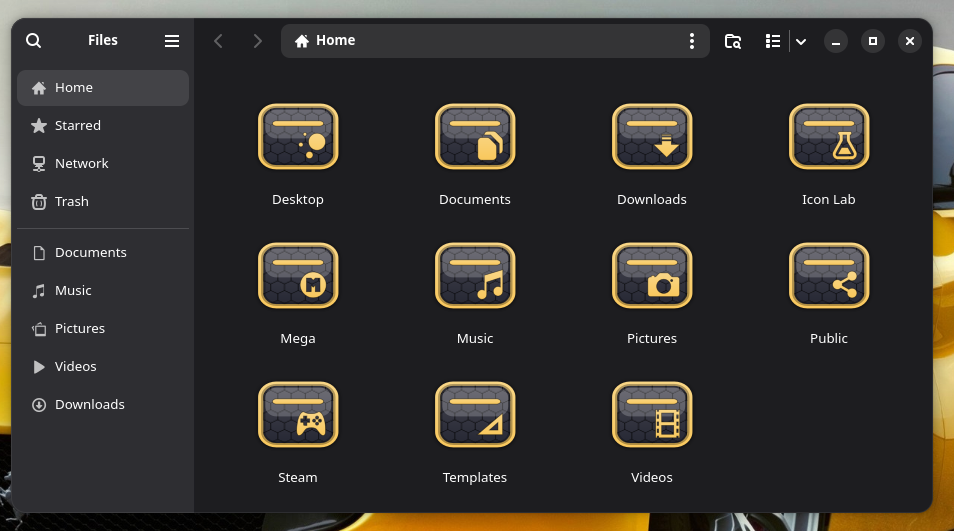
Download
Coming Soon (tm)
Wasp icon theme is a black and yellow icon theme for Gnome, XFCE, Pantheon and Budgie DE.
Coming Soon (tm)
I like the Honeycomb Pattern.
Pretty coo, I like it 
I hate you Storm you are always causing me to make decisions .... went back to using your Mystique icon set (which I feel is one of your best) for a while .... your coming out with the new circle set and now the Wasp which I really like also ..... decisions decisions .... LOL
Just wait until I announcing a round version of Wasp 

You know it ain't right to tease a poor 'ol frog .... LOL

@Storm Loving it. Brilliant multi-layering Sensei!

Except it's a wasp nest comb!

I can do that.
I know you can, but is there a demand for it? (only 1 like so far)
My quick and nasty mock-up probably does not do it justice.
Maybe people prefer Ferrari to JCB when it comes to car preference and rectangles to hexagons when it comes to icon shape.
Well, I think it would be a nice Idea. And it would be because of the Hexagon-Background fitting and consequent. Plus it stands out from the more common round and square Icons Sets.
Zab ... It looks really good as a logo but for me as an icon set it is much to busy .... but that is probably not what you meant anyway ....
Note my "Hexagon" had 8 sides. Clearly wrong. No wonder the Z logo does not fit or match the genuine ZorinOS logo. My bad. I am sure @Storm would do a better job.
Maybe you just have a fat wasp ..... put him on a diet .... LOL