So coming into Z16, I was really prepared to change the default theme as soon as I get the core functions of the system working. At the first sight, I thought oh it looks cool but there is no contrast and I think my eyes are going to hurt. But, I decided to keep it. I found myself actually liking the Z16 theme more than Z15. I think the developers really did a good job with the color composition and the overall theming of the system. It really looks good... most of the time. There are some rough edges but they are easy to fix before the release. For example, this screen shot:
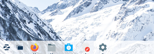
This is the default Z16 background and theme. But the Text editor is almost invisible. It hurts my eyes trying to figure out the edges of the paper icon. This happens with a bunch of other similarly colored icons as well.
I'll tag @zorink and @AZorin so that they see this issue.
Overall, I really like the Z16 theme. But what do you think about the theme in contrast to other Linux themes in general? I'd like to hear other people's thoughts on it.
On a similar note, Firefox also recently 'updated' their GUI. It is very bad example of a flat design with no contrast. When I looked on their forums and their subreddit, basically everyone collectively hated their new design and wanted them to revert to the old design.
1 Like
In FF, about:config
You can enter in
widget.content.gtk-theme-override and then specify the System Theme that you want FireFox to use.
1 Like
On the Icon Contrast... When you have a Light and Dark theme mode, it makes sense that some Icons would hard contrast. It's funny because even as I am typing this post... I am in the middle of creating a New Theme (Currently titled "concept-three" until I come up with a name for it) and I just ran into this same exact problem. My borders in this theme are very light, with windows very dark. Because of this, I made the system Panel match the borders because that makes the most sense. But where Light Icons will be needed for the dark buttons and windows, they now will not show up on the Light Panel. So... I am revamping the panel. It's the only logical course - especially as I am considering hocking people off onto @Storm 's Icon sets instead of making a new icon set for this new theme. Whatever I end up naming it.
Another trick I sometimes use in making Icon sets is I create a Background cover that goes behind all Icons that contrasts the Icon, enabling the one set to be used on either light or dark themes. For example, if the icon is light in color, I create a dark colored shield icon that borders all the light icons- and the reverse; solving all contrast problems for the set on any theme.
1 Like
In addition to @Aravisian 's suggestion you can switch back to old FF UI in this version:
in FF, about:config
toggle browser.proton.enabled to disabled
I have heard that this switch may be removed in subsequent FF versions though, so will then be stuck with the new unloved proton UI.
1 Like