Due to some inconsistency in Zorin lite, I have switched to Zorin core. But missing some of the things from Lite, like it's file manager Thunar for this topic. Getting it under Core everything works good except it's UI, which doesn't match to Core's design language. So I made some customization to match the look and feel as close as possible. And have succeeded on the most of the part.
Here are the results:
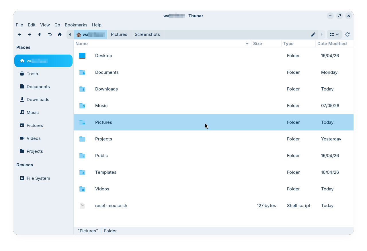
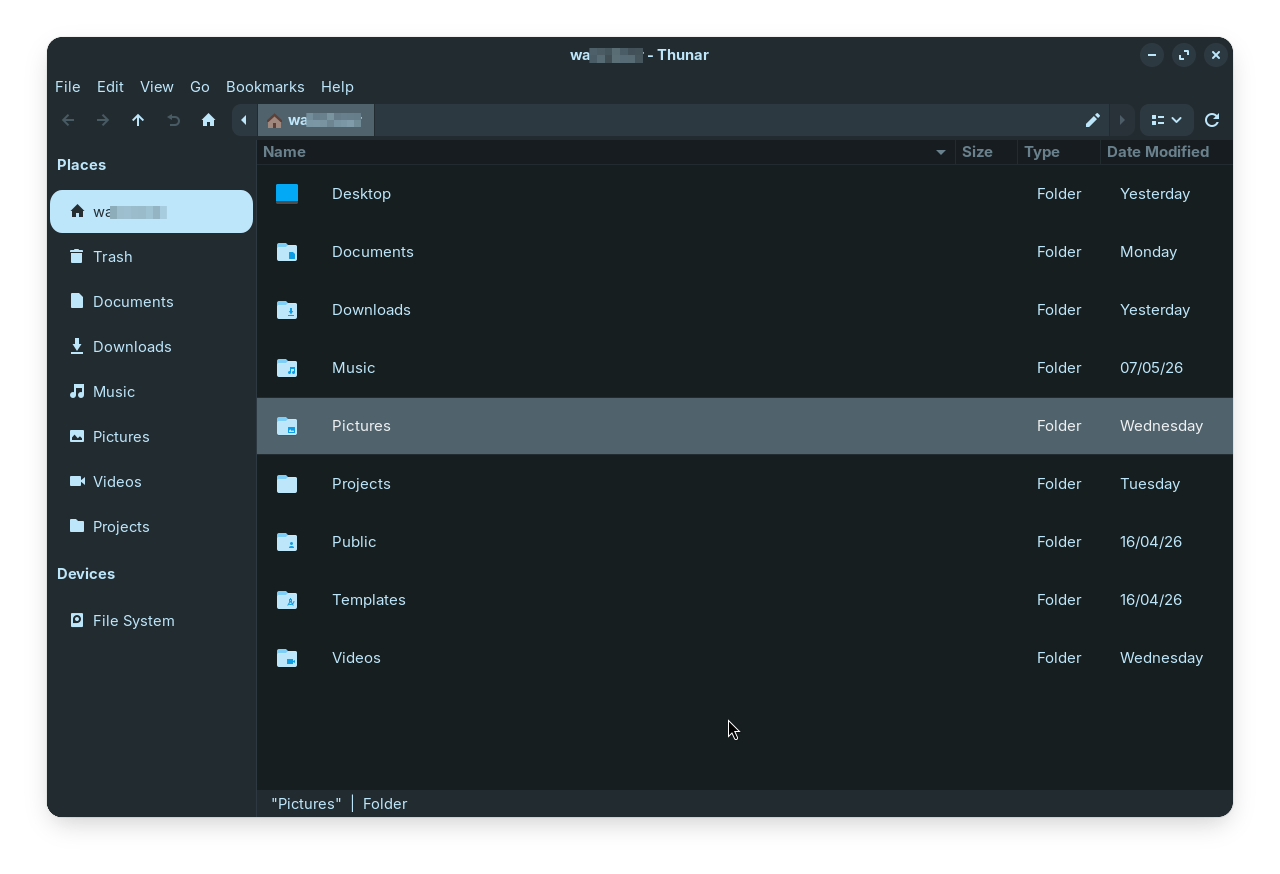
Now the problem is, when I'm using it in ~/.config/gtk-3.0/gtk.css, it doesn't respect the changes when I switch the dark/light mode in the desktop. So to workaround this I made the light and dark variant of my customization and added them to the respective gtk.css of Light and Dark variants of my preferred theme (ZorinBlue). Everything works good, it changes when I switch between theme modes, except the following part:
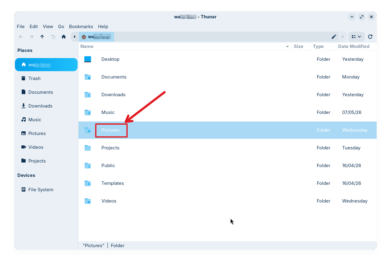
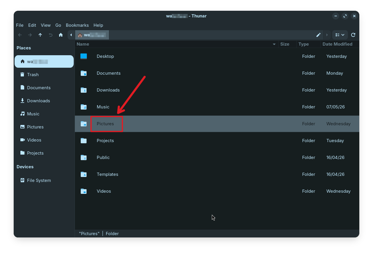
The text colors of the selected item isn't applying the color that I have added through my customization (compare it with the first set of images, to know the difference). Anyone have clue, why it happens? and how to fix it?
Contents of the customization:
Light variant
/*Thunar sidebar customization*/
.thunar
.sidebar.frame.shortcuts-pane
.view {
border-radius: 15px;
padding-top: 10px;
padding-bottom: 10px;
padding-left: 2px;
padding-right: 2px;
background-clip: padding-box;
}
.thunar
.sidebar.frame.shortcuts-pane
.view:hover {
background-color: rgba(0, 0, 0, 0.1);
border-left: 2px solid transparent;
border-right: 2px solid transparent;
border-top: 1px solid transparent;
border-bottom: 1px solid transparent;
background-clip: padding-box;
}
.thunar
.sidebar.frame.shortcuts-pane
.view:selected {
color: white;
background-image: linear-gradient(to right, #059feb, #1fc0fb);
border-left: 2px solid transparent;
border-right: 2px solid transparent;
border-top: 1px solid transparent;
border-bottom: 1px solid transparent;
background-clip: padding-box;
}
/*Thunar List view customization*/
.thunar
.frame.standard-view
.view {
/*background-color: rgba (235, 247, 255, 0.1);*/
padding: 15px;
font-size: 15px;
}
.thunar
.frame.standard-view
.view:hover {
background-color: rgba(0, 0, 0, 0.1);
border-top: 1px solid transparent;
border-bottom: 1px solid transparent;
background-clip: padding-box;
}
.thunar
.frame.standard-view
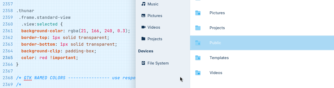
.view:selected {
background-color: rgba(21, 166, 240, 0.3);
border-top: 1px solid transparent;
border-bottom: 1px solid transparent;
background-clip: padding-box;
color: rgb(18, 51,84);
}
Dark Variant
/*Thunar sidebar customization*/
.thunar
  .sidebar.frame.shortcuts-pane
   .view {
	border-radius: 15px;
	padding-top: 10px;
	padding-bottom: 10px;
	padding-left: 2px;
	padding-right: 2px;
	background-clip: padding-box;
}

.thunar
 .sidebar.frame.shortcuts-pane
  .view:hover {
	background-color: rgba(255, 255, 255, 0.1);
	border-left: 3px solid transparent;
	border-right: 3px solid transparent;
	border-top: 1px solid transparent;
	border-bottom: 1px solid transparent;
	background-clip: padding-box;
}

.thunar
 .sidebar.frame.shortcuts-pane
  .view:selected {
	color: rgba (0, 0, 0, 0.8);
	background-image: linear-gradient(to right, #bde6fb, #bde6fb);
	border-left: 3px solid transparent;
	border-right: 3px solid transparent;
	border-top: 1px solid transparent;
	border-bottom: 1px solid transparent;
	background-clip: padding-box;
}

/*Thunar List view customization*/
.thunar
 .frame.standard-view
  .view {
	background-color: #161e1f;
	padding: 15px;
	font-size: 15px;
}

.thunar
 .frame.standard-view
  .view:hover {
	background-color: rgba(0, 0, 0, 0.1);
	border-top: 1px solid transparent;
	border-bottom: 1px solid transparent;
	background-clip: padding-box;
}

.thunar
 .frame.standard-view
  .view:selected {
	background-color: #50636d;
	border-top: 1px solid transparent;
	border-bottom: 1px solid transparent;
	background-clip: padding-box;
	color: rgba (255, 255, 255, 0.9);
}