Zorin OS markets itself as being familiar, which for me means "similar to Windows". It does a great job of this, but there is one small bit of UX that seems to have been overlooked which I sorely miss.
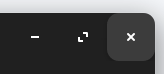
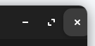
The title bar buttons in Zorin OS are too small in comparison to Windows. This means that when a window is maximised, moving the cursor to the top right corner does not hover over the Close button like it does in Windows. This is quite annoying as whenever I close a window I feel like I constantly have to make an extra movement before I can do what I want.
In short, I think this... Move cursor to top right -> Click
...is much better than this. Move cursor to top right -> Move cursor a little bit down and left (???) -> Click
What have I tried?
I've attempted to modify the built-in theme, but my Gnome tweaking skills are somewhat lacking:
While I haven't quite got it looking how I'd like, this does enable me to click in the top right corner while applications like Nautilus (Gnome Files) are maximised to close them. However, not all applications appear to work with what I've done.
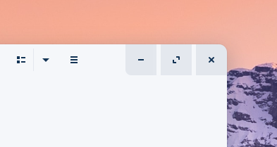
Take VSCode as an example:
Despite the larger amount of padding around the buttons (which I think I prefer), this still works in receiving a mouse click while the cursor is in the corner of the screen, but it's clipping off the edge. This is definitely due to my shoddy Gnome CSS work, but my point is that I've at least tried to make this work.
What do I want?
In conclusion, I would like one of two things:
An official change to the Zorin OS title bar buttons to either make them bigger or to at least receive clicks from the top corners of the screen. This would be ideal as everyone using Zorin OS would benefit from the improved UX.
Pointers or help with creating/modifying the Zorin OS theme to make these changes work. This would essentially be a community tweak rather than an official change.
The Button Thing, yes ... As I made my fist Steps with Linux I found it a little bit strange too. But now not more. But this is an individual Thing.
You could use simply another Theme what delivers You bigger Buttons. Spontaneously I know that the Qogir Theme can give You that. But on the Website is only a default Version. For the Buttons You need the tweakable Version from the developers Github Page that is linked there.
As I made my fist Steps with Linux I found it a little bit strange too. But now not more. But this is an individual Thing.
This feels like you're just saying "Get used to it". Am I reading that right?
You could use simply another Theme what delivers You bigger Buttons.
While using another theme would technically solve the problem, I prefer the Zorin OS default theme (apart from the title bar buttons). Making this change to the base theme would give every user the improved UX, rather than just myself.
In fact, the button's visual style wouldn't even need to change as long as the "hitbox" (for lack of a better term) extends to the corner of the window.
I really don't think it's a big ask.
I read this a little differently: That people can be surprised at how adaptable they can be and that we can get used to changes, not necessarily that we should or will.
Your request is a valid one and a familiar one. On Zorin OS Lite, I adpated and uploaded a copy of the Zorin Theme a Zorin OS user was using that brings the titlebuttons right to the corner of the screen so that the user could have the theme without disrupting his workflow searching with his mouse for the few pixels over he needed to move to close a window.
On Gnome, this is indeed harder to theme. Gnome uses CSD's which build the titlebar based on the widget UI, not on one standardized size. The buttons contained within the titlebar can vary the size of the titlebar depending on the app that is loaded.
It looks like you adjusted the margin parameter in your .css in the screenshots you showed.
No. I only say that I understand that it feels in Usage a bit strange when You come to Linux as a log-year Windows User because it was the same with me. But after a While it was no longer a Problem for me. But that doesn't mean that everybody MUST feel the same. When the Usage of this feels uncomfortable it is so. And when You bring the Suggestion for a Change of this You can do it. Why not?
I suggested the Theme because I thought it could be a relatively simple and fast Way to get You Buttons like You want it now.
I would like to use 125% scaling as I find 100% too small at 1440p, but it breaks things I need. Currently I'm using 100% with Large Text accessibility option turned on and my browser set to 125% zoom by default, which is good enough for now.
I'm not quite sure how that would help with the corner buttons though. I would assume the gap between the button and the edge of the screen would get bigger if you increased the scale, right?
people can be surprised at how adaptable they can be
Ah I see, I definitely read that incorrectly the first time.
On Gnome, this is indeed harder to theme. Gnome uses CSD's which build the titlebar based on the widget UI, not on one standardized size. The buttons contained within the titlebar can vary the size of the titlebar depending on the app that is loaded.
It looks like you adjusted the margin parameter in your .css in the screenshots you showed.
Yes, I remember briefly coming across CSDs when looking up what the class names I needed were. Many people think they're a pain to work with. I can see that.
Also, you're right with how I've changed the theme. I thought being comfortable with CSS would make it easier, but Gnome CSS is a bit harder than it looks!
With .css, you can set the classes as needed in the html. Or Java.
But with gtk.css, you must rely only on the available classes supplied by the widget and you must be able to identify them. I use GTK_Inspector for this task, but in your case, the classes are clearly defined in the supplied theme .css.
However, the issue of the size being defined by the widget and contents still arises since it is relative.
This is why I was happy to do so for XFCE (Zorin OS Lite), but not so happy to try with Gnome.
It can be done a bit tediously in Gnome, though. Instead of setting the margins (Which will remain relative), it is better to use a background image for the button as an absolute, then have it fill the entirety of the button space without a gap at the far left edge. This can be done and I have done this on several of my themes.
Interestingly, the reason Windows can do it with more ease is because Microsoft has enough sense to use what works and allows the work - it uses...
gtk2 resource files.
Don't get me wrong, I do actually think that gtk3 with .css was an improvement in some ways. But CSD's were a step backward and their implementation had more to do with the developers maintaining control over the appearance than the users.
I have the same problem. When I move my cursor to the top right corner and want to click "X" (to close the window) nothing happens.
On Windows, if you click that pixel in the top right corner, the window will close. There is no gap between the buttons and the screen.
Is there a solution for this problem on Zorin OS? (using the default theme).
When you maximize a window, you will be able to click in the top-right corner and close the window. Tested with Firefox, Brave, Nautilus, Shotwell, Sublime, Gnome Files, Pinta, Filezilla.
There are probably some apps that will not work, but I can't test on all existing apps. This setup is universal for most GTK apps. You can adjust CSS for your needs.
When you change gtk.css file, log out and log back in to see the changes.
The most important part here is this code (source):
It makes buttons "touch" the top right corner of windows thus giving you the ability to click them. Everything else is just styling to look ok-ish in most cases.
Edit: if you want to decrease/increase the gap between the buttons, read this explanation.
No, that is the radius of those 3 buttons. By default, buttons are round (circle) and that doesn't look good with big buttons. So, I made it look like Windows 11 buttons.
Note that I still haven't figured out how to change the gap between buttons. I will try again when I have some free time.
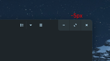
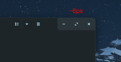
you can set margin-left: -6px; if you do not want any spacing between buttons, or margin-left: -5px; if you want that 1px spacing like on Windows 11.
Of course, you can set a positive number for a larger gap. But in a nutshell: there is a default gap of 6px so by using negative values you are decreasing that default gap, and by using positive values you are increasing the gap.
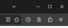
Hello, this also used to irritate me and I think I finally made it into something I am satisfied with. This is how it looks in firefox
I am aware that it's far from perfect as the gaps still appear to be a little big and that the icons are a little bit off and not symetrical. The latter stems from the fact that I had to get these icons from different sources on the internet as I could not edit .svg icons myself. Someone who is better able than me can get it to look a lot better.