Which of these two are better? A or B?
A:
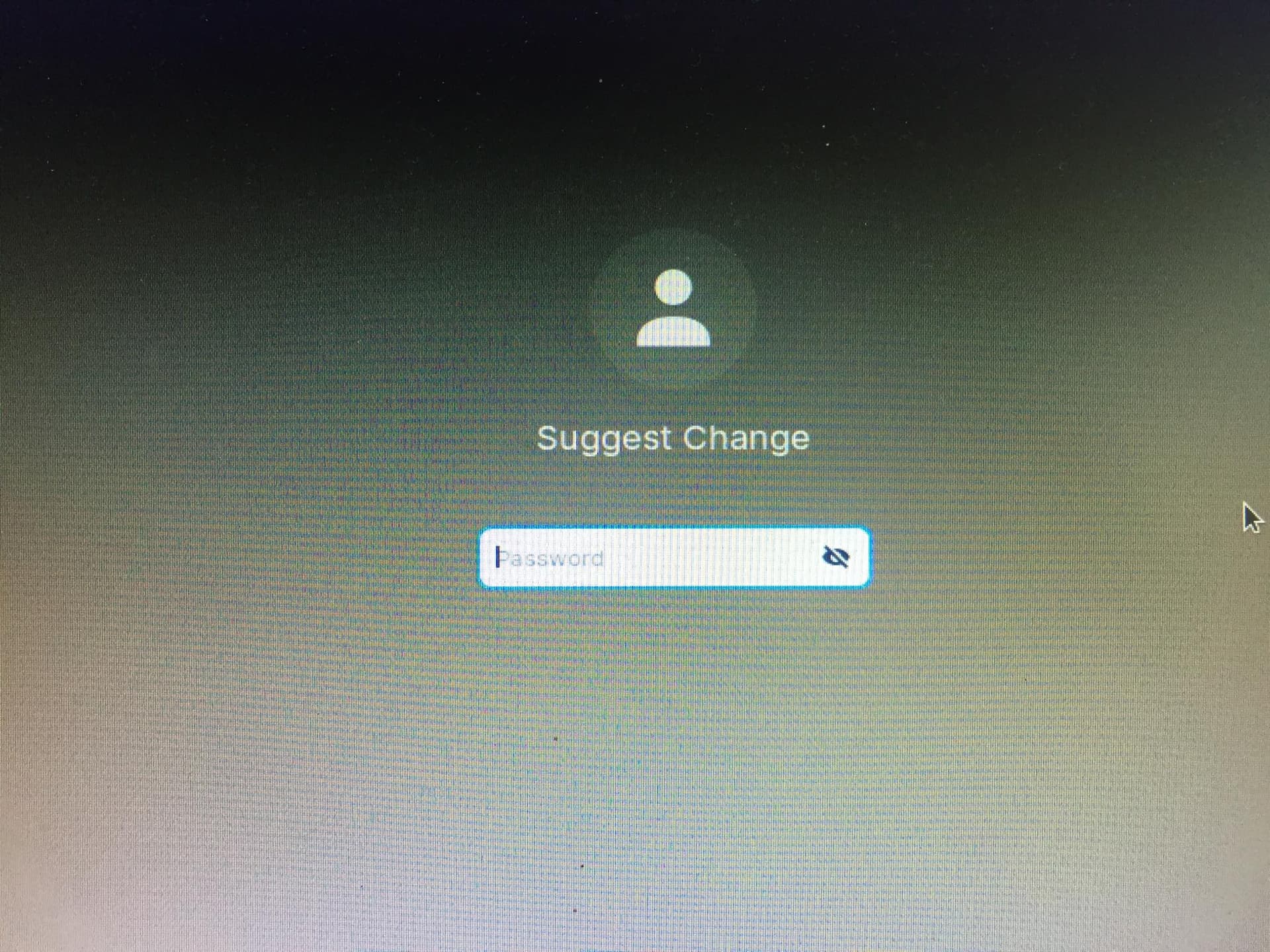
B:

Me: letter B is much better looking. It is look more premium.
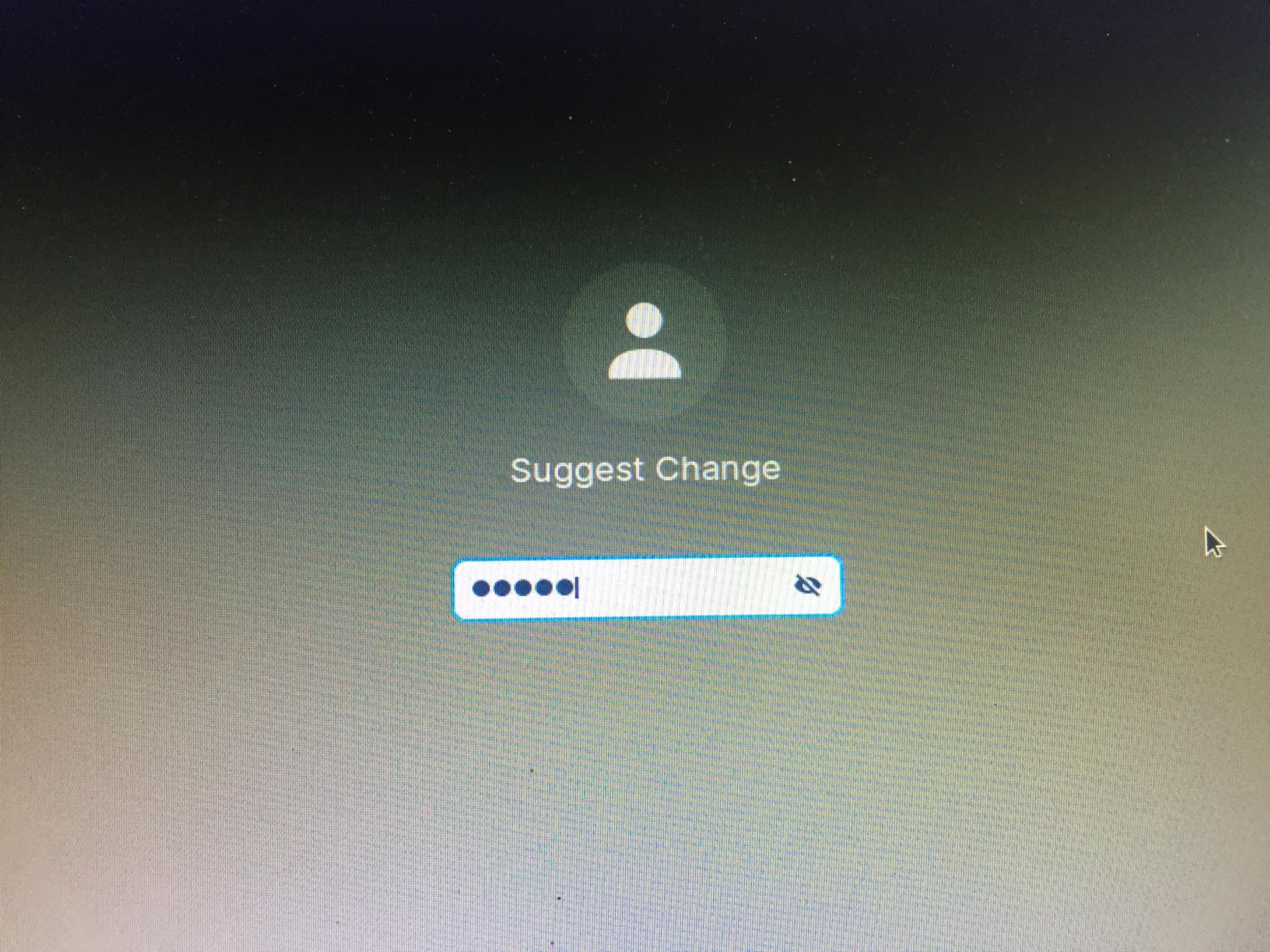
Which of these two are better? A or B?
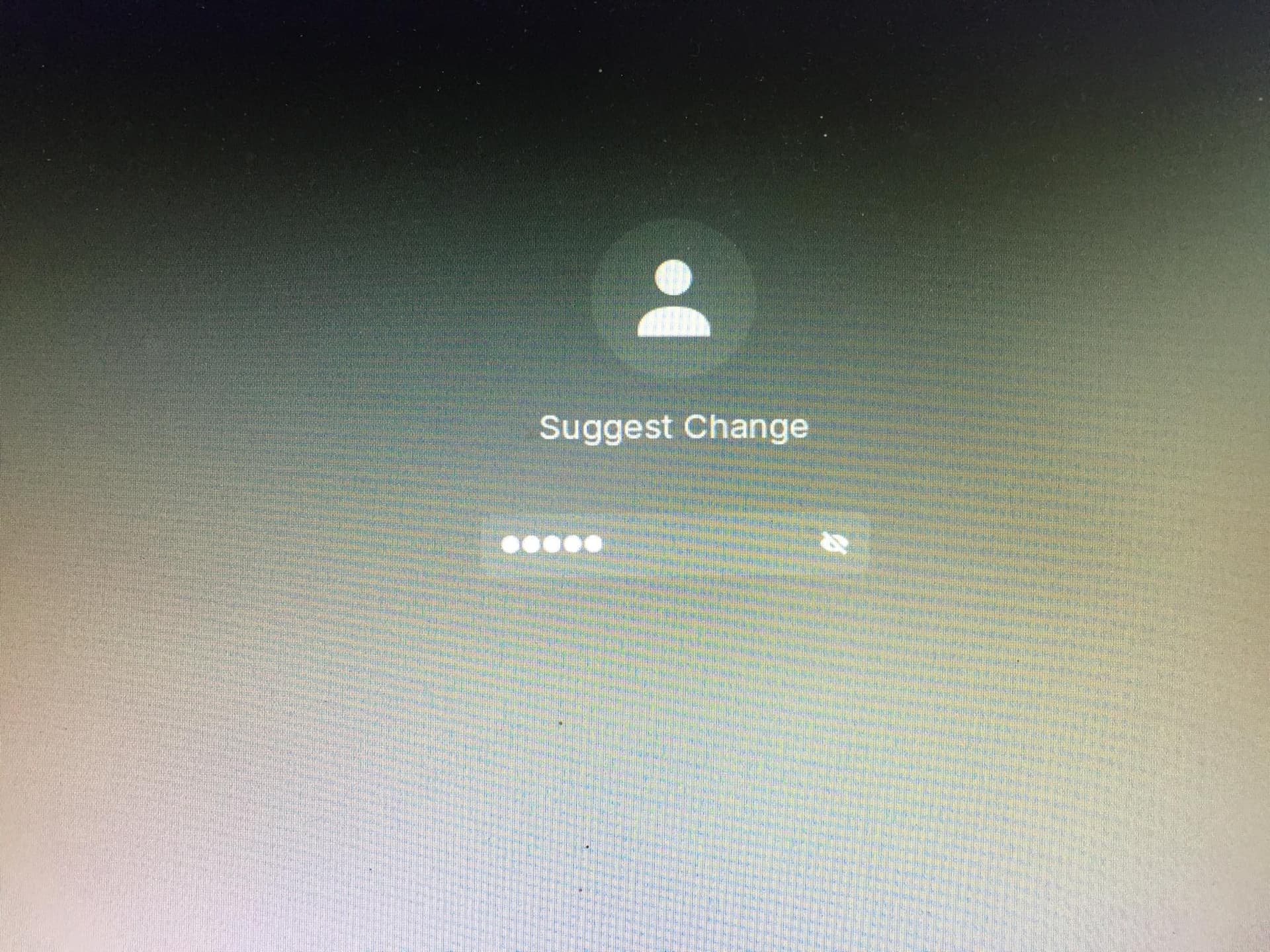
A:
B:
Me: letter B is much better looking. It is look more premium.
It took me some time to realize what the difference was. I feel like option B is better. It gives a clean look to the log in window. But how did you do it? It looks cool. Also, just realized that you have two posts which have the same question.
I prefer A. It is clear and well contrasted. B looks translucent and harder to see.
And for the record, graphical designs cannot look:
The above words apply to something in a defined state.
What people think of how a theme looks is subjective and not a defined state but instead, varies person to person dependent on styles and tastes - preferences.
Well, my defined state, is something that I can read. If I cannot see it, I cannot read it, and I might as well be looking at my screen through a kaleidoscope. I vote for A as well, may my eyes be spared the strain brought on by B.
I prefer A.
B looks like viewed through thick fog. i.e. lacks clarity and contrast.
Totally A, the white background rly helps to see what ur typing
Just want to say... This is the great thing about customization:
For those that prefer A - they can do that.
For those that prefer B - they can do that.
Much better than being stuck with what you have and feeling resigned to have to accept it as it is.
I like B better it looks much more pleasing and the password is not something that you want to be visible
how can i make it look like b
I choose 'C'. C - Whichever the User prefers... OK, since there is no C, I Pick 'A'.
Currently the background seems to be pure black color based on what I'm seeing. If the password textbox is a slightly translucent black textbox (similar to ZorinOS 16 Core's dark theme taskbar), I would go for B, as it, in my opinion, will fit in better with most wallpapers - if you ever decide to change it
I didn't know I posted it twice hehehe. How did I do it? well it's not permanent I just seen it in the log in window. try this, click here before you log in.
Same as you I wish Zorin notice this and include it to the next update
First welcome to the Zorin forum!! Whichever floats your boat as I have no opinion on them, as they don't vary for me... None are eye pleasing 
For me, A is the way.
What I like about this question, both options have been picked. And that's good because we all have our own, unique taste and opinions. Just like everyone else. And the fact we can alter, style to satisfy what we prefer. Cheers to Zorin/Linux... Freedom to change.
i think B looks more pro
