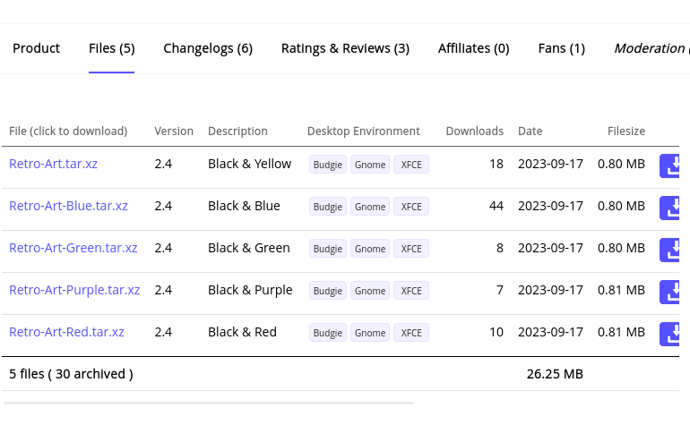
I've noticed by making icon themes most people choose the color blue on that area - people are very predictable. Where's the imagination and creativity to choose another color for once?
2 Likes
Because Blue=awesome.
4 Likes
Links are blue by default in most browsers, so maybe they were trying to not deviate too much from this convention?
2 Likes
I always choose the icon color and shape how the wallpaper looks like.
1 Like
Oh, I thought you meant the links on the screenshot ![]()
2 Likes
I agree with this information.
1 Like
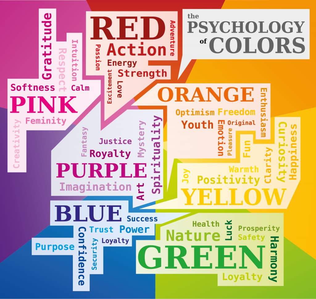
In Human Culture and psychology, we often associate colors with certain things. I imagine that Alien Beings would find our obsession with color coding to be confusing.
Red is seen as a warning color, showing aggression, heat or danger.
Green is seen as a serene color. It makes us think of meadows and summer and nature.
Blue is perceived as a Safe Color. Calming, quiet and cool - it is the opposite of the color Red.
When it comes to computers, safety and security are top at peoples list. So, I think it makes a lot of sense that people would gravitate toward choosing a "blue" option instead of a "red" option, regardless of the true nature of the options.
3 Likes
This is also true in nature, we can see it in some animal's mating rituals like birds, or colorful patterns to signal danger like frogs or snakes.
But now that I recall, I was told to wear blue shirts when doing presentations or interviews and such. It's supposed to be neutral but elegant or something like that, I forget.
3 Likes
Was just going to comment similar, Blue is seen as trusting.
That is why MS went with Blue for Business Editions and Green for Home - Business = Trust , Home = Calm
3 Likes
And yet, it always made be see red.
You don't want your appearance to make other people green with envy.
3 Likes
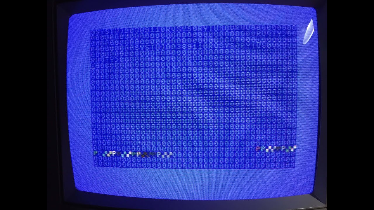
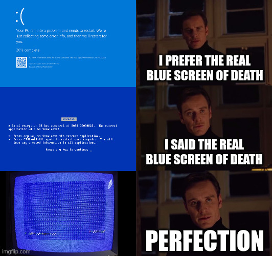
Blue as in Blue Screen Of Death? ![]()
3 Likes
i believe those were chosen for readability on color, monochrome, amber, and i forgot what the green phosphorous monitors were called, but white on blue is readable across all monitor and display types at the time cga/ega/vga/tandy ect basically any dos (8086) machine could display it ~ now non production versions use red screens of death lol - to induce extra panic ![]()
3 Likes
Yellow is a warm color and a good match for painting your kitchens ..... I used to have a whole bunch of info on what paints to paint your house inside and out but I lost them along the way ....
It was very interesting as a lot of colors and shades of colors had to to with your personality and how you view the world in general .....
I know, I'm not the greatest doing things with graphics forgive the pixels ![]()
4 Likes
2 Likes
I guess it's better for eyes, Personally I choose dark themes and icons. I can't bear light themes.
4 Likes
I always thought people who said things like this were exaggerating, until I tried dark theme myself. What a relieve!
5 Likes
Yes, there's definitely a time and place for everything, I was just surprised at how big of a difference it really makes. And even though today I mostly use dark theme, there are some places where it doesn't look good.
Dark theme is easier to get wrong and become an eye sore. For example, there are websites that have huge contrasts that make the text unreadable. Reading books on the phone or tablet is also much better on light theme, and even ZorinOS's dark theme could be better, in my opinion of course.
2 Likes