Zorin OS 16 with Plank
5 Likes
Those icons are looking really sharp... only if there was a colorful option 
5 Likes
Multi-color or just another color variation?
3 Likes
Yeah I mean multi-colored. I like the style of your Icons but personally, I think they hurt productivity as it gets hard to say which application is which by a quick glance at their logos.
Adobe is a recent example of it. This is how their app-suite icons used to look like:
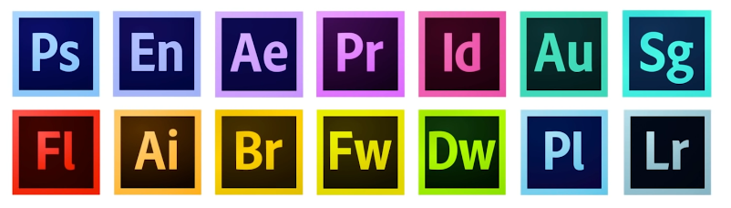
Every application has a distinct color and you can easily tell them apart.
But then they recently changed it to:

This really sucks because now all of them look similar and it hard to tell apart for example when they are in the task bar. That's why I think colorful icon-sets are better than monochromatic ones especially for productivity.
5 Likes
Fair enough. Personally it's the figure not the color that identify an object. Guess it's different from person to person.
4 Likes
As frustrating as it can be to have a machine break down, there is a certain enjoyment in setting up a new or different one...
5 Likes
I love to install and set up a new gadget.It's half the fun. 
3 Likes
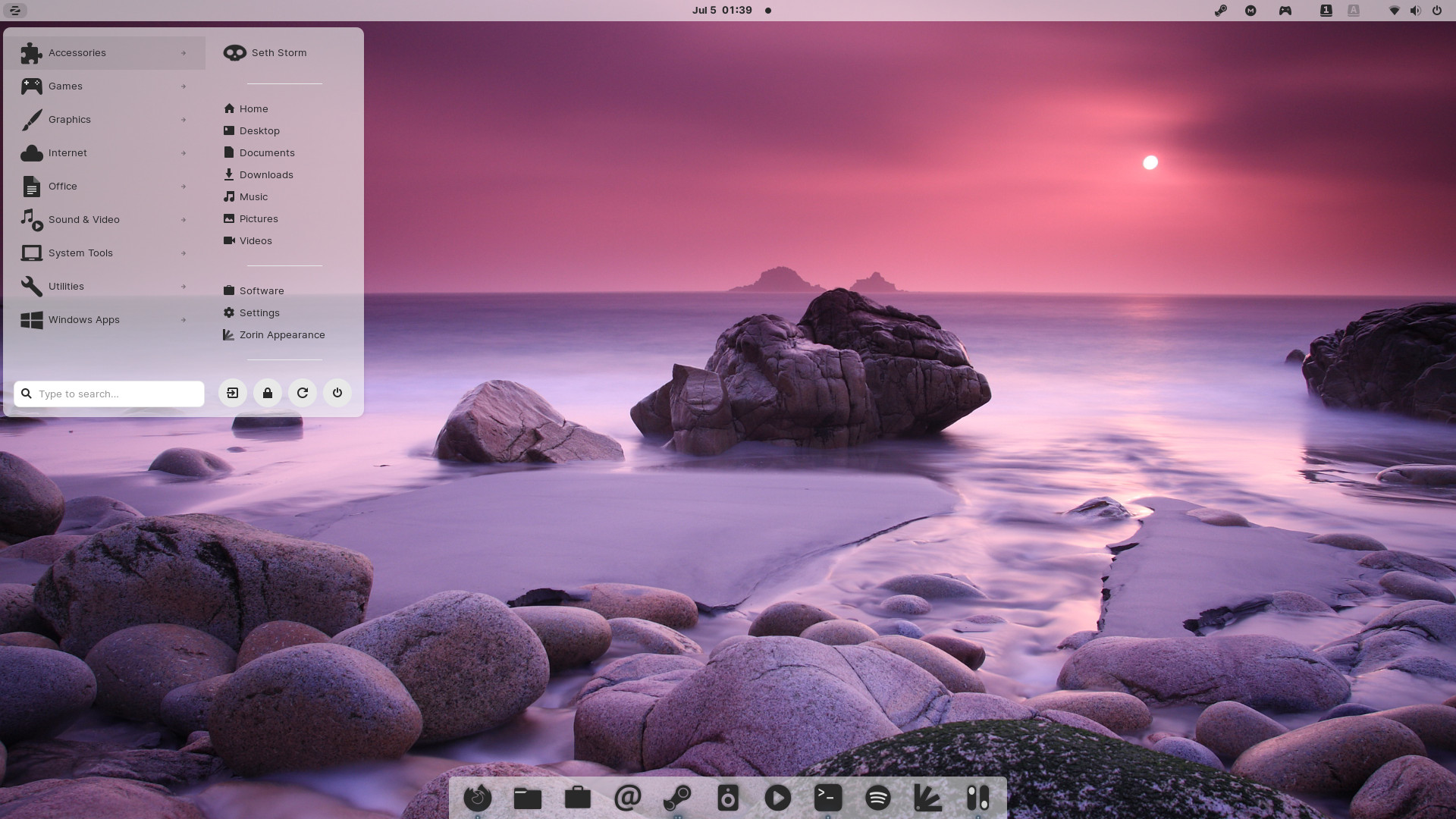
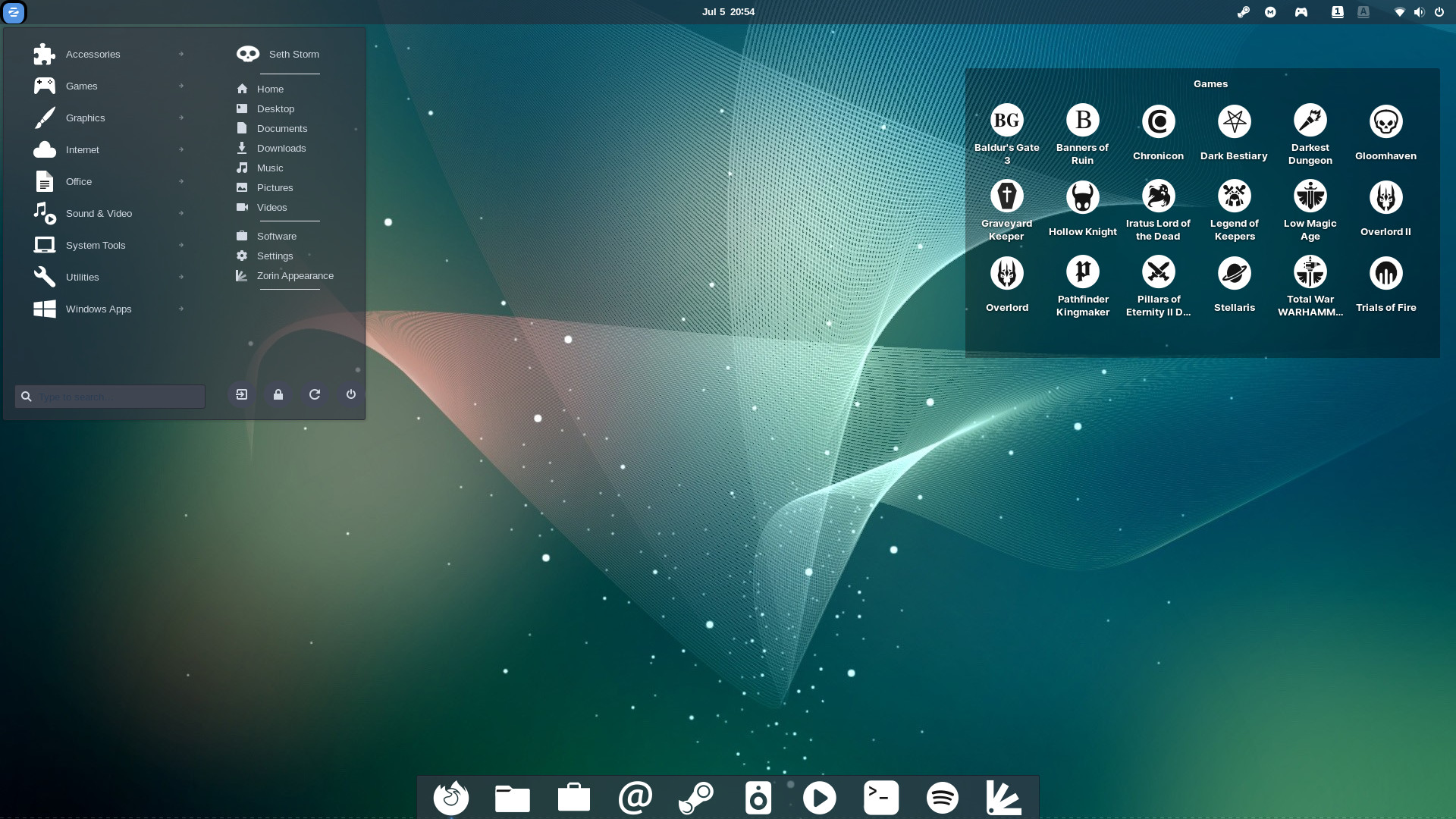
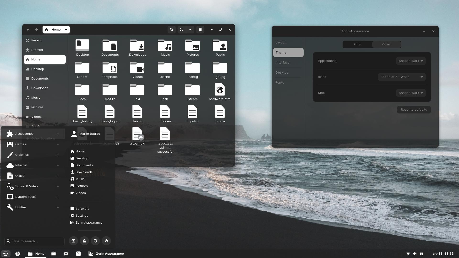
This is mine. Credits to @Storm
7 Likes


Hello @Storm
How did you use Zorin menu on the panel above the screen?
1 Like
Right click on the taskbar ---> Taskbar Settings
Style: Panel Size 28-30
Position: Top
You might want to use Plank to use as a the lower Panel
1 Like
Oh! I get it, You moved the taskbar to the top screen.
I use gnome style and remove some features, add plank ...
How stupid I am 
Thank you, @Storm
1 Like
In this one, the menu is the original Zorin OS, or the Arc menu?
1 Like
The Standard menu.
2 Likes
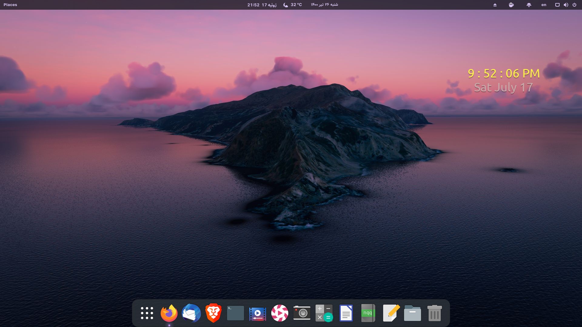
Is it Conky you used to display the clock on the wallpaper?
2 Likes