My logic was...
I have done it so much that a lot of it is muscle memory.
By creating a theme, I can include all elements clearly - but Made as Dark with pink border or something.
Then as I do, I write down what I do in Gimp as a guide that can easily be referenced that can help you learn the ropes.
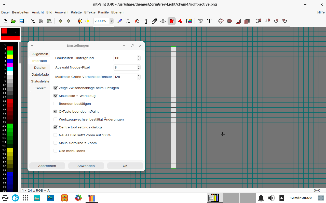
In mtpaint you can set a dark background paper when you go to image > settings > interface and set a custom value for greyscale background
I just looked how the xfwm theme of Zorin is made. It has only a 1 pixel thick border.
But when I changed some image files, e.g. bottom_active and left_active, and made a 3 pixel thick colored red border, it still shows a 1 pixel thick border line - red, but thin. Maybe also something else defines the thickness of the border, not only these images?
Only the images do.
But if you have a 1px border meeting a 3px border, the 3px border sets the priority - so you now have 2px left blank on the 1px border.
You need to ensure you have no blank space.
Also... you do not want a 1px border anyway. The Grab Area on that would be a nightmare to nail down.
Here is another option:
https://launchpad.net/~aravisian/+archive/ubuntu/gtk-theming/+files/zenith-blue-dark_1.1-6_all.deb
Grab the Zenity theme that includes the XFWM4 that is structured to give a Zorin Appearing theme but with good grab area - examine how I integrated the window background into the borders to create that space, while having a visible 1px border - but with ten pixels of grab area.
Thank you, I'll take a look at zenith.
This solution sounds more elegant for creating a wide grab area. I don't like standard frames with a width of 10 px, unless they have great color gradients or 3D effects like in your themes (maybe they would look better if they had a part in the same color as the window).
XHDPI is practical to use, but I don't like the appearance at all, especially the upper part of the window which is huge. I've also considered whether I could use an HDPI or XHDPI theme and modify it also at the top.
Now you're starting to find your sealegs.
You are considering options and exploring how to make them a reality.
Maybe some will work out - maybe not - but the exploration brings knowledge and experience and that is wealth.
I vary: I can enjoy a thin border theme that uses the window background color as filler for the grab area or...
I can enjoy a thick walled theme when it matches the entirety of the screen.
1 Like
Do you know why there is no colored border displayed in the focused text editor in Zorin 17 Lite?
Not sure what you mean...
The other apps as Settings, Terminal, Thunar, Brave...have a brown border now when they are focused. But the texteditor (gedit) has not.
It seems as if gedit has no border around its window. I just installed mousepad and it has a brown border when focused.
Edit: I installed the package gtk3-nocsd (sudo apt install gtk3-nocsd) and now the texteditor uses the system titlebars and has a brown border when focused. This method doesn't work for gtk4 apps, e.g. Zorin appearance still has no colored border and own window decorations which don't fit to the other windows.
Now I edited the zenith theme so that it fits to Zorin light themes (not ready yet). I need to find out how to make the text of the title bar black. Next step is to add a colored frame for active windows. It is easier in dark mode to make an inconspicous frame with a wide grabbing area.
That's Zorin light grey gtk theme with clay icon theme and the edited Zenith blue dark window manager theme:
This time, I used mtpaint for editing and did not receive any warnings when saving the files normally.
Edit: In the themerc file of the xfwm4 folder you can adjust the color size of the window topbar. Use the lines active_text_color and inactive_text_color
A very special XFWM theme, but for those users who search for a colored border in various colors and don´t want to edit image files, this one is an option: City XFCE. It is available in a few colors and has a wide grab area of 8 pixels. Inactive windows have a light grey border.

1 Like
Do you have any tips on how I can get the buttons to look like they do in the Zorin Light themes when prelighted? The .png files don't include the close/maximize/minimize icons at all. Maybe they’re on multiple layers? Unfortunately, I’m not sure if I can cut them out and paste them into the Zenith files. Since they’re a different size, I can’t just replace the files with the Zorin images. Drawing nice, round buttons seems to be quite difficult, since different shades of color are often used for the border of the circle.

Are you referring to the "City XFCE" themes?
Some themes
Here, you refer to Zenith: To be clear, Zenith is a duplicate Zorin Theme (17, I think), that I made to allow for actual Grab Area at the borders. Other than that, it is identical in appearance.
I was referring to the Zorin themes. You have made the Zenith dark theme for use with Zorin dark themes.
I tried to change your dark Zenith theme into a light theme which has the same colors as the Zorin light themes.
You can see some posts above how it looks. It is It's almost finished, just some buttons are difficult for me, e.g. the prelighted ones. They are black and shall be grey and red.
I took a look at many xfwm themes today to get ideas, from vinceliuice and others (Mac Tahoe, White Sur, Qogir, Orchis, Obsidian), and some were even worse at the top corners. I liked Qogir and Obsidian, but the grab area was not so wide as in the Zenith or City XFCE theme. I noticed that many of the xfwm themes had easier button pictures - only one picture for the prelighted buttons and not different layers as the Zorin ones where two pictures define one prelighted button.
The simplest solution would be to use a rectangular area instead of a circle for the prelighted button, as Qogir does in the modified version, but my plan was to recreate the Zorin theme as faithfully as possible, just with a wider grab area.
Yes, you notice that when I made Zenith, I went the simpler route, too.
Adding complexity does not always improve a theme.
The Zorin Themes are probably using symlinks and other images in order to ease transition between creating new ones. Since every release of Zorin (16, 17, 18...) comes with a newer theme, they probably set them up in that way to make it easier on them to quickly make a new theme for the next version. Not for others to modify the current theme.
If you are really struggling with that portion; here is a Quick And Easy cheat (shortcut):
Load the Light Zorin Theme you want to use; then take a Screenshot of the window while hovering over each window button - with the "Show Cursor in Screenshot" option unchecked.
Open the screenshot in gimp, tap the 5 key to zoom all the way in and center on that - It will be the exact right size image you can cut and copy over to make the Window Button Background in your new theme.
It is not perfect - but near enough to get you easily fixed up.
Thank you so much for your help!
I still need to learn how to use image editing software. It sounds so easy when you do it, but I still have to figure out how to select something in the image, cut it out, and paste it somewhere else. It’s pretty difficult - I couldn’t manage it yesterday. The selection tools are so complicated, and the circle is even more so.
It would be nice if I could just change the circle’s color, but when I select a new color, the circle is solid in the middle and dark pixels remain at the edges. If I replace those too, the circle looks totally frayed and ugly.
I used to think you had to set all the color shades at the edge of the circle yourself, but I’ve realized that when you create a circle, different color shades are used automatically. I’m not yet sure how to preserve those when I want to change the color. And then I need to make the circle two-toned (maybe by mixing colors?)
Maybe I’ll soon manage to delete the circle completely and create a new one in the same spot with the same radius.
What determines the area that responds when you click "Close" (X), for example? How can I enlarge the area so that it covers the entire rectangular or square area of the close button but still looks as a round button?
In Gimp:
Keyboard shortcuts help a lot.
Tap r for rectangle or e for circle (Ellipse)
Tap ctl+x to cut or ctl+c to copy, then tap ctl+shift+v to place that copy or cut in a new window or tab.
Putting it in a new window or tab helps keep elements separate until ready to place them.
Especially if you need to modify or edit it more - or make a mistake and need to go back and reference it.
When ready to paste, ctl+v to paste while ensuring you have tapped r or e - then use the arrow keys or your mouse to move it into position. The arrow keys help for Fine Movement - 1px at a time.
Get the Size of the circle.
Create a new image in Gimp that is 1px size in the exact color you want.
Select image > Scale image - then scale that 1 pixel image to 200px square.
Now, tap e and cut a new circle of that image that is perfect and pure and has rose scented breath - tap ctl+shift+v and it will pop into new window or tab - ready to be final fitted for placement on your theme image.
In XFWM4, the entire close background - which is a beautiful thing.
It already covers the entire close button tile - but you can adjust its position using the themerc file to be all the way to the right, if you like.
Did you note the guide I sent earlier in the thread?
1 Like
Does that mean you just have to click exactly on the round buttons in GNOME, but not in XFCE?
In Gnome, that area can be altered, using margins. In XFCE (XFWM4), the entire tile is used automatically.
Both have their pros and cons.
But I prefer XFWM4 in this regard, because you can adjust using the themerc, too.
It makes theming harder in Gnome and CSD's, as well. The close, min and max buttons are individual elements, nested in specificity in the .css. It can be a major pain to get them all aligned.
Ah, because of this other users complain. I never had problems in daily use with window buttons in XFCE.
I'd like to configure gnome/libadwaita to draw all window borders like it does in gedit, for example. The windows there have such good rounded top corners.
Can I do this for testing?
I don't like that there are different window styles. The nocsd app helped for gedit (but it doesn't look good now with two topbars) but not for Zorin appearance.
Where is the code/the images for those windows from gnome-apps? Can it be used by xfwm?
Gnome uses several different classes in apps... including notebook stack, window and others.
This makes consistency between them, as well as borders, exceptionally difficult (Here, you are witnessing first hand, the lack of polish in Gnome).
Some windows do not have a border, at all, because it is only formed as a notebook stack without any window.
Some, do use a window but set the headerbar as its own window, causing a border around both the window and the headerbar (titlebar).
The solution is as you said: NOCSD. This works, but yes, you can end up with a secondary inner titlebar, wrapped in the XFWM4 border. This can be suppressed or it can be hidden using the .css.
These are in the gtk3/4 folders and in the gtk.css files contained within them.
Some themes do not contain any images for the close, min and max, simply calling on the symbolic icons from the icon theme.
Some do contain images.
1 Like