I'd choose light. The dark one is nicer but very dark on the dark background and in light it would better fit to the other icons.
Why not light and dark? Depending on the used Theme and personal Preference the one or the other Icon Set could be used.
1 Like
I could do both, no problem. But which one to make first :P?
The darker looks so nice, but the light are easier for the eyes to spot.
Could you do a light and dark theme? ![]()
I scrapped the idea and went for dark foundation with a logo on it. WHat you think of a worn out logo?
2 Likes
WOW! cool wallpaper as always @Storm ![]()
2 Likes
Dddddddaaaaaaarrrrrrkkkkkkkkk
3 Likes
When You ask this Way, I would agree to that:
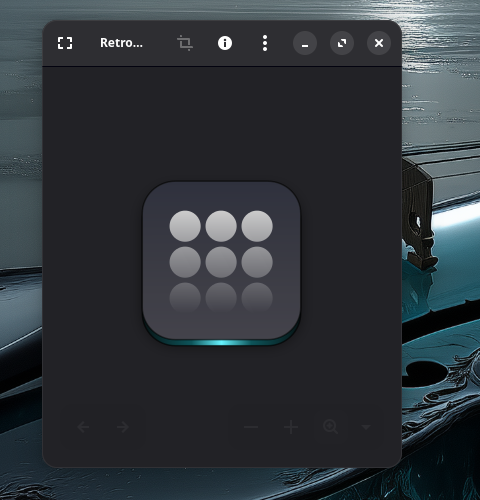
Hmm ... it is a nice Idea I think. But this is a big Picture of the Icon. So, You can see good at the bottom this fade out Effect. Now my Question would be: Would it still work when it is smaller in the Taskbar or Start Menu?
1 Like
@Storm I love all your hard work. In the words of Spock, "Live long and prosper".
1 Like
Hmm ... I find it better that the Effect is on the Top. Maybe the Effect a little less ... but this depends a bit on the Icon Symbol itself in my Opinion. On the 9 Circles Icon, I find it okay. But on the Symbols on the Folders in Nautilus, I would find it a bit too much.
These 2 are for me right at the Border of okay:
I wouldn't make it any bit more.
And on this, I find it too much because the upper Part with the Handle almost disappears and make it almost like a fade out Square.
At the End, I think it is Trying and Correcting how much is enough and when it is Time to stop.
1 Like
I can't figure out what I want. I think I need to sleep on it which way to go.
3 Likes
Then I wish You a good sleep. I hope, You get enlightened.

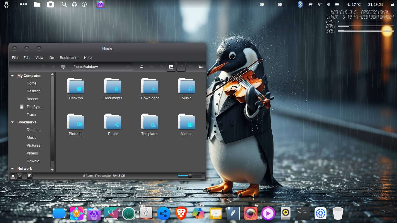
I am trying out this new to me linux distro, so far it seems pretty cool. Everything you see is built in except Brave browser i added it. I've given up on my hostname issue as it seems to be determined by my bios so wtv it doesn't interfere with performance so i leave it alone.
Modicia Linux
BlackMate theme
Queen Margherita icons
Violin playing Penguin wallpaper


6 Likes
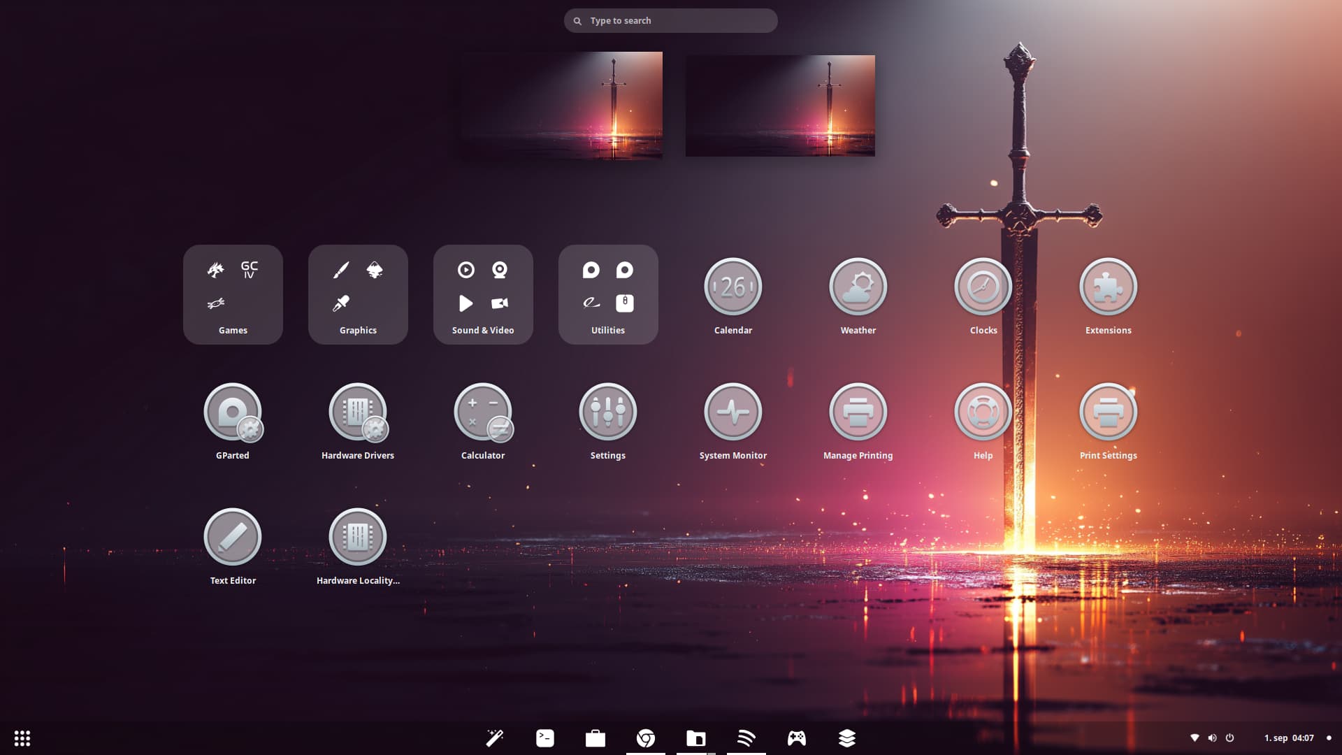
Elegant
1 Like
A little transparent background on the icons, then only using white colors ![]()
See, there you go, thats what I'm talking about! While its true that my favorite colors are, blue, pink, & purple, the transparency sells it for me. I like the idea of seeing behind my icons, for all icons.
Most themes don't include transparency for icons, to make the contrast stand out I assume. But I believe the mark of a modern icon theme, should show your background behind it. Good work @Storm
3 Likes
The Transparency in this matte satin Style I like. Maybe it would be an Option to make the Symbols in the Middle a bit darker. Depending on the Background this could serve a better Contrast and Detection.
I see only one little Problem with the Transparency. You have that on the GParted, Hardware Drivers and Calculator Icons:
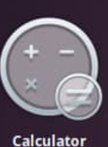
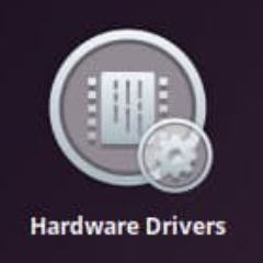
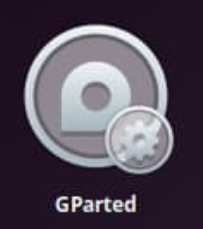
The little additional Icons in the bottom right Corners. These are not so well visible in my Opinion because You have the Frame from the big Icon behind them what runs thorugh the Background.
Did You checked how it would look if the little Symbols wouldn't be transparent? Or maybe simply remove them?
Please don't understand me wrong. I don't want make Your Icon Set bad. It is only what I see.