The dark one looks cool... but I think having enough contrast with the background is key to quickly see the icon at a glance, so I'd vote for the light version.
I find it this Way with the little Symbols definetely better; ist more visible and seperated. In common the Icons seem to work with the Light in the Background; I don't know if You have adjusted this but I think it works. Maybe the Help Icon is a bit, but I would see it as an individual Thing.
The Symbols on the Folders, I would make any more lighter. I would say, that it is this Way directly at the Border of good Visibility, maybe a µ darker. But it's okay.
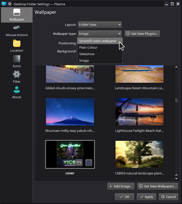
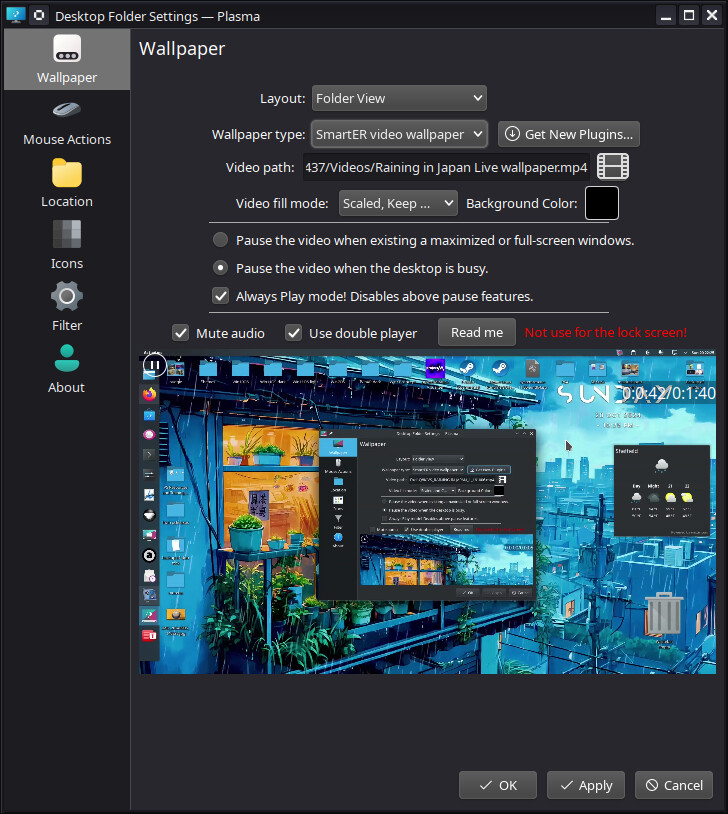
Here You have used (relatively) dark Wallpapers. Did You tested them with light Wallpapers and Themes?
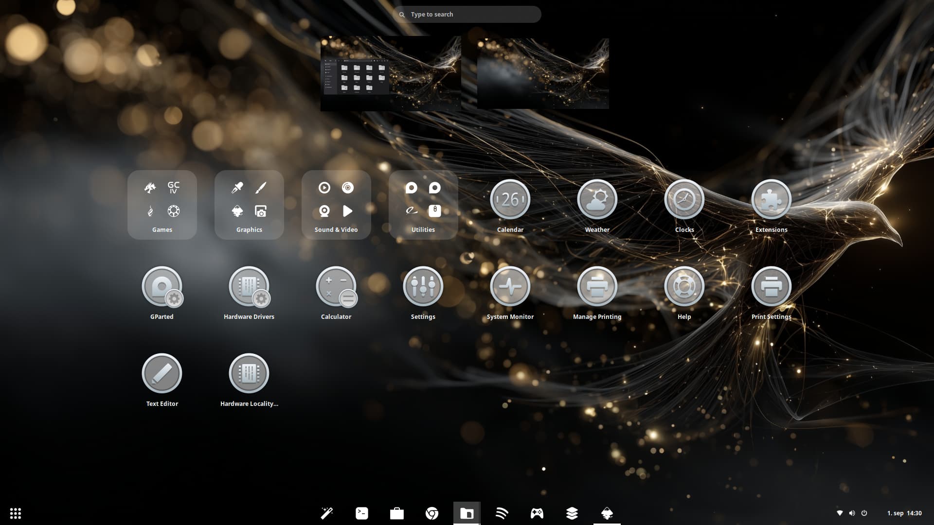
@Storm I would find it even better for the contrast if the images inside the large round icons also had a darker border/outline so that the white stands out more from the surrounding gray. And I'd prefer the icons in the taskbar in light grey or the same color like the large border of the round icons (maybe they look different because of transparency). But that's probably a matter of taste.
Hi, you missed an 'i' - Modicia Linux ![]()
Sadly it uses systemd, so won't be for me.
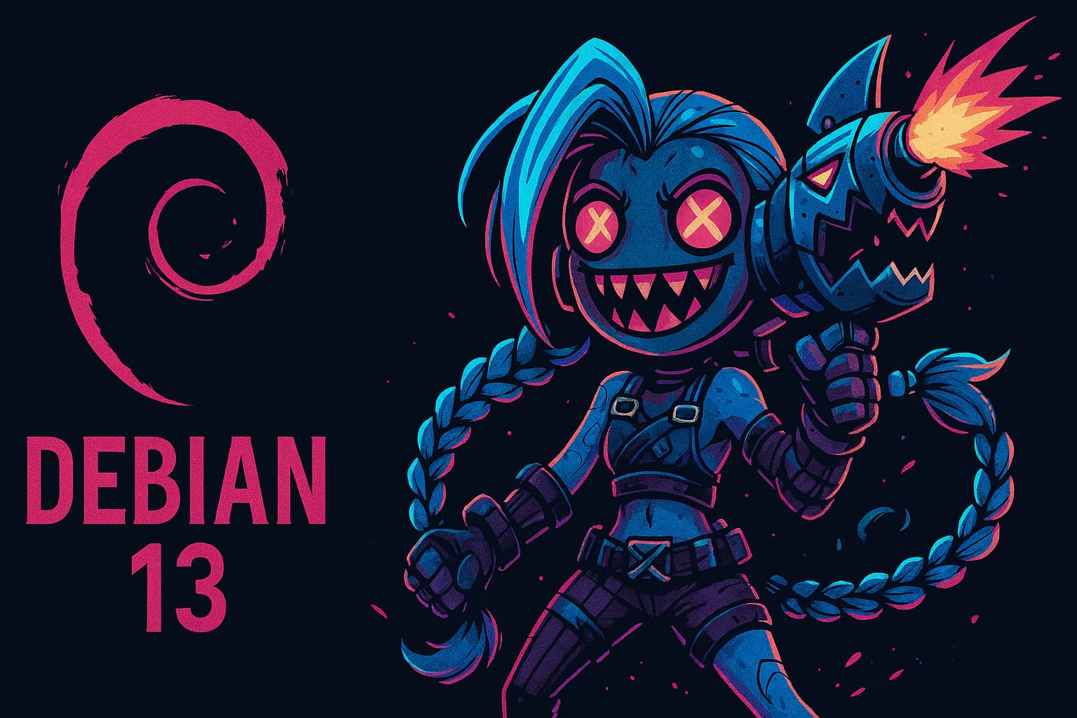
Create a wallpaper of Jinx for Debian 13 using three different AI models.
CharGPT

Perplexity
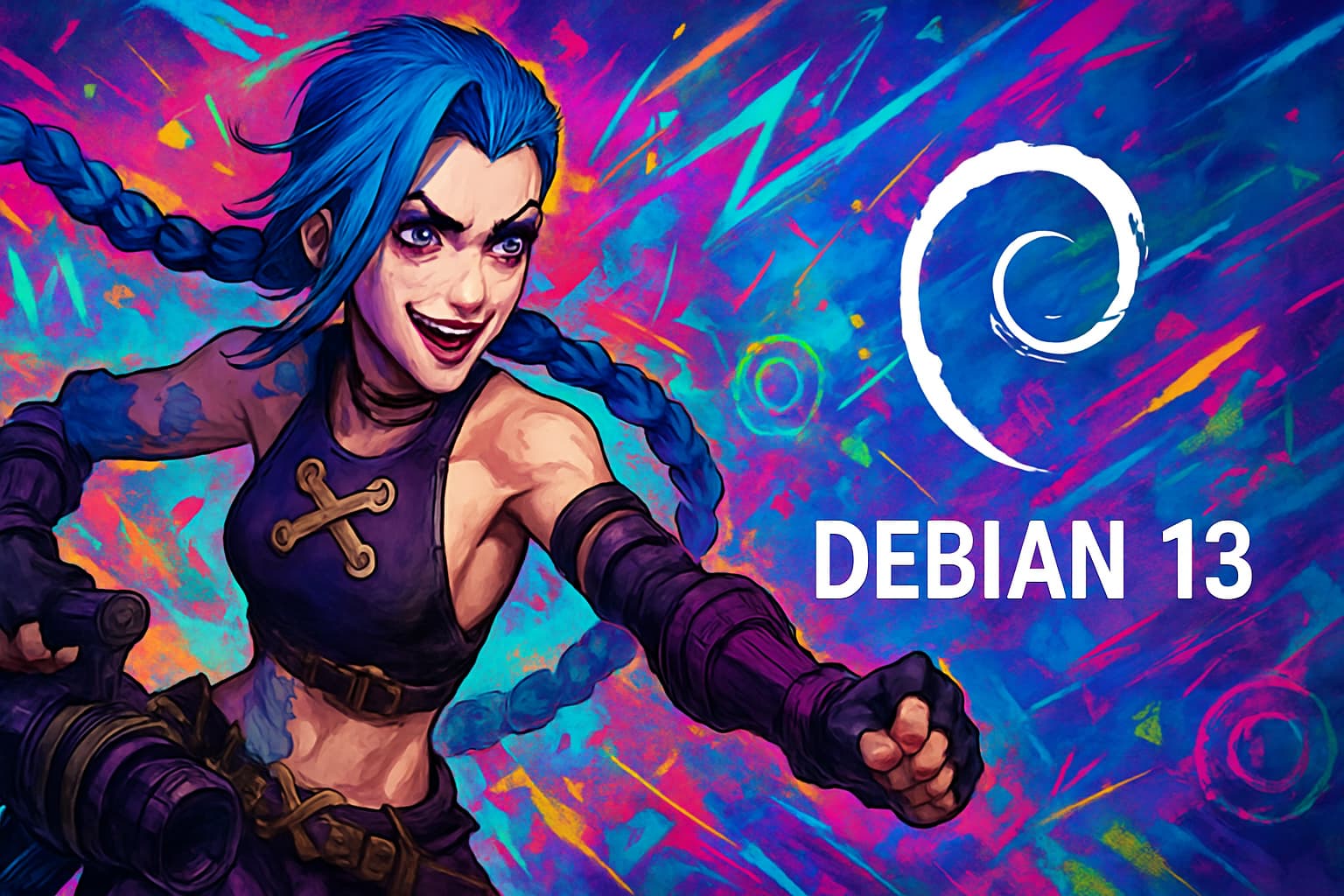
CoPilot
![]()
Fixed thanks
Very good! Beautiful
I start my university tomorrow so i have fixed my laptop up with the solid reliable user friendly ZorinOS 17.3 Pro.
MacTahoe Dark Nord GTK
MacTahoe Blue Icons
Wallpaper from UnSplash
Does Komorebi still lives? Thought it dies years ago.
Have you tried Hidamari? It's active.
Oh, these Icons have a nice Contrast with the Blacktone! I like them. One little Thing (my personal Opinion):
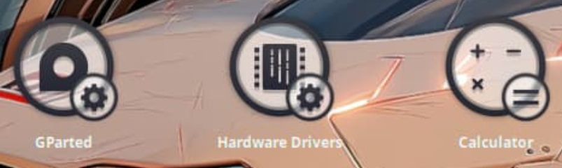
Make the little one's in the bottom right Corner untransparent like before. I mean, you can see the little Symbols way better with the black like the light Version. But for this, I would think it is still better without Transparency or at least with lower Transparency. but like I said: Only my personal Opinion.
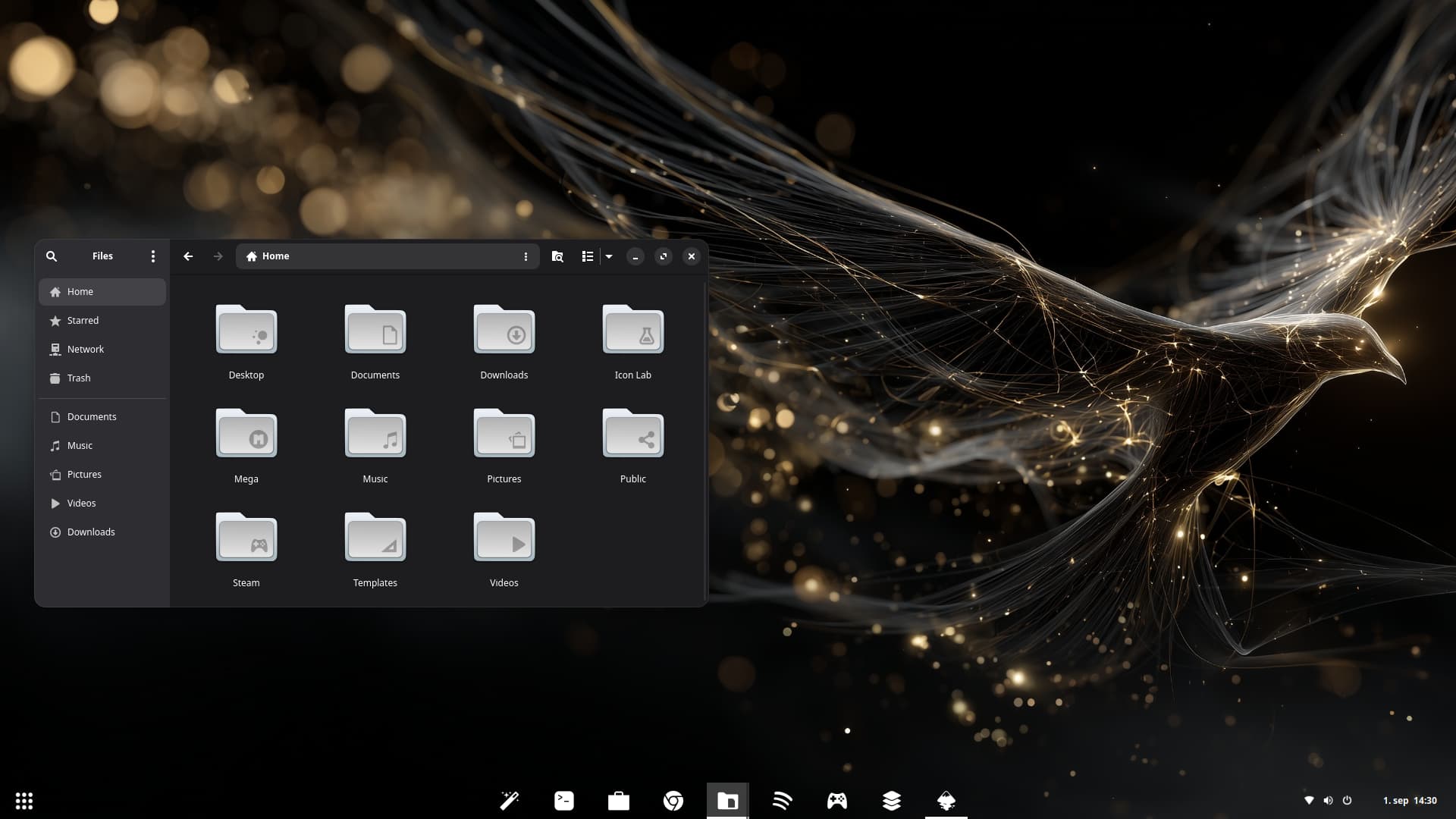
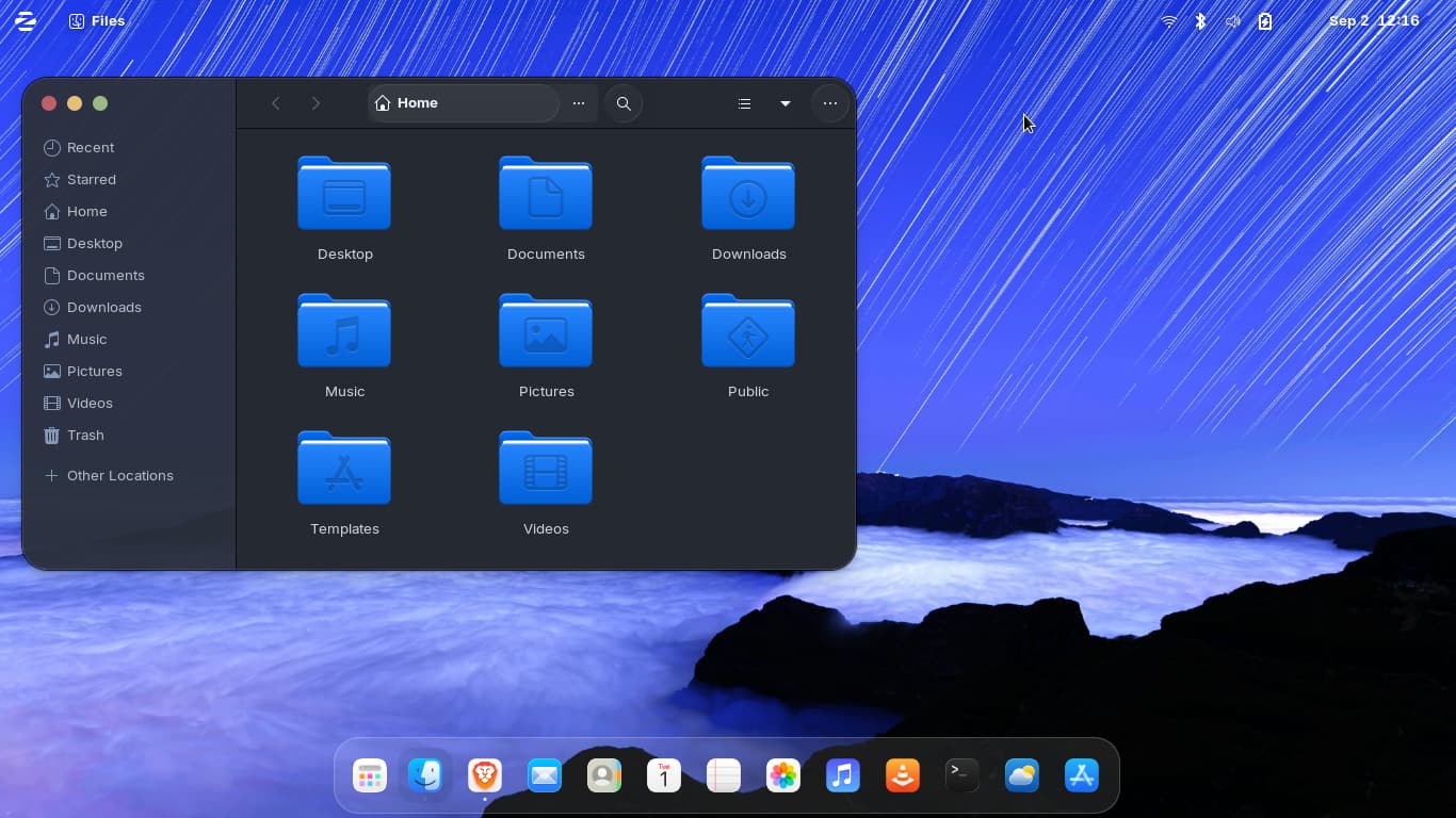
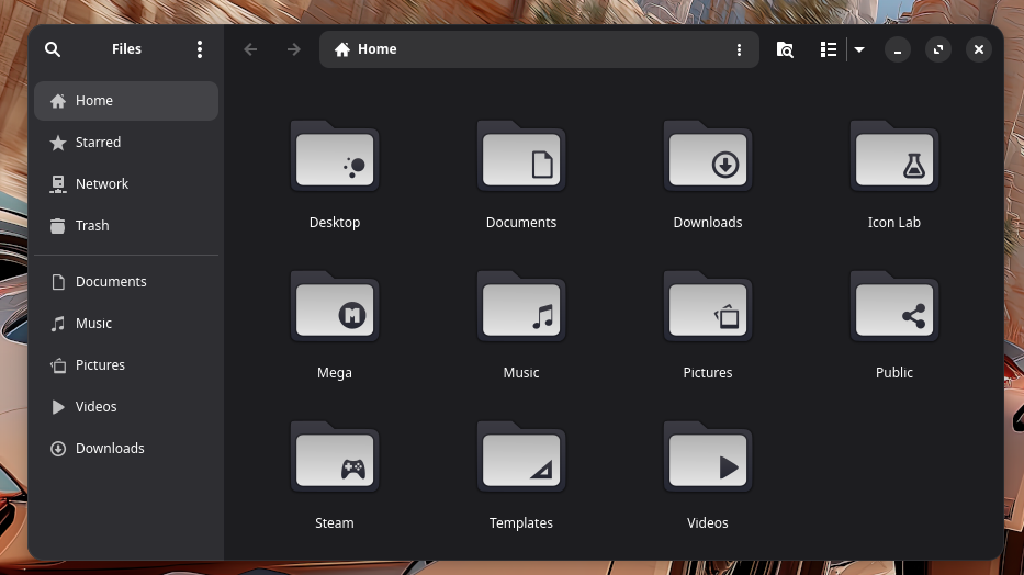
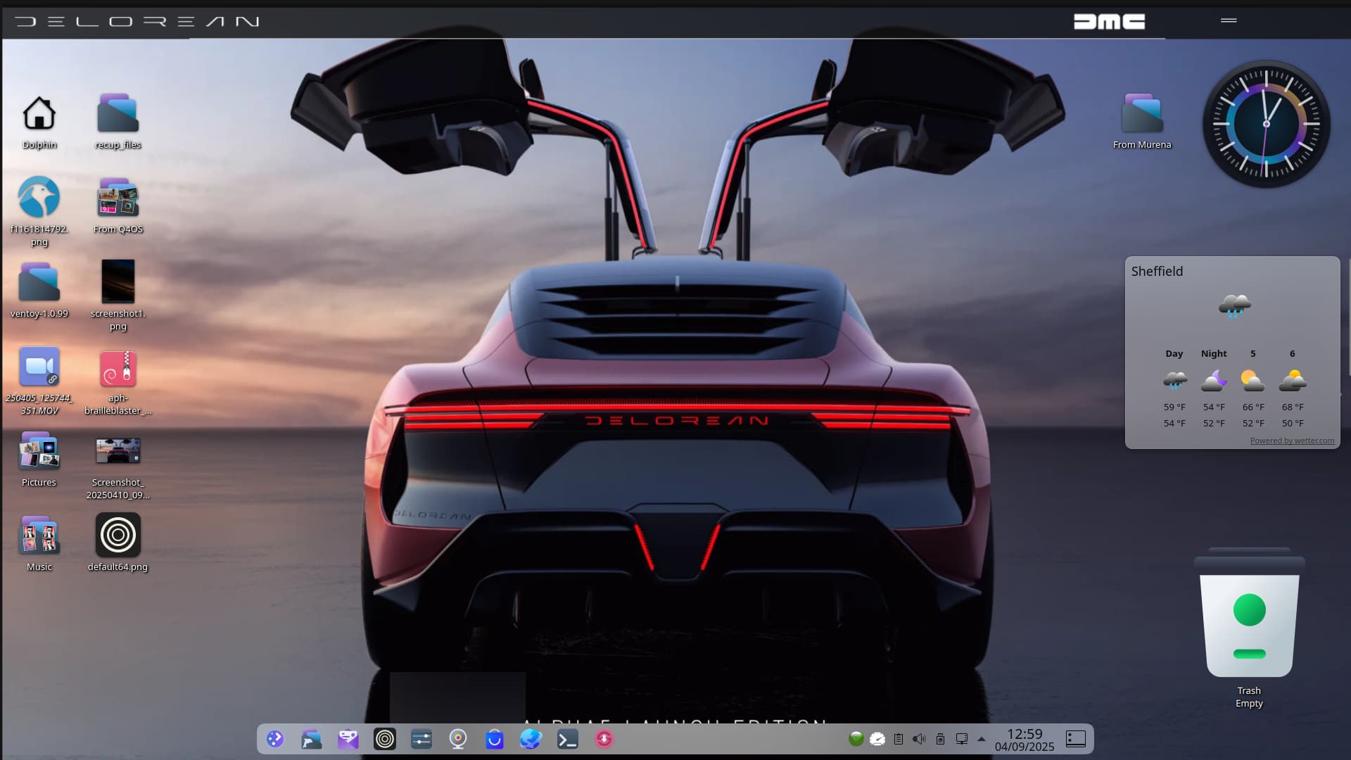
Oh, and have You a better Picture from the Folders? The Nautilus window is a bit small, hahaha!
Yes, that looks nice, too. I like it.
Think I posted this before and spotted I had not scaled the Desktop wallpaper correctly! PCLOS Debian:
Plasma 5.27
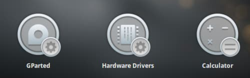
Application style: Oxygen
Plasma style: PurPurDay-Plasma (even though it says not installed!)
Colours: blue
Window Decorations: PurPurNight-Aurorae-5
Icons: Slot-Dark-Icons

Cursors: Breeze
Splash Screen: Animation-through-outerspace-13 -
But I think I will change it to this:
Animation-Live-Cat-screensaver
Still working on my 3D icon theme. Made them uniformed this time. I like when things are uniformed ![]()
OS: Solus
DE: KDE

Do You plan different Light Colors?