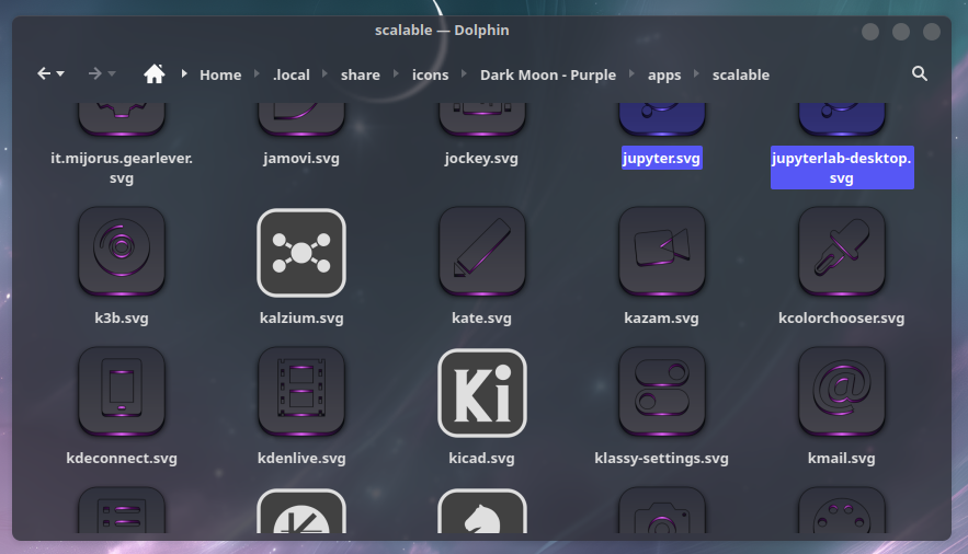
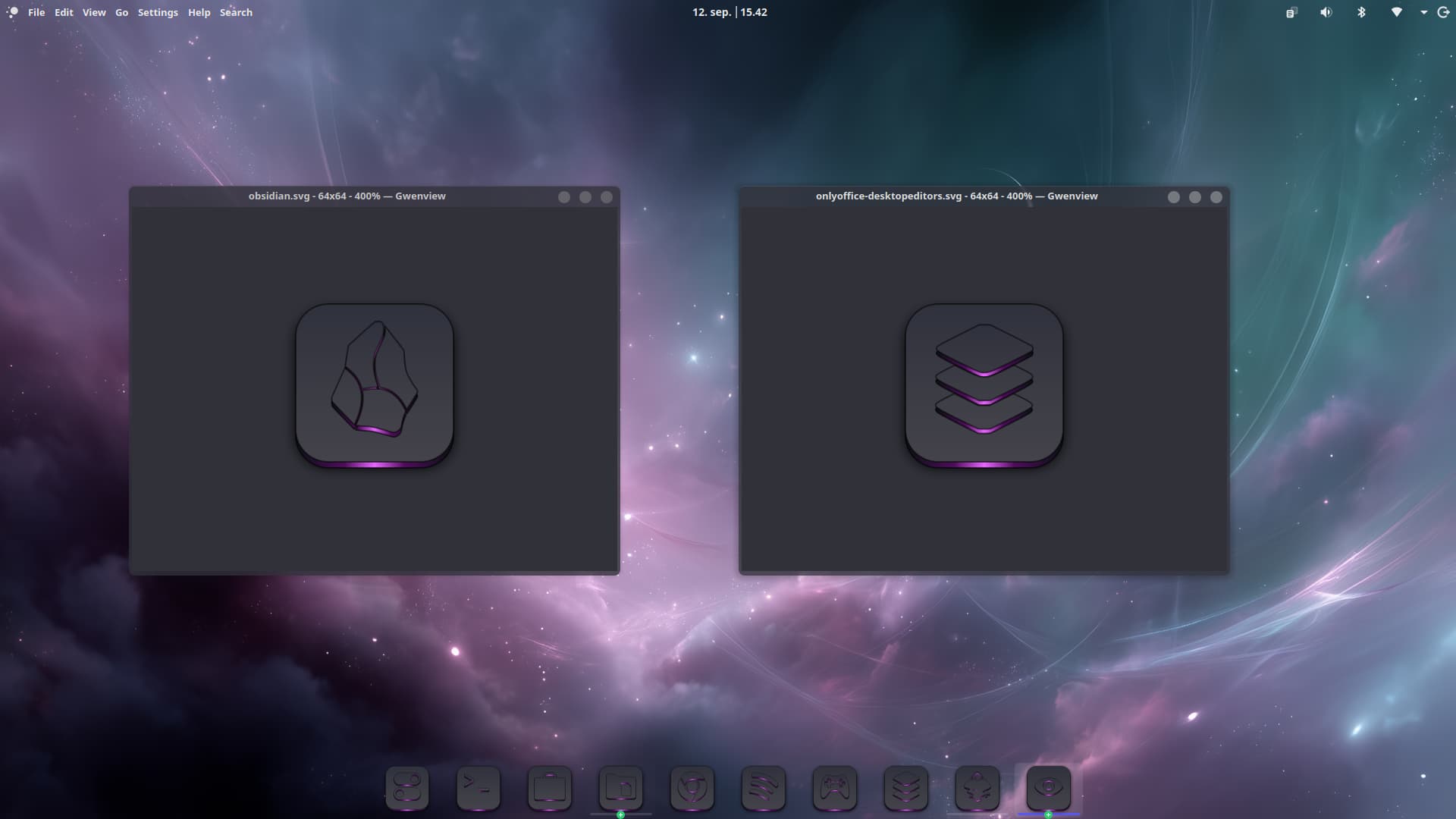
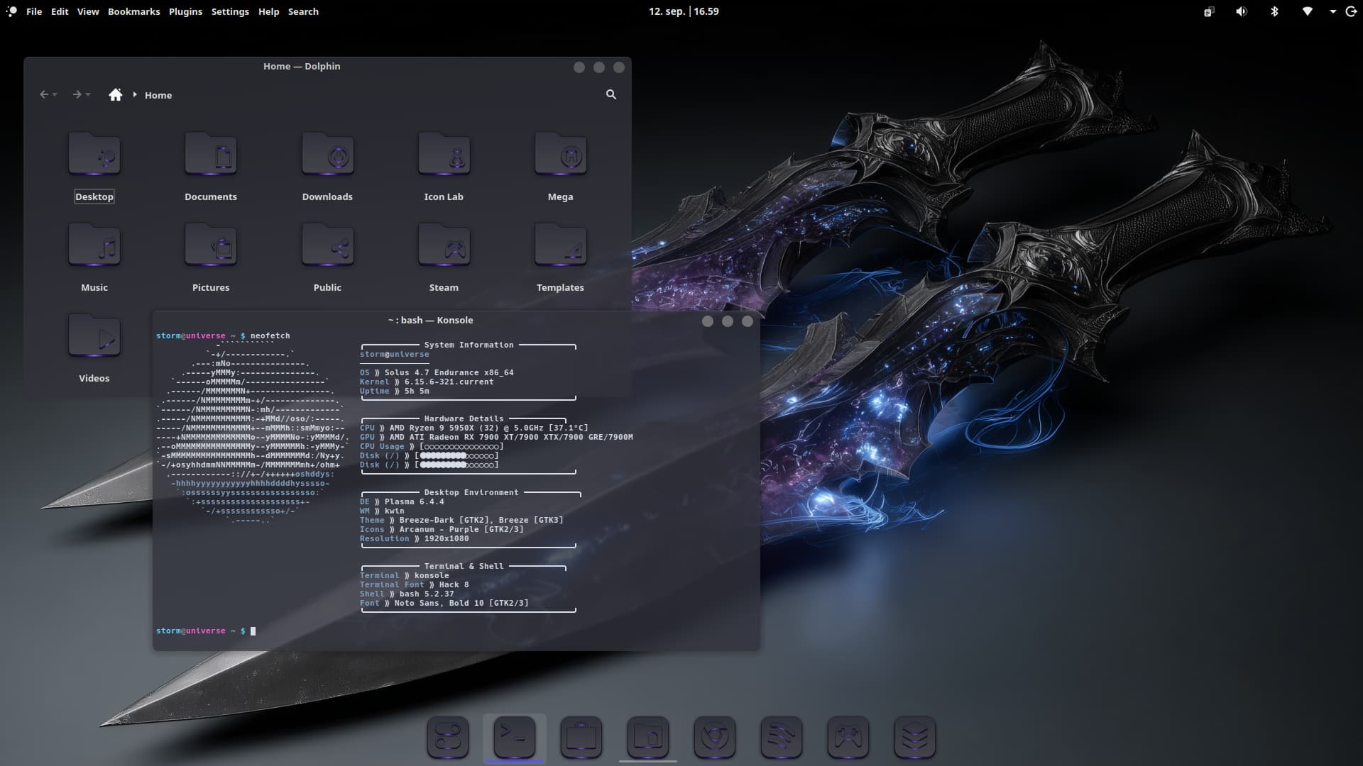
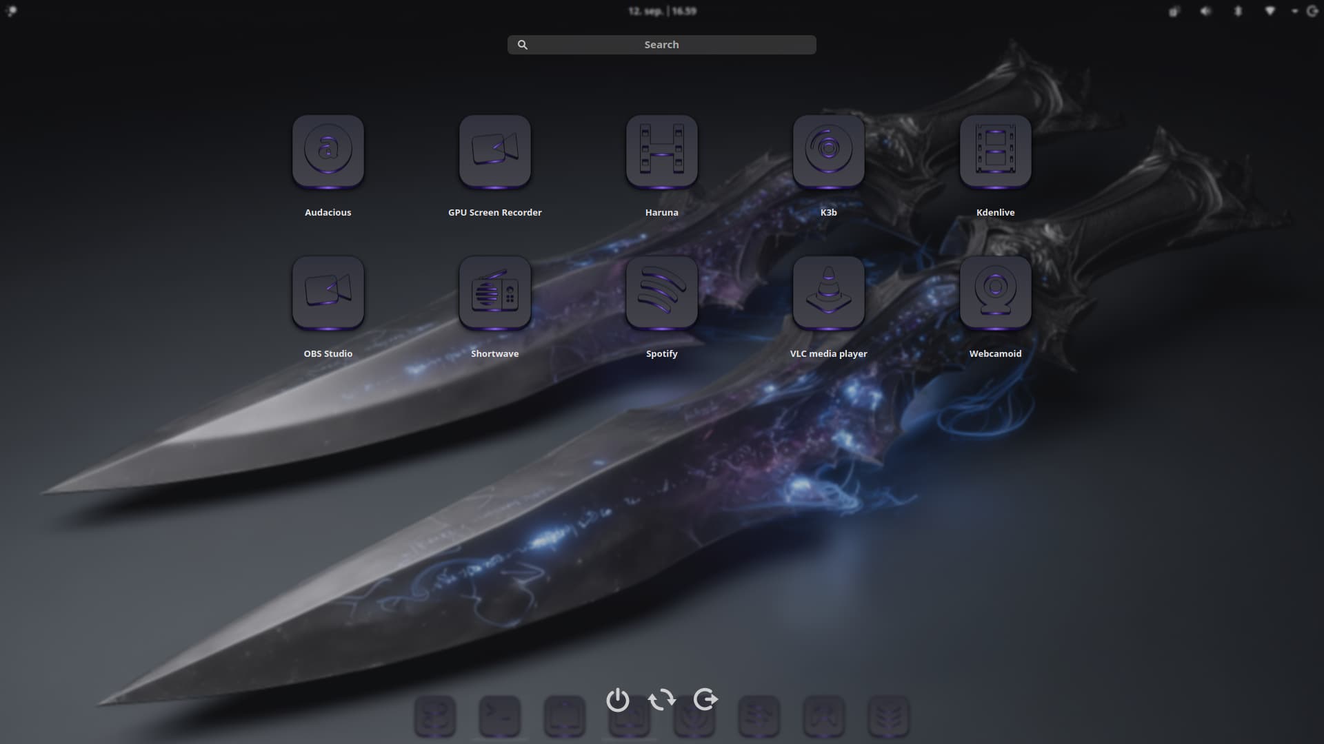
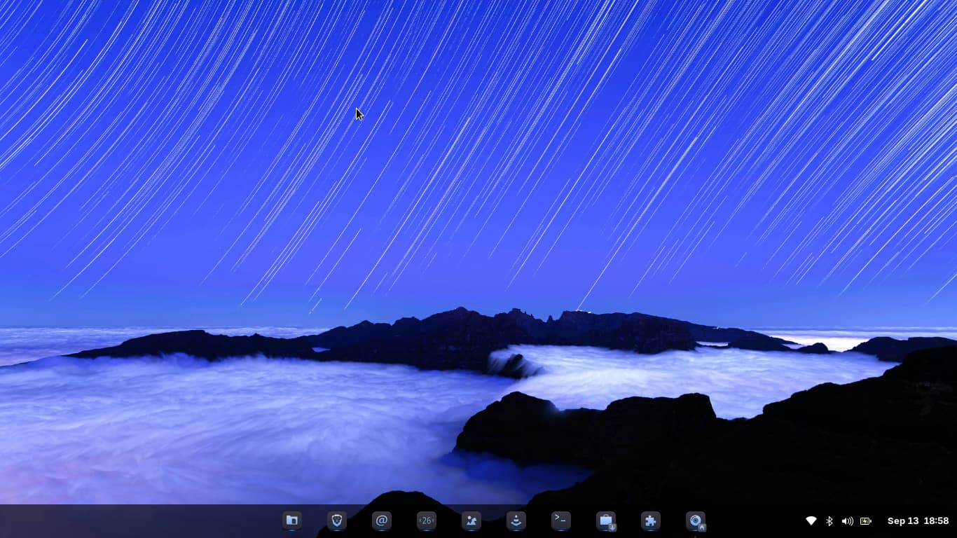
Round ones are nice.
How about giving the square ones just a little bit of front-back perspective i.e. mild trapezoid shape.
I actualky don't know how ... well I do, but never succeed in making it right.
2 Likes
Actually, I have a mixed feeling on this one, you might appreciate my idea here.
Folder Icons:
Please leave the folder icons square, I believe as name implies, a folder in real life is square, so should digital ones.
App Icons:
Application icons, would look better rounded, IMO.
Final Thoughts:
Not only would the mixed square & round look better, it would also aid in training newbies to Linux, better differentiate between an application, and a folder.
PS: Your killing it with your icons lately, @Storm im impressed!

3 Likes
Omg pure
3 Likes
I'm going to finish the squares first, and then maybe making a round version. But it takes a lot of time to just make one icon as there are many layers to add.
3 Likes
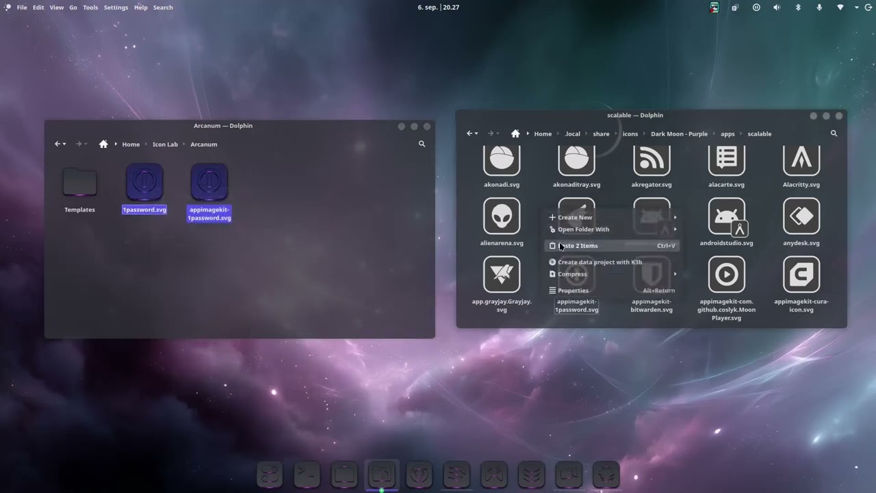
For those who are interested in how I make my 3D Dark moon icons, I have created a video. Though it doesn't show when I make the foundation of the icons, but merely how I convert/reuse logos from one icon theme to another.
5 Likes
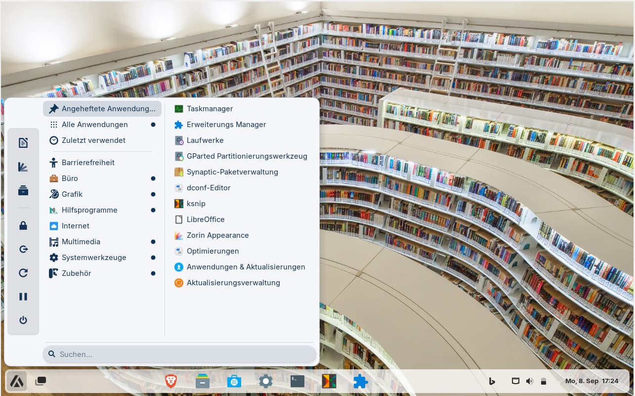
I´m trying gnome extensions on my Zorin VM. This is bing wallpaper gnome extension for background and found out that floating taskbar looks really nice.
4 Likes
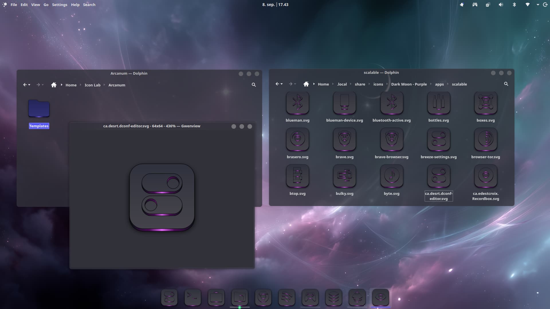
I'm at letter "C" with the apps of my Dark Moon icon theme. Man, it's slow working on them. Each icons takes time and I got a 1000 apps icons than needs processing, plus all the other icons.
6 Likes
Take Your Time; You don't need to hurry.
2 Likes
Badass AF @Storm
1 Like
Fresh New install of my favourite linux distro ZorinOS 17.3 Pro
Lavanda-Sea GTK
Besgnulinux Rainbow Icons
A Woman And Her Flowers Background
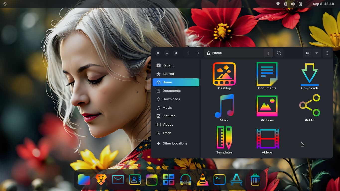
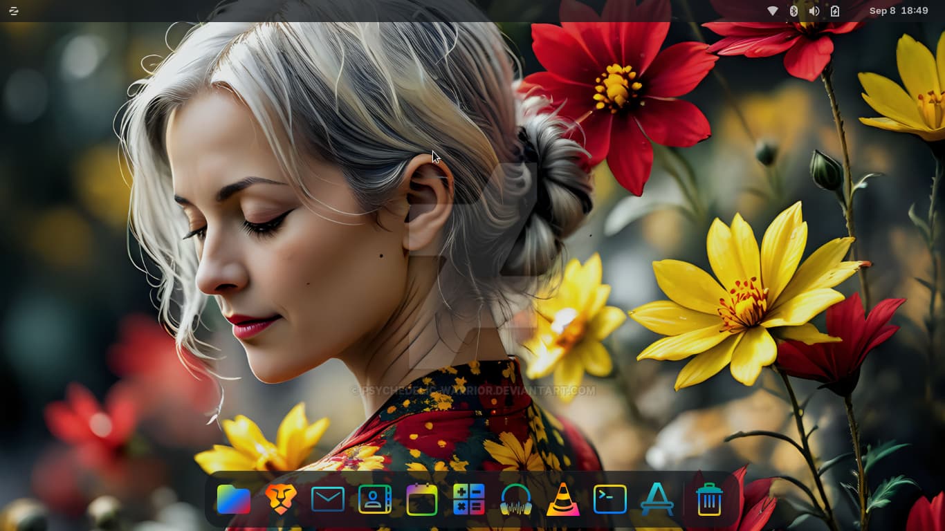
6 Likes
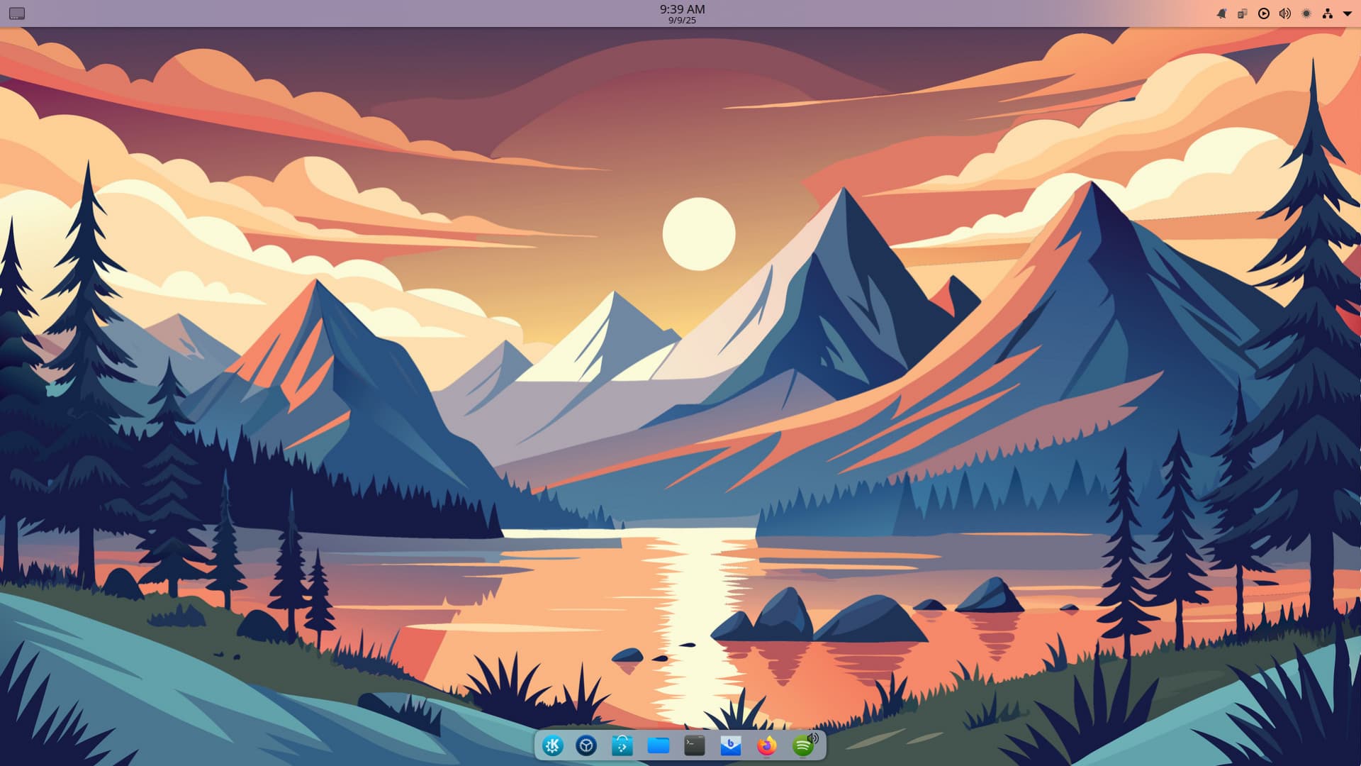
Desktop dual boot is finally back. Had to go with plasma or budgie distro because of not wanting multiple DEs. KDE Neon
4 Likes
Loving the icons.
1 Like
Does it say which library is that? Looks pretty neat.
It is Orchard library in Singapore.
2 Likes
Hello, take a look at this
https://github.com/jeffshee/hidamari
it work with low memory used 
1 Like