Pop OS 24.04 has now a stable Rellease with Cosmic, yes. I have it on a USB Stick to test it. I find it quite nice. It feels for me like Gnome with more Options to customize - which I find good. I even had a Performance Mode.
But I don't like the Dock. And I would prefer a Startmenu like ArcMenu. the is this Applications Thing, yes ... but that is not mine.
I thought it would make much bigger news than it did, since it's been on the works for so long. Anyway, I will give it a try probably on the next release which should hopefully be in a few months when all the smaller bugs have been ironed out.
Yes, I will probably wait a bit. Usually a new major release has a few bugs here and there anyway, and what better place to start using it than with a fresh version of Pop!_OS. I did like it last time I used it (it was 20.04) so I'm looking forward what they've come up with now that they have full control over the desktop environment.
Just tried creating a VM which it does not like and fails to install to a virtual drive.
And yes it is very buggy even in live mode. Will be interesting to see if he can make any improvements with a new snapshot, but at the moment it is not worth the hassle. The installer screen is terrible. Selected English for the language and waited for something to happen - you have to go down to the bottom right of the very dark installer window and search in the dark as it were to find the arrow in the circle to commence installation. I suspect the Electron Installer is not as good as Calamares!
Yes if fully installed but I don’t recommend it. It fudged with my drive and I had to do extra work to completely wipe my drive even after I installed another distro after it
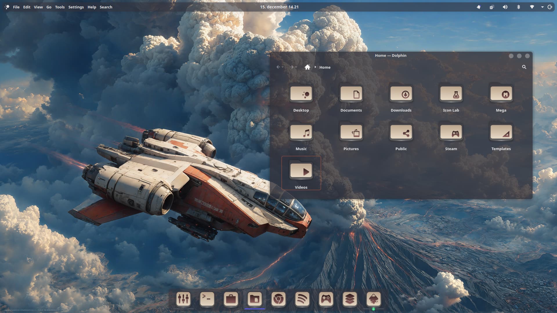
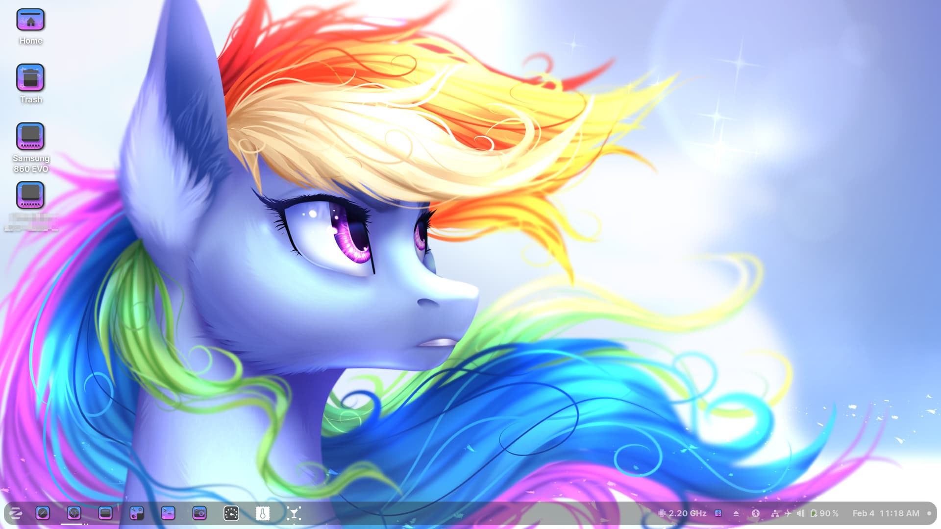
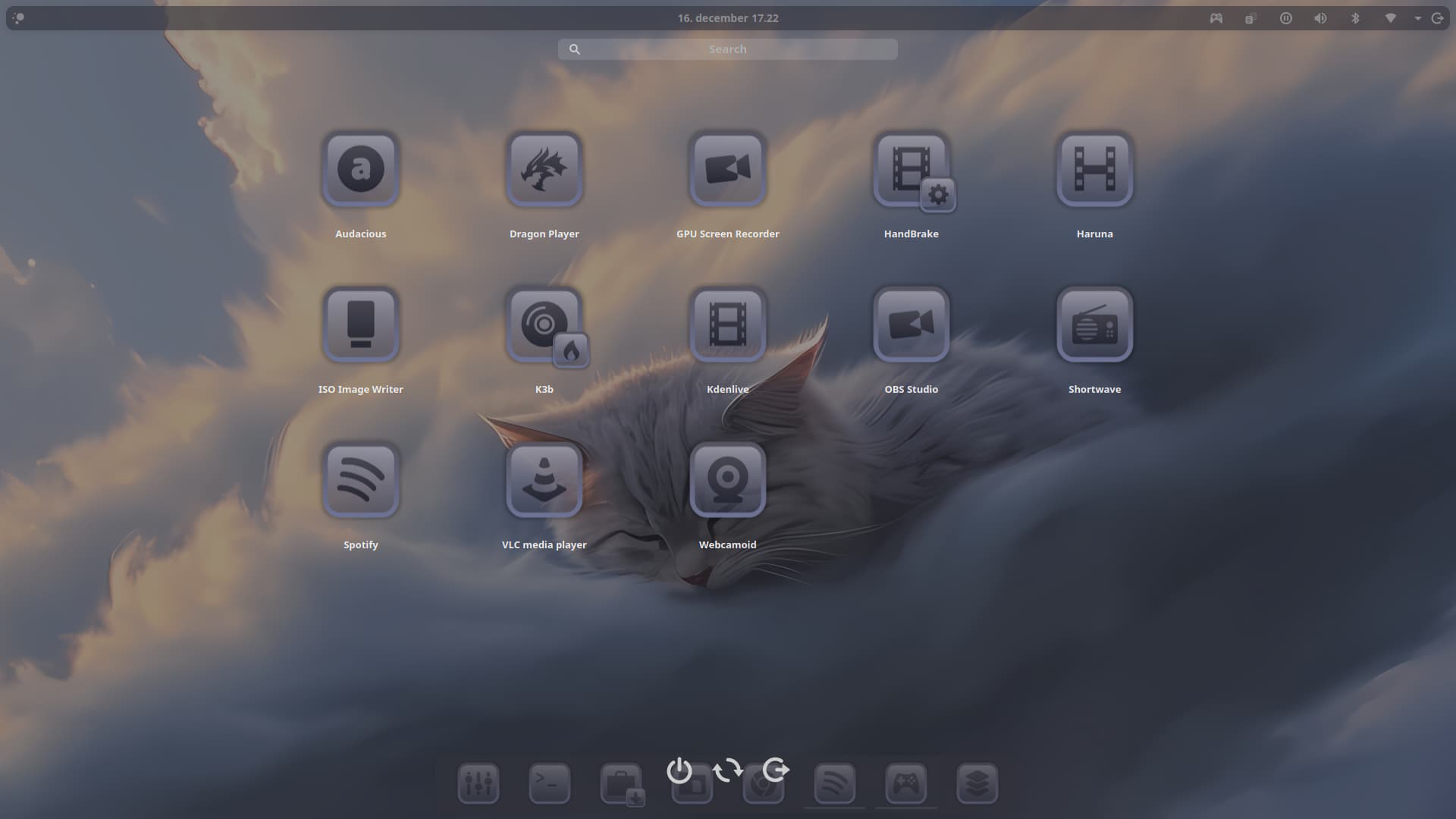
That was back in 2021, glad you like it. These days I'm running the ILP theme icons & wallpaper from @Storm , & Star Labs Dark, and I am only using Zorin OS now days.
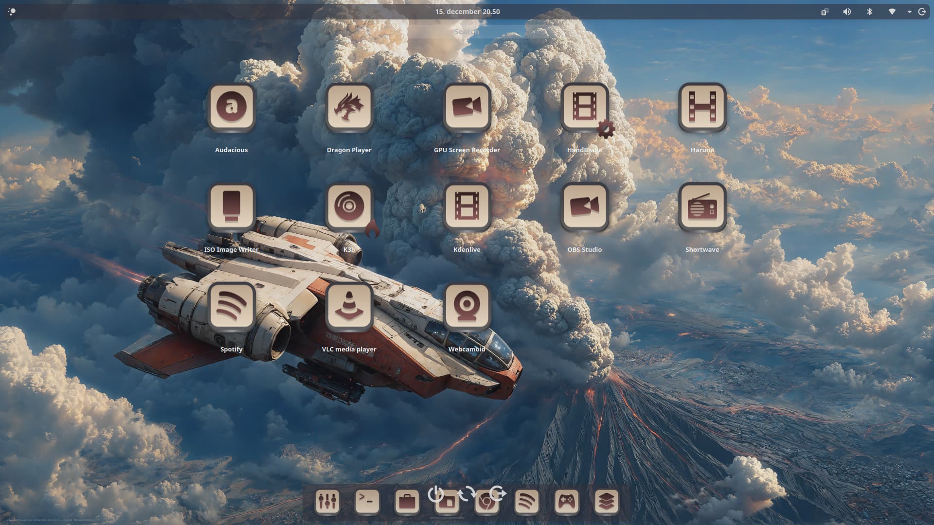
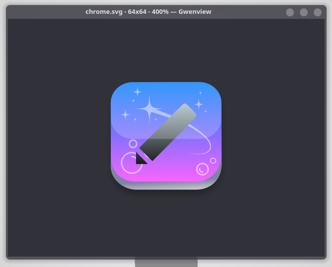
Interesting. The Style isn't really mine but from the View of making it, I find that it is pretty nice with the Color Gradient. And then with this Stars a Bubbles in the Background, too.
The only Thing were I would be a bit concerned with this Background Stuff is if the actual Program Icon is ... how can I say it ... strong enough to be detected. Maybe a bit less Transparency on it and a bit more black. Only a bit.
It looks very nice Storm, I love the pretty stars with the bubbles. Its good to add stars most certainly. Rainbow Dash & Twilight Sparkle approved.
If you are refereeing to the silver stripe at bottom, that you moved that to black, likely looks better anyways. I assume the whole reason for it in the first place, is to make the buttons look glassy.
Since its been years since you've updated the ILP theme, I can see why your updating it. Just don't remove the Rainbow Dash tail from the desktop icon, you can make it look glassy as well though.
I like what you are doing with the icons thus far.