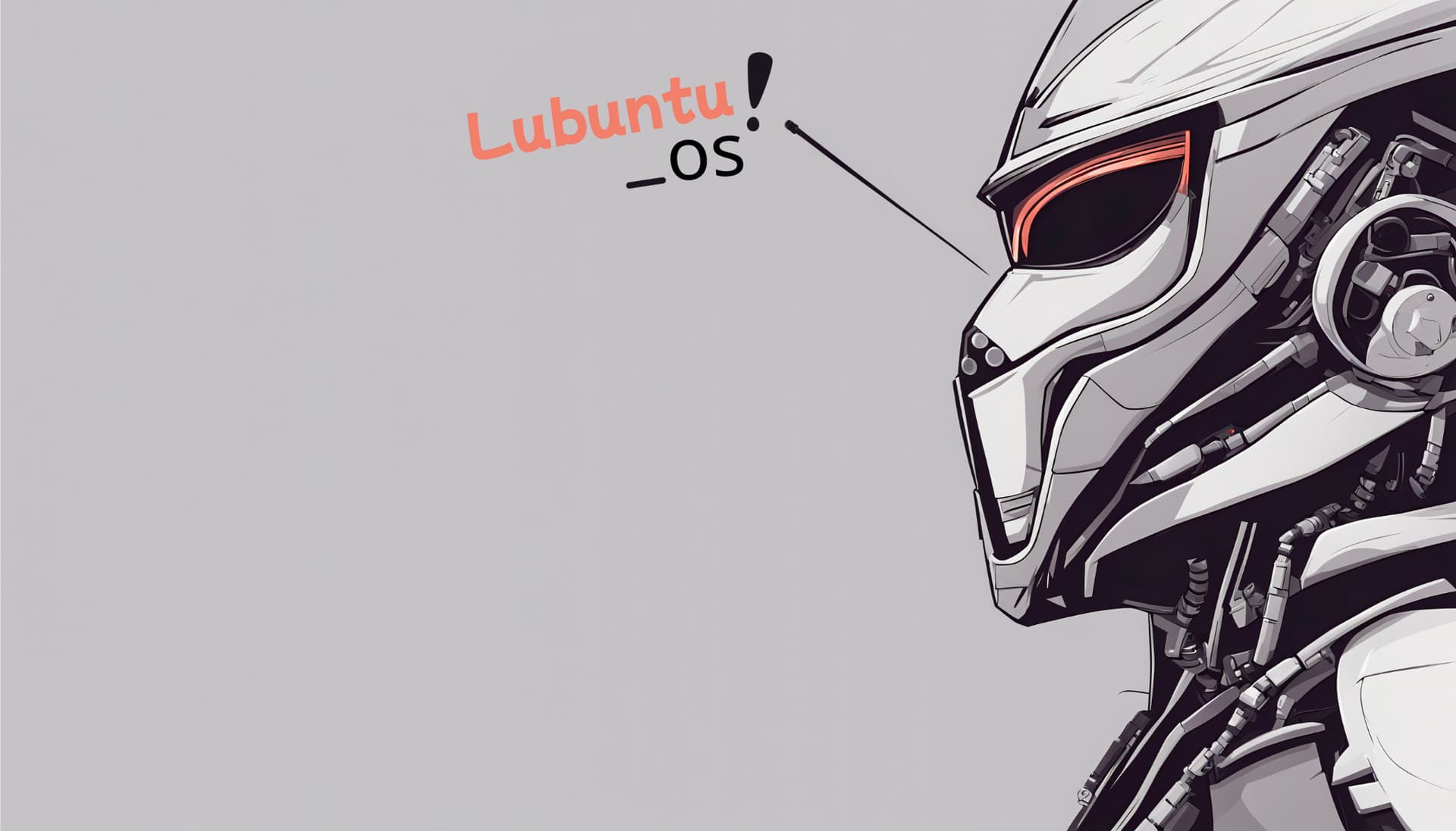
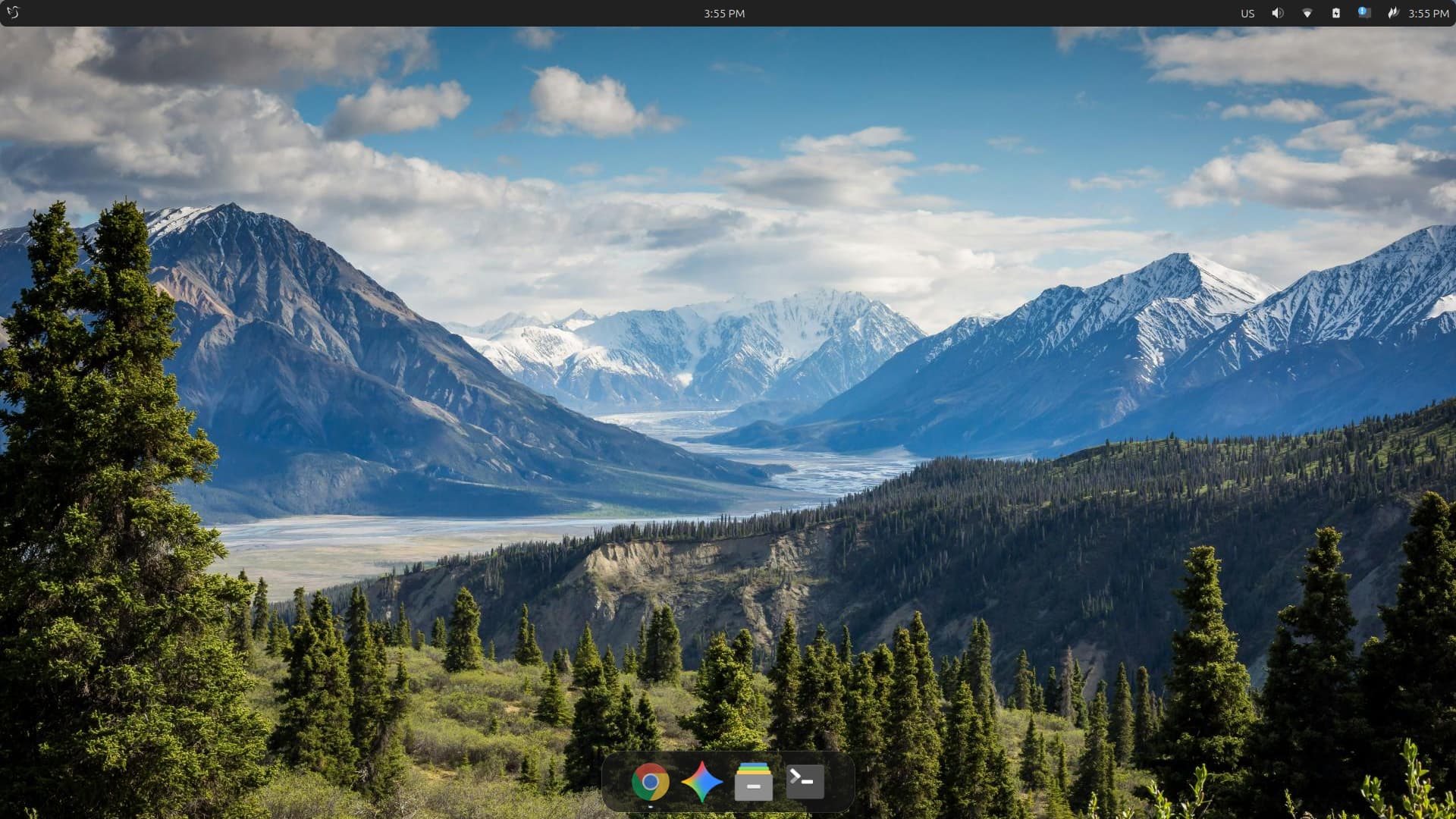
I've edited this wallpaper for the Lubuntu distro.
The final result
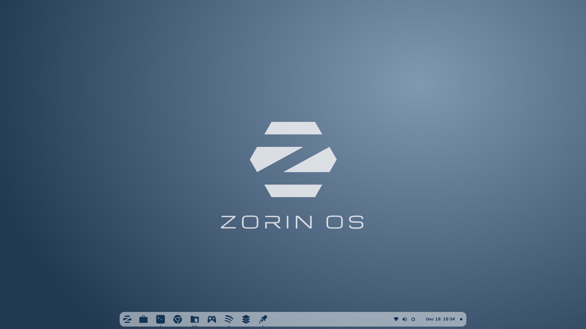
The Wallpaper is cool; would be a good as a Zorin default one.
The wallpaper is something I made with Inkscape. Available here: https://www.deviantart.com/sethstorm666/art/Zorin-OS-Wallpapers-1020272170
Dope ![]()
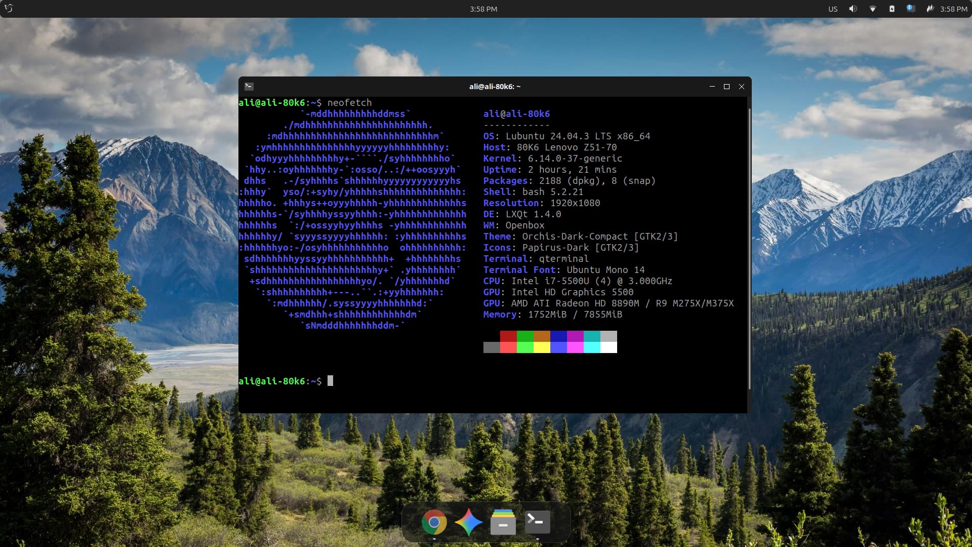
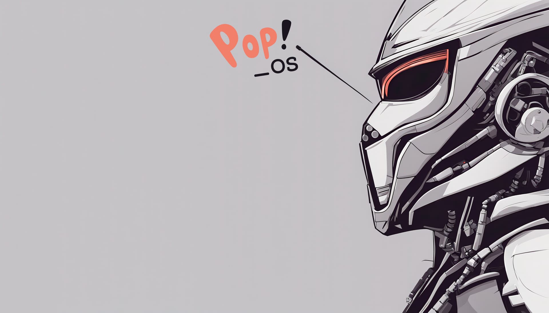
What distro is it?
Solus - Plasma
Solus Plasma distro
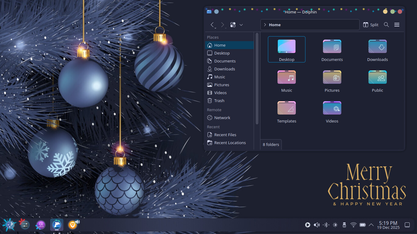
Happy Holidays Colours Plasma Theme, Icons & Wallpaper
Nice
and Nice wallpaper.
Thank ya ![]()
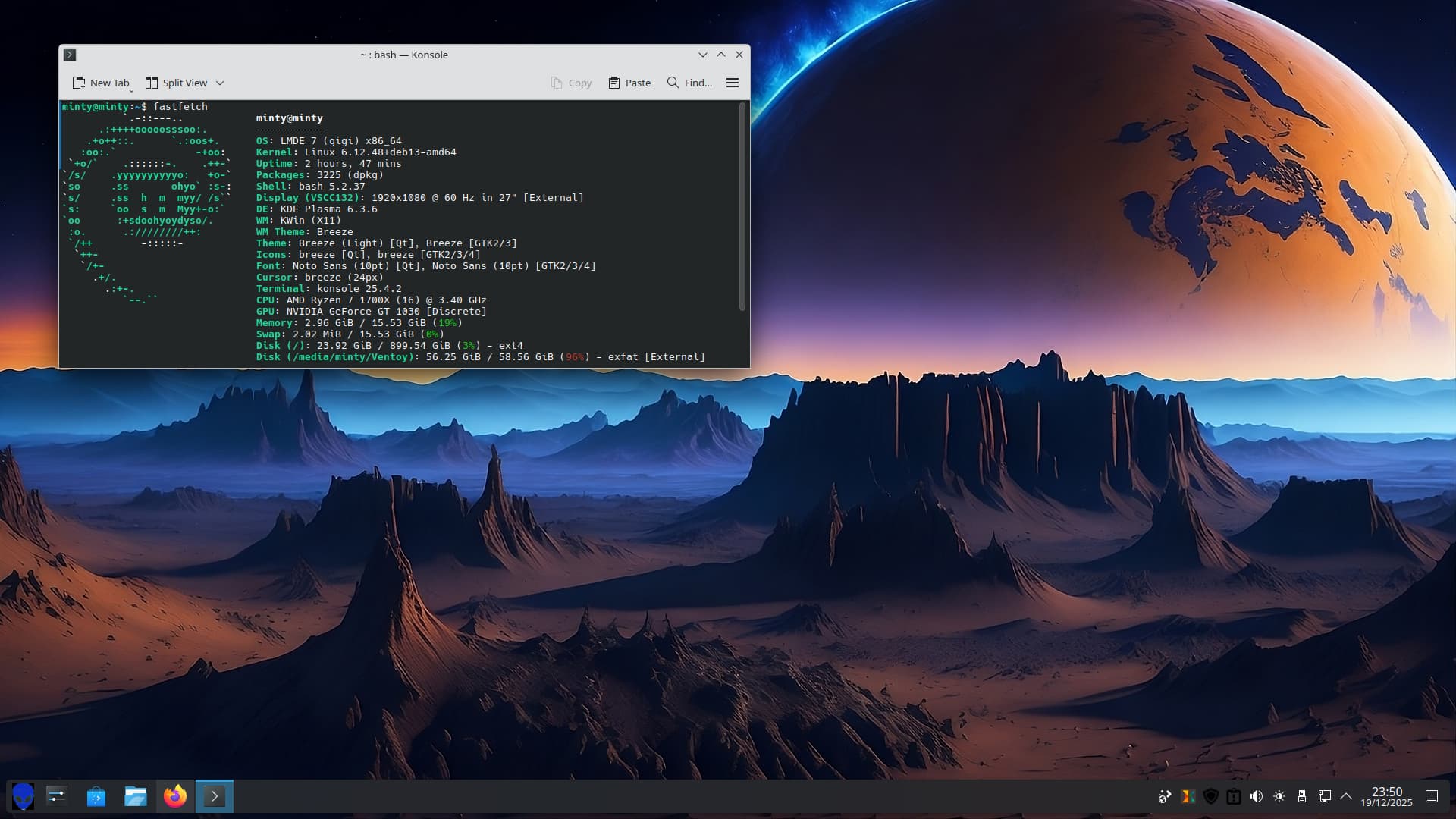
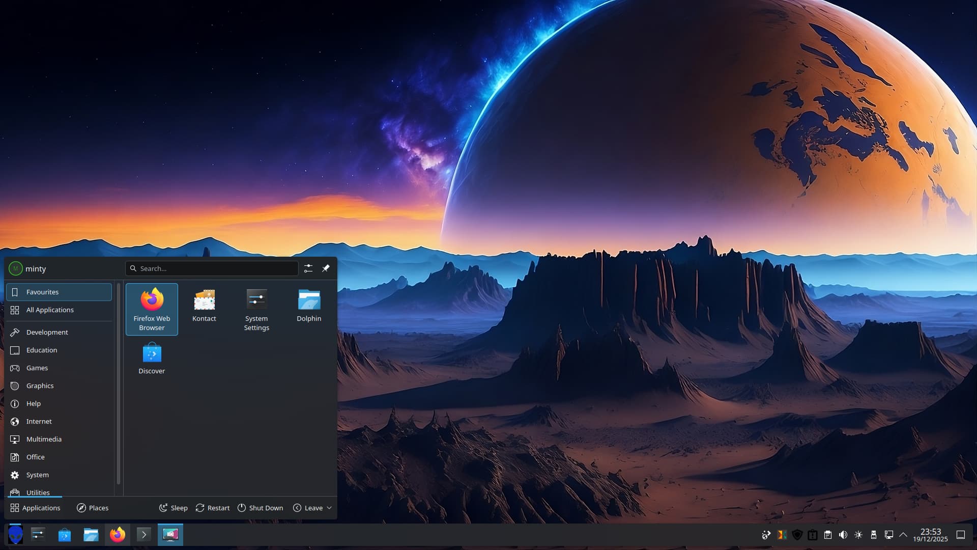
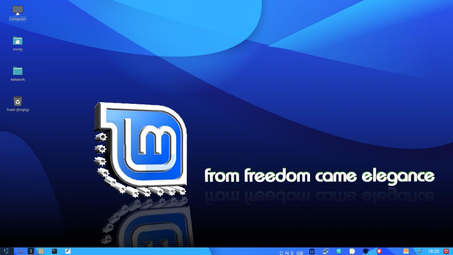
Linux Mint with Plasma 6.3.6 - Not recommended!
fastfetch details:
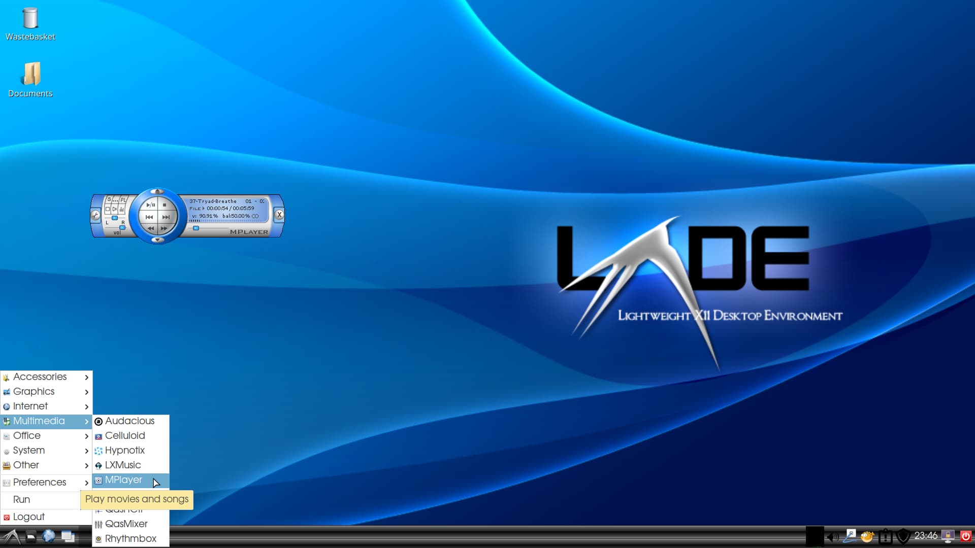
Standard Launcher Menu:
SpaceKicons:
Wallpaper: Red Space Art Alien Planet by yoter.
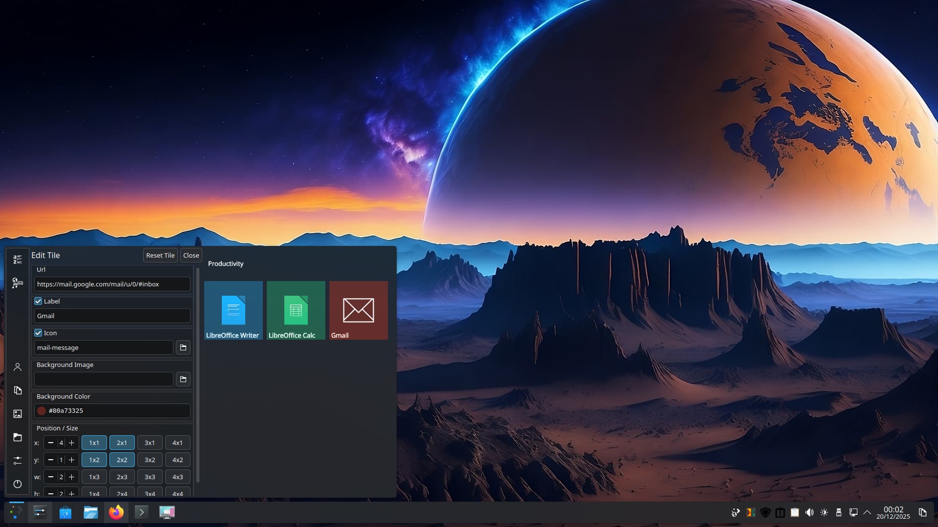
So why does Plasma 6.3.6 suck? Well you can't change the menu icon if you go for tiled menu. Plus choosing alternative menus seems not to work correctly - this also happens on Trixie on PCLOS Debian too. So I am going back to bookworm. When you add an application to the tiled part of the menu it plonks it where it wants it to be you then have to mess with x/y coordinates to move it where it should be - no such issue in Plasma 5.27, as smooth as that other OS tiled menu.
Additionally, in 6.3.6 I had to expand the menu to see the Gmail icon, no such issues in Plasma 5.27 with tiled menu!
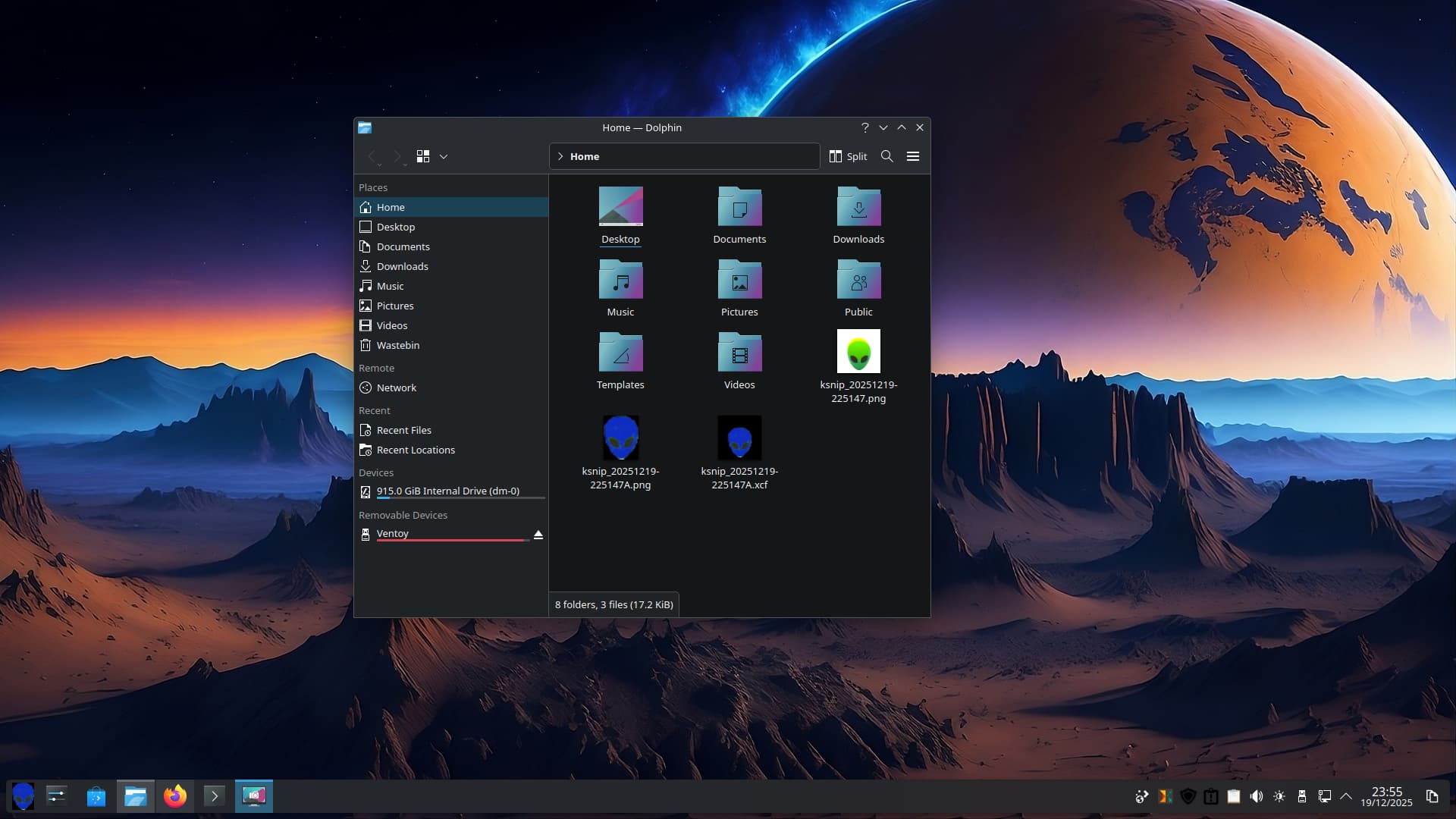
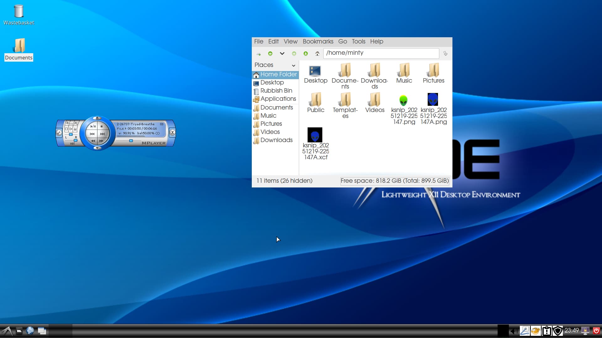
This is on a drive that had Zorin 17.3 Core. It sounds like a bag of marbles so I will be trashing it. Need to install new 1 Tb WD Black to replace this 1 Tb WD Black.
For clarity LMDE 7 comes with Cinnamon - I installed KDE full and used X11 compositor for this desktop.
Just to add, when tiled menu was first released this is what you had to do with the Win10 styled menu. Only in 5.27.5 of Plasma can you freely slide the Group titles and tiles using your mouse directly on the titles and tiles. This is when GNU/Linux feels like that other broken alternative. When a DE meets user needs, why break it for a newer inferior product.
Some experimental exploration for a change. I added a bit of color, and when dark mode started to look a bit too gloomy, I tried a compromise—combining dark and light elements. I disabled the dash and moved the top bar to the bottom.
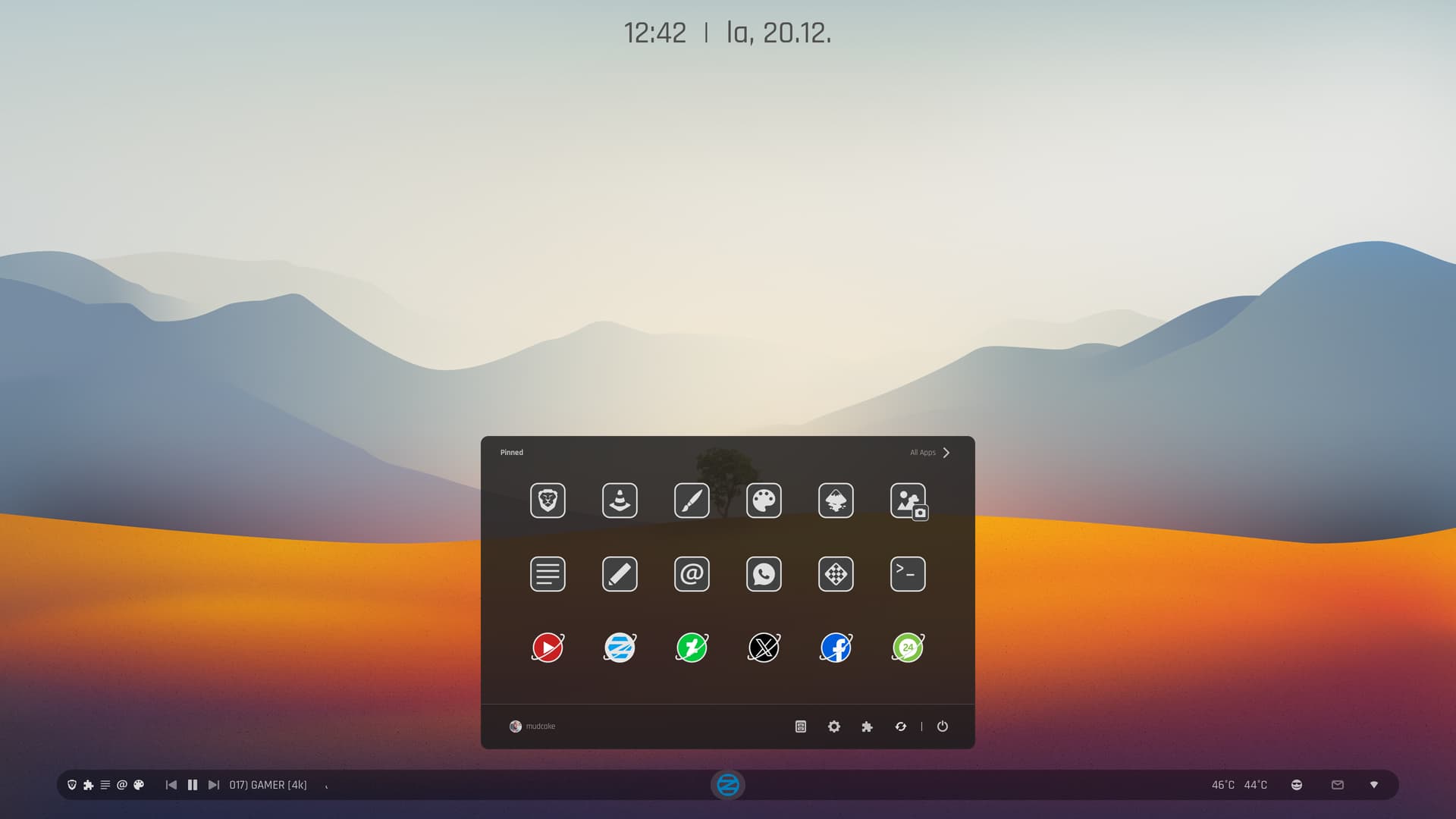
Is that Linux Mint's new start menu icon now? Its so Caligraphy'd, I can't even tell what it is! Now, the backround wallpaper is a different story, I can clearly see the LM in the background.
I like the folder icons, reminds me of my Start Labs icons. The RED off button on the bottom right panel, reminds me of the old Zorin OS days, some distro's have those power off buttons, directly on the panel.
I think it would be funny to rename the trash bin to, "Where Everything Goes To Die." ![]()
It is a bird, the icon is from lxqt desktop.
"The LXDE logo is intended to represent a bird flying fast, symbolizing lightness and speed, with the design specifically resembling a swallow."

Logo design has failed if the logo arbitrarily evokes random or wrong associations and its idea and purpose are not clear without an explanation.