Haha, yeah I know that's why I mentioned the gnome-shell css. That's how I got the zorinmenu changed.
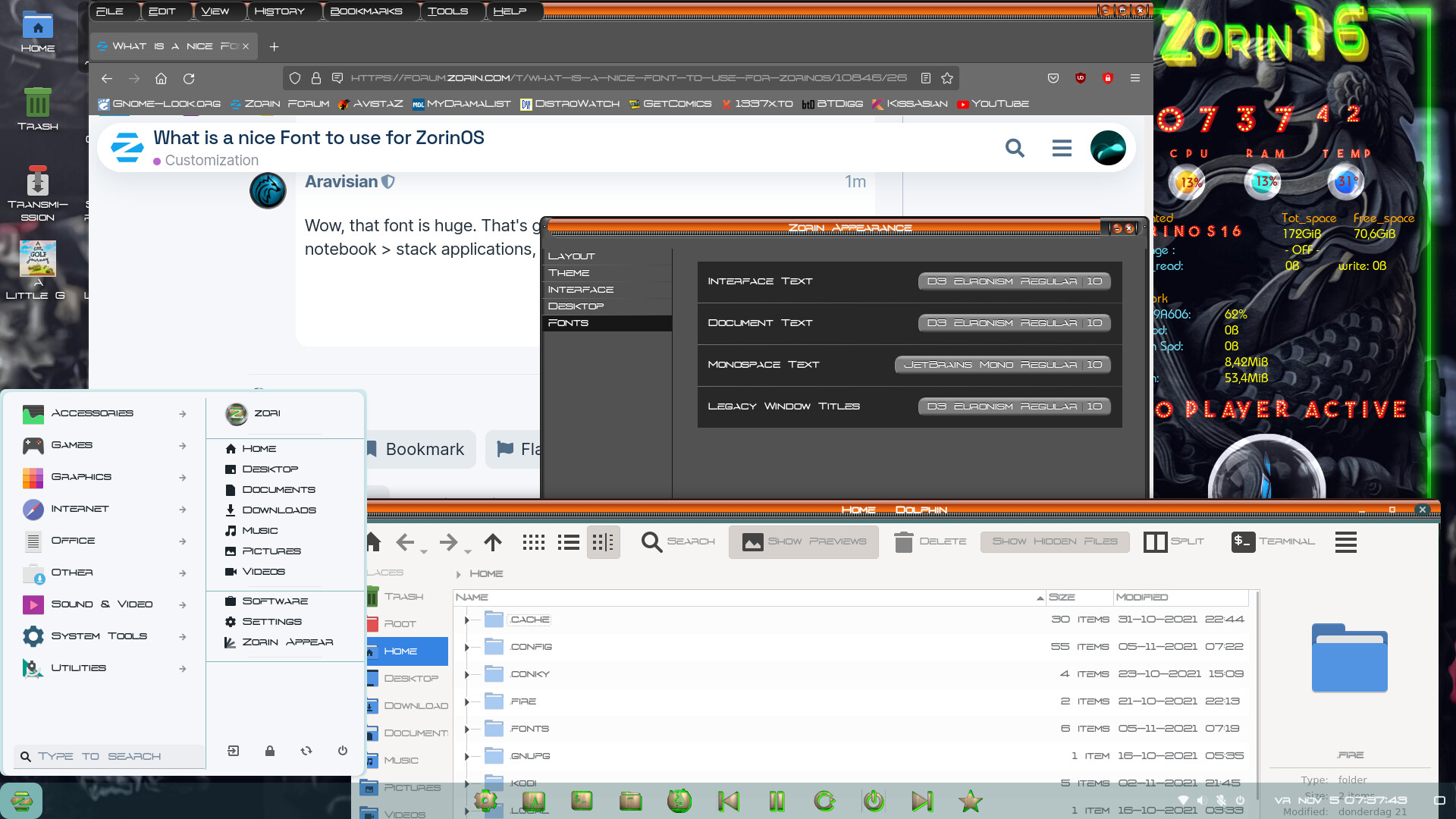
D3Euronism
Haha, yeah I know that's why I mentioned the gnome-shell css. That's how I got the zorinmenu changed.
D3Euronism
Place the font in /usr/share/fonts or in ~/.fonts
I like it when the font uses - upper and lower cases, that way it makes the text systemwide more readable. The Red Seven is nice but wide and like the D3Euronism, does not use lower cases.
Oh I see, you are speaking of the OTF file I downloaded, to put it in ~/.fonts, I see, within the home folder, I get it now. Keep in mind I am brand new to this, while I have done themeing before obviously, but never installed a custom font before, so I am new to that.
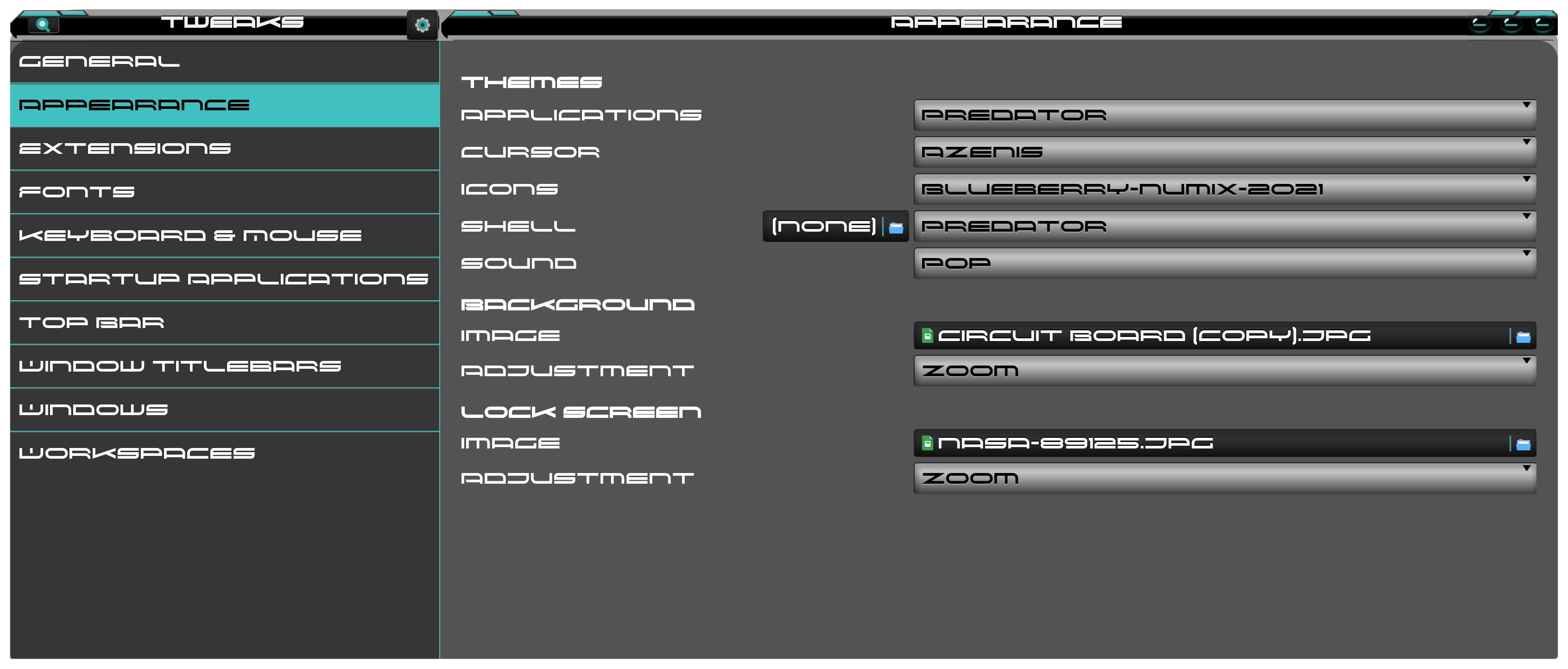
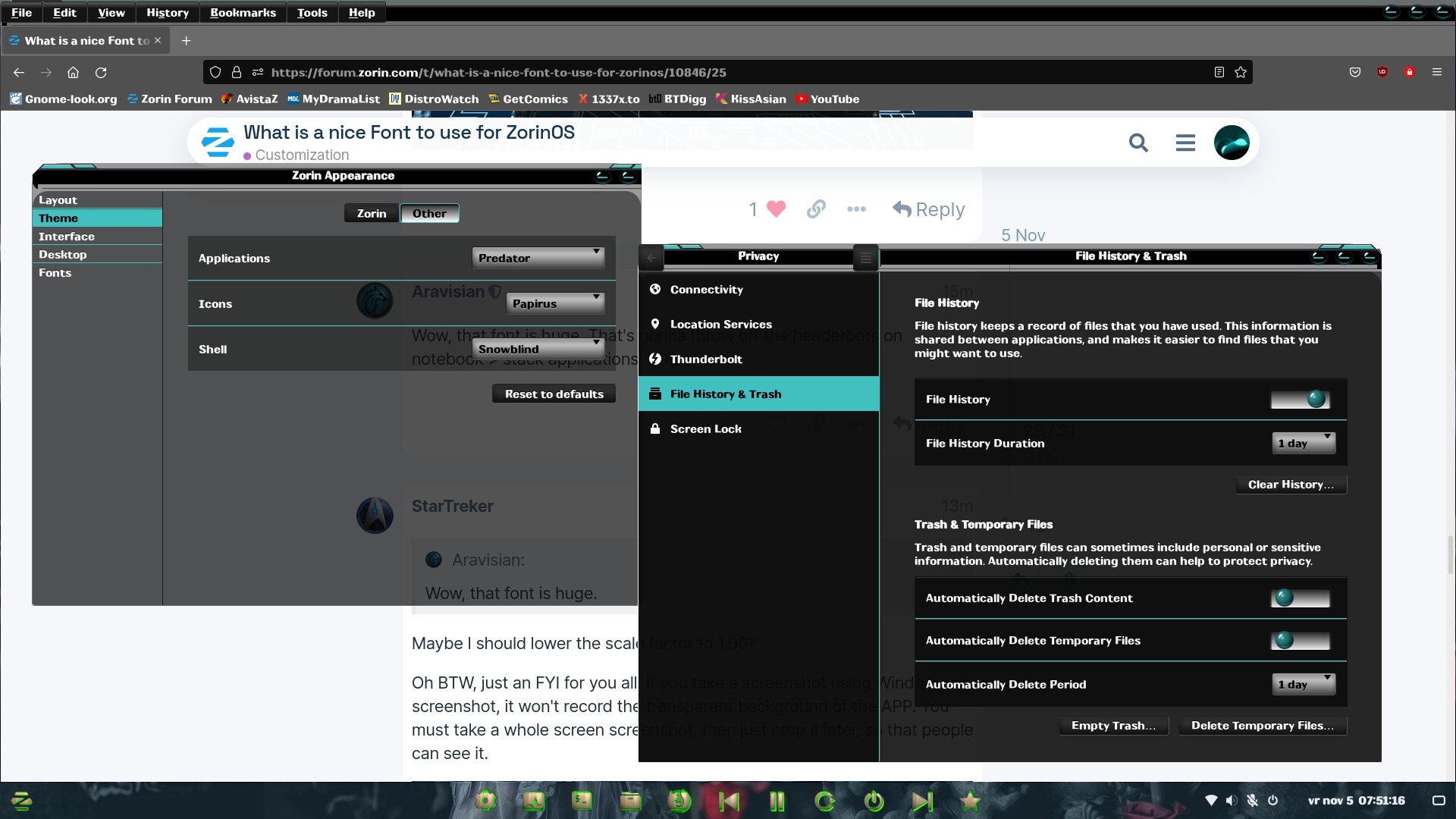
I am going to have a look at the Predator theme again with this font. But keep in mind, those who see the screenshot, my Predator theme is not currently optimized. Aravisian knows about the issue already. But I will show you what it looks like so far with this font.
Its my opinion that this theme goes really well with this font, do you guys see it as well?
Wow, that font is huge. That's gonna throw off the headerbars on notebook > stack applications, LOL
Maybe I should lower the scale factor to 1.00?
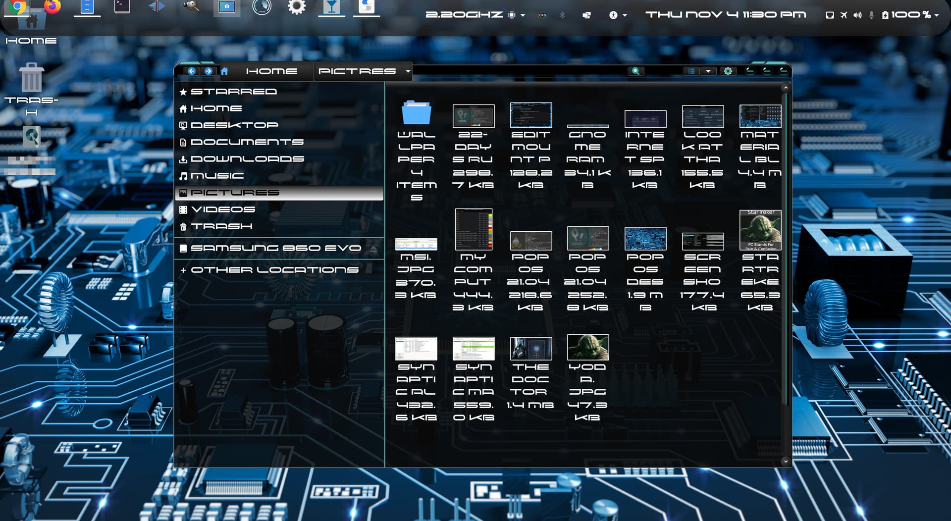
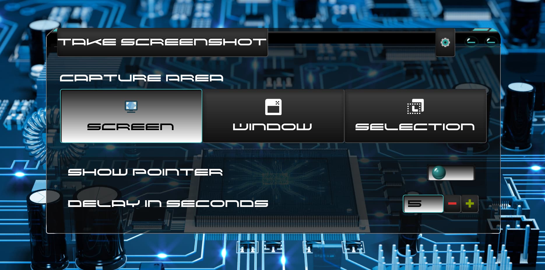
Oh BTW, just an FYI for you all. If you take a screenshot using Window only screenshot, it won't record the transparent background of the APP. You must take a whole screen screenshot, then just crop it later, so that people can see it.
That is entirely up to you... Just keep in mind if you enlarge things on the headerbar, it may look very strange on apps that only use notebook > stack.
This is Gnome with the Copperdeck and D3Eronism font, Shame the creator doesn't make/apply the theme for the gnome-shell.
If orange was my favorite color, I would like Copperhead. But I took a look at it and said, nope not my thing. I did see your above screenshot and I liked it dasjdoom, the D3 something font.
@Aravisian The reason why my scailing factor is set to 1.25, is because as you know, I am viewing on a 4K screen, and everything is usually outragealously tiny on 1.0, so I gotta have it on at least 1.25. This is a common issue for everybody who uses Linux on a 4K screen, not just me.
Chrome browser on Youtube.
What a jerk. You should write him a nasty letter.
I do not theme Gnome-ordinarily. Gnome makes a drastic effort to break theming and this affects everyone, including developers like ZorinGroup.
Theming Gnome - making it tolerable - would make fewer people speak up against Gnomes proprietary behavior. The more people unhappy with Gnome, the more likely Gnome will have to stop its antics.
However, since you know that I don't plan to upgrade to Gnome 40, and I somehow doubt System76 would just automatic update me to that garbage Gnome 40, this means I will say on Gnome 3.38 for POP OS for like forever.
So the point is, its worth the effort for you to to be so kind to fix Predator to make it perfect. And once I get that second hard drive, (If it ever shows up that is) and I get 16 LITE on it when that is released, I know it will already be perfect on XFCE.
Oh, BTW, Aravisian, I noticed that the ICONS repo got added to my system anyways, but because of the errors, I removed the repo until it gets the Hirsuit build you were talking about. But for now, I am glad we are seeing where problems are, so we know where the bugs are.
That is not a bug, I just have not built a Hirsute package for Prowler at this time.
This is predator theme on Gnome with the font I usually use. Makes it more readable (upper and lower cases)
I guess the creator will not change his mind, he already mentioned
I will NOT be making any other Gnome-Shell themes.
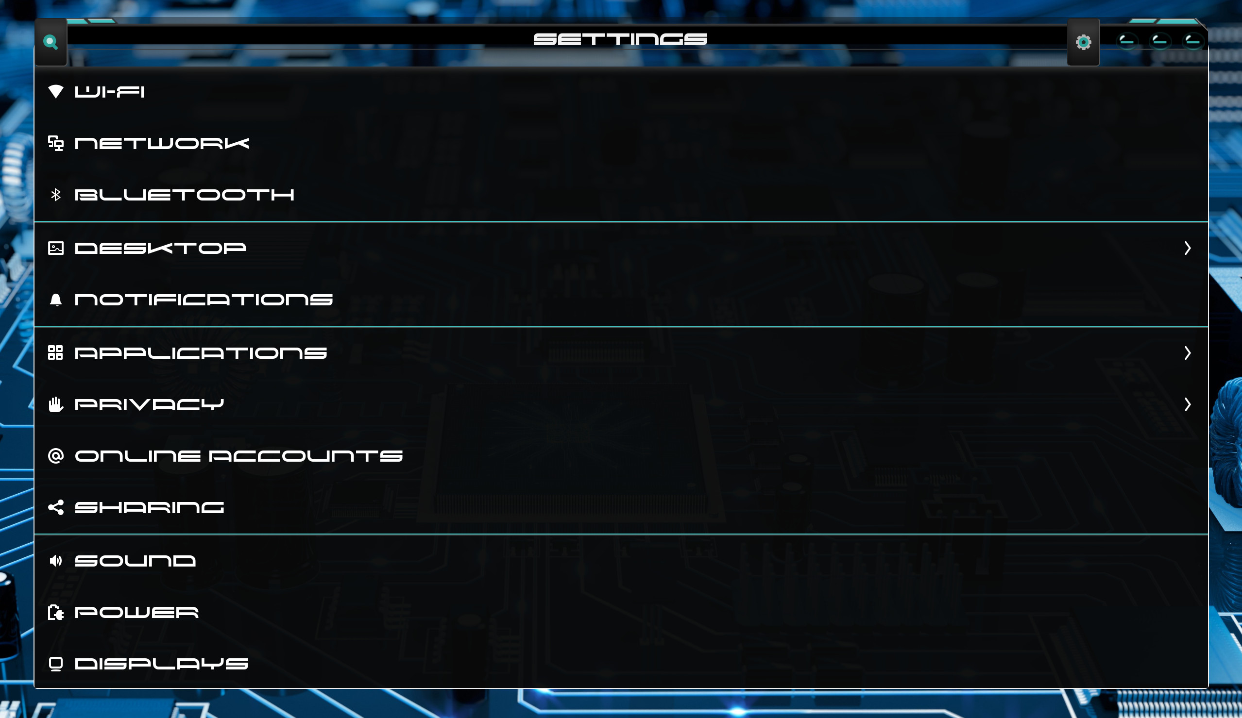
Apologies, I meant bug with the Predator theme. Let me get a new screenshot of this with the new font I am using now, cause even I am curious to see what my Settings menu looks like now. Yes, I haven't looked at it yet lol.
This is what I mean by how I like the rounded bubbly button animation that got enhanced from your theme, that is in my Dash To Panel.
And here is a look at the screenshot APP...
That is the notebook > stack I was talking about.
I will work on it when I have time...
!!!YES!!! YES!!! !!!YES!!!
That is what I am talking about, way to finally upgrade DasJDoom, you finally got on the Predator. WOOHOO Lots of sexy, and you know it. WOOT WOOT! WOOT! Love IT! ![]()
I was waiting in line for a reply. I like the predator theme better on XFCE. Really amazing and great work Aravisian--- Bee Knees -- Your the man.
The font Red Seven is really wide but like you mentioned StarTreker, perhaps on a wide TV screen it does looks nice.
Aravisian, am I missing something because the icons don't apply with the (predator or copperdeck) theme. my folders still look the old way?
Notice so do mine? There is no icons theme included with the Predator theme right now. Aravisian would like to include the Prawler icons maybe at some point.
You can install the Prawler icons manually. But what Aravisian and I were talking about, is that if you are on 21.04 Hirsute, there are no icons for us yet until Aravisian makes a build for them in his REPO.
However, if you are on 20.04 Focal, then you can go ahead and add Aravisian icons repo and install the Prawler icons pack. Then you can use Gnome Tweaks to select it.
FYI: This is again, for 20.04 Focal Only!
sudo add-apt-repository ppa:aravisian/iconsets
sudo apt-get update && sudo apt install prowler-icons