Thanks StarTreker, it worked.
1 Like
@StarTreker
You can just grab the .deb installer if you are on Hirsute...
https://launchpad.net/~aravisian/+archive/ubuntu/iconsets/+files/prowler-icons_1.1-24_all.deb
Sorry, I am multi-tasking like insanity on some heavy concentration work. Did not occur to me earlier to link you to the installer.
1 Like
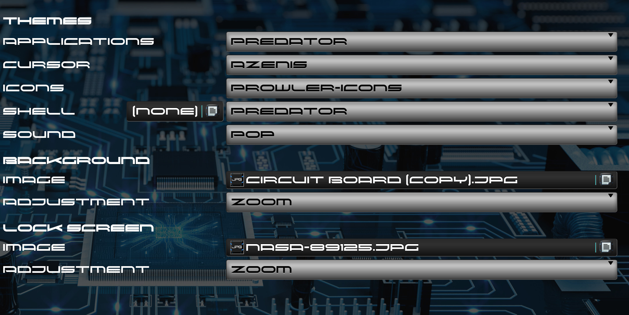
Sorry, but I guess the creator had a drink to much that evening
, because I do have the Predator gnome-shell
I note on the listing that it is the ONLY gnome-shell theme I will make- and I did so as a favor to a buddy of mine.
Well, I guess we are all your buddies now. (For those who use the Gnome DE)
1 Like
dasjdoom, if you select your browser to use the titlebars, that should clear up your funny lookin' titlebuttons on your web browser.
1 Like
I totally didn't know about the DEB installer. You just solved my issue entirely when it comes to getting ahold of the icons, you rock!
Ohhhh, and in regards to my Dash To Panel, incase you didn't know this, I wanted to remind you why the panel is so thick from top to bottom. This is because I have animations turn on, which means if I hover over the APP, the icon will pop out. So that part is normal incase you were wondering.
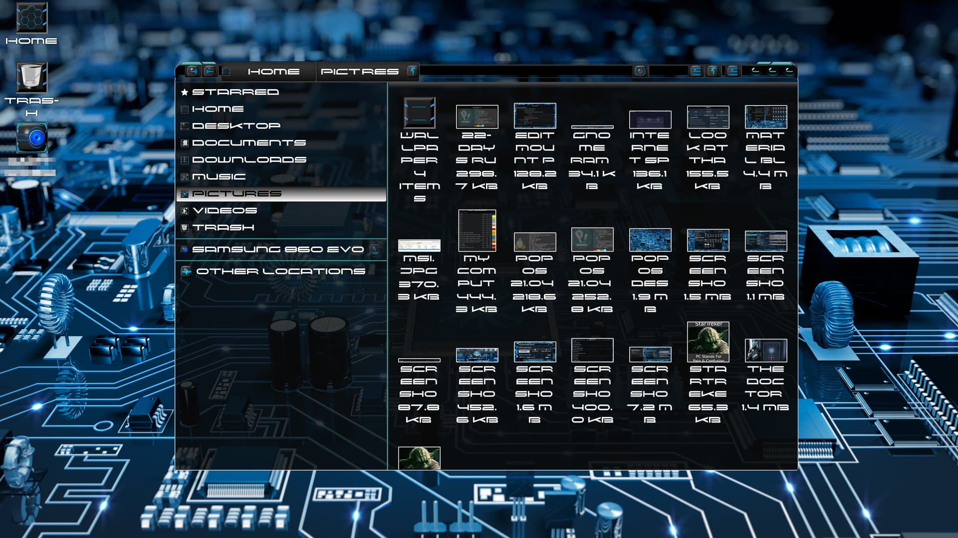
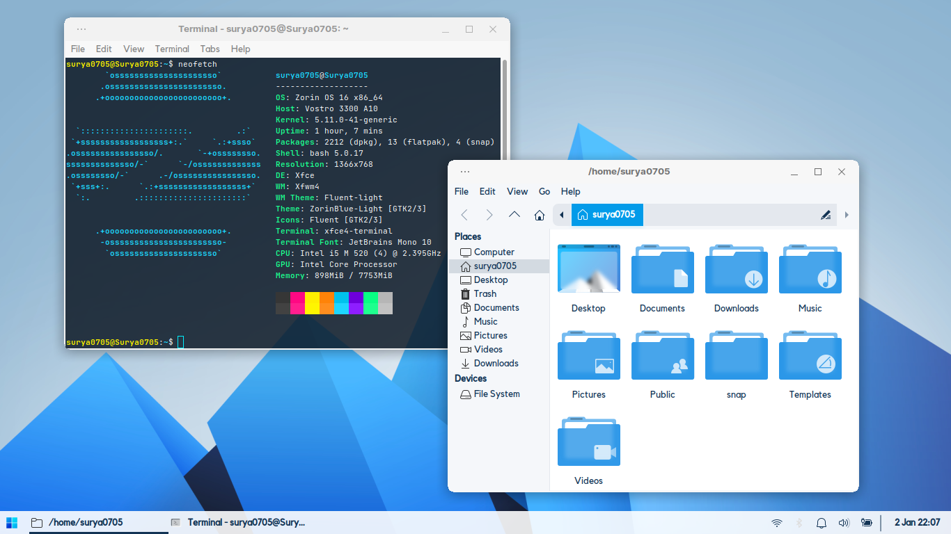
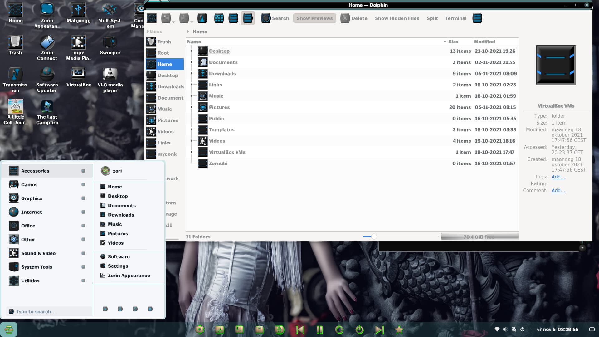
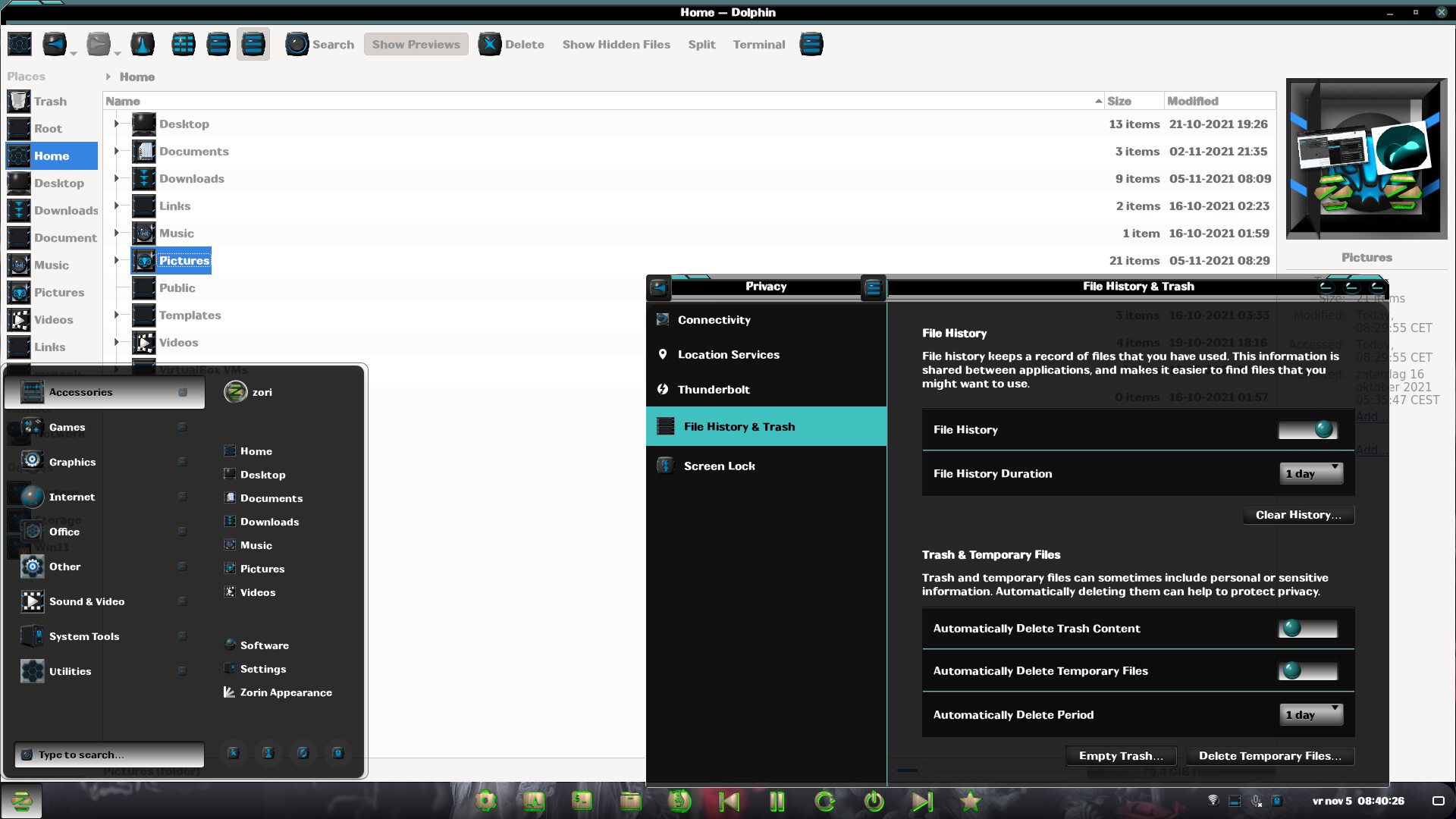
For the record, I truly freaking love the Prawler icons. These icons rock too. Thank you Aravisian! I hope this was enough screenshots to show that the Prawler icons are most certainly working.
There many font, but I prefer Roboto Font .......
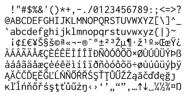
My preferred font is Myrica.
One of the few programming fonts which also have CJK font sets.
Don't know this one. Guess it can't be normally downloaded and installed. Perhaps you can show us with a printscreen?
This font makes it easy to tell the difference among similar looking characters:
There is only a Japanese language site for Myrica:
But essentially it is Inconsolata font plus Japanese characters.
https://levien.com/type/myfonts/inconsolata.html
Wow, guess japanese characters automatically imply italic.
When I look for different fonts, I usually look if it comes with, upper -and lower cases and also if covers the numeric characters. This one (like most) seems to fit the request.
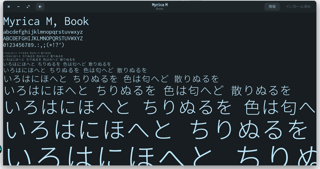
Well, my guess was wrong. But you already figured that I can't read japanese. But nice that this one also uses romanisation version.
So not all fonts are usable for you because of the japanese characters, I guess.
Yup.
You got a picture ![]()
Number of fonts in Japanese is over 3,000.
You can see why there are not that many font faces for Japanese language.
I use the fonts to make png's within Gimp. So for the romanization version its 26 letters and 10 numbers times, lets say 12 adjustments in Gimp per character.
So if I try to do this for the japanese characters is would take a long long long time - and that for just one font, hahaha. By the time I finish I would have a beard to sweep the floor.
1 Like
I really like Product Sans Regular (its the Google font I think) - on 10px. Dont know why but I find its looks more esthetic if smaller  even if that makes maybe no sense, haha.

(triple monitor setup)
1 Like
I think the Inter font used by default is lovely enough that I've never been tempted to change it, but on previous distros I always liked to install the Aller font and use that.
It's a really dapper looking sans serif font that's nice and readable, while also having a warmer character to it than many other sans serif fonts like Roboto or Open Sans.
I trying find sherif but Lucida Console also is good.
I don't know if you can installing from this side.
1 Like