I was just thinking about this but I wonder how many people are using a Windows like layout and have their window buttons to the left? lol
I am honestly fine with the default Gnome layout but I am more of a mouse driven muttitasker so I like having the icons to switch applications visible at all times
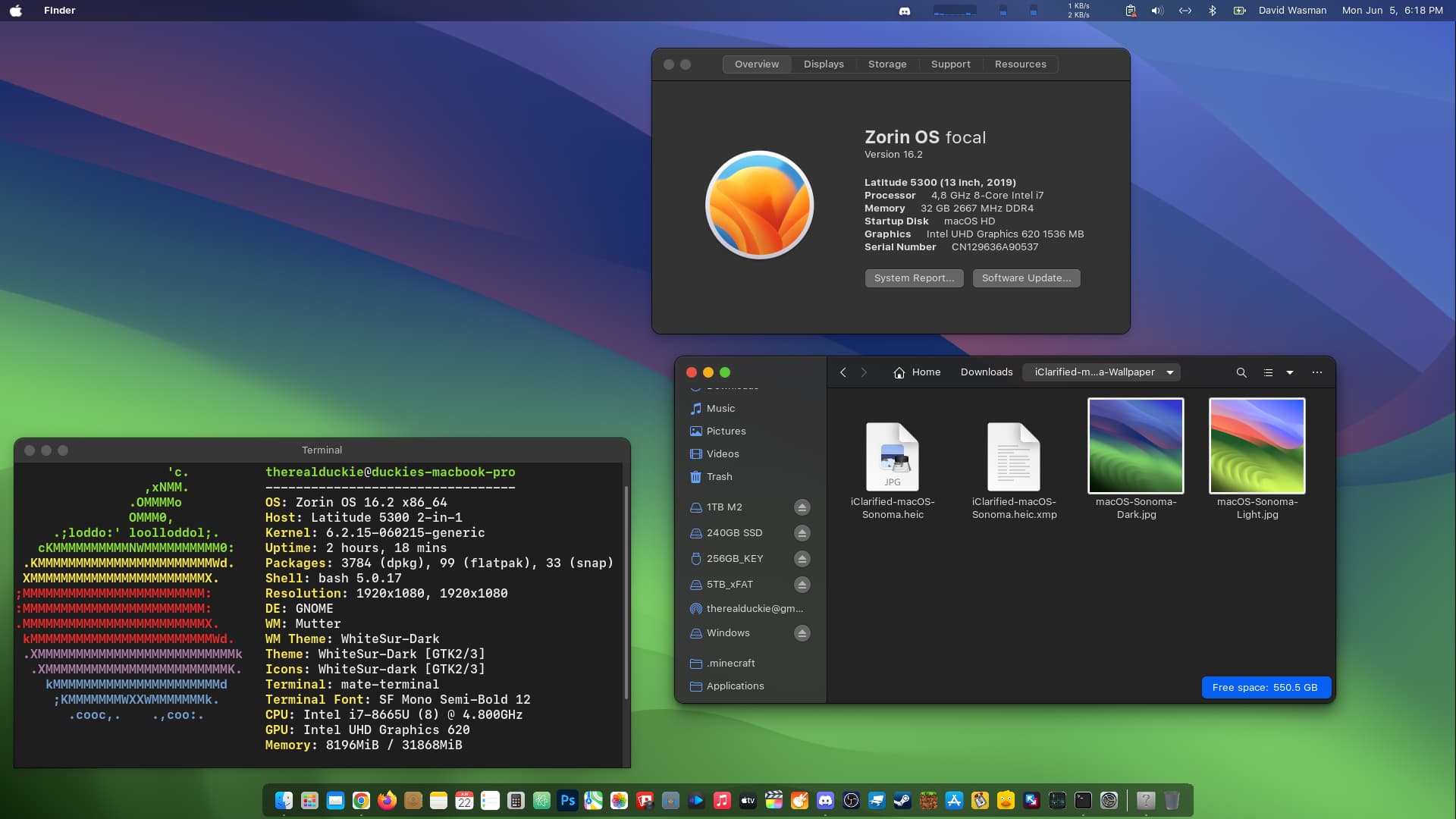
As far as the window buttons being on the left I am also a MacOS user and just prefer that to be the same no matter the platform I move to.
I have always used righty buttons of windows. I came to linux to try different things differently. So, Ive switched to the lefty keys. Idk if I prefer it.
Yes, but it is terribly outdated. Modern applications are not made with it in mind and you get bugs sometimes (especially with app icons). They are working on a new version of Unity we will see where that leads
Ive been struggling a little with my desktop layout. There are things I like about the Windows workflow and things I like about the Gnome workflow and Zorin makes it so easy to swap between them lol
I prefer having the buttons on whichever side the dock/panel/launcher is. I generally prefer to have those on the left like on Ubuntu since Unity, since also larger applications with menu bars have those left aligned too.
It is a personal preference and I can use a mouse with great precision easily. So I want to clump all controls and buttons together. There is only one general area to search and little mouse movement required which for me helps prevent RSI.
I think the design Ubuntu and especially Unity was well considered and makes much more sense than Windows. Start menu and task management lower left, menu bars top left, window controls top right and tray icons bottom right? It’s all over the place. It’s not efficient.
HOWEVER, for people that are visually impaired or don’t have fine motor control it may help to spread controls around.
The main reason task buttons and menus are located at the corners is because those places are very easy to predict, and therefore access with a single movement of the mouse. This is especially important when using badly configured, damaged or completely broken displays.
I think your view is perfectly valid and I'm happy that most Linux desktop environments are flexible to enough to cater to people's personal preference. Mine is for little mouse movement, others prefer accessibility or familiarity.
Unity especially was just so darn efficient. I never understood why people gave it so much flak.
I am not a tremendous fan of their current desktop though.
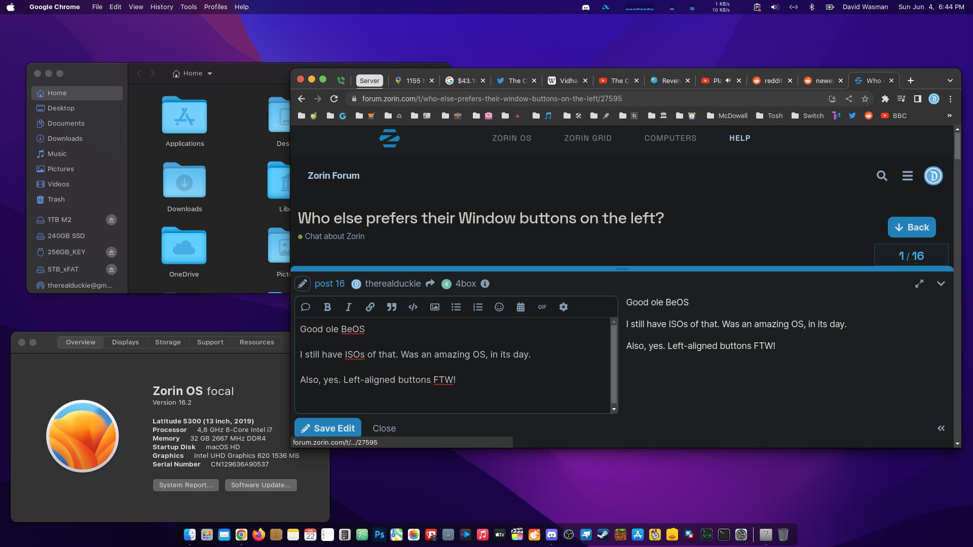
Familiarity is definitely the deciding factor for where my window buttons are. If I put them on the right I would constantly start my mouse in the wrong direction on my Mac and Zorin when I switch back and forth lol.