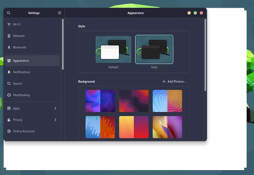
Would you mind sending a screenshot of your desktop? Don’t recall seeing it before and just curious how you use your computer.
Dozens exist...
https://www.deviantart.com/aravisian
You know I actually saw these when I looked at your work before and totally forgot lol
To vibrant for my taste. I am unfortunately very boring lol.
(I better not let my wife see these though. She will love them lol)
Let her have her own style. Nothing wrong with that.![]()
Some are also too vibrant for my taste, too. Some are just right (I am using Prowler2021 currently). I also have multiple copies of several of them... The public ones you see but I have private versions of the public ones that are much more toned down and tame that I use for myself.
Me too, but when it comes to productivity that's a good thing!
I rarely customize my system and only very lightly for those little things that bother me the most. Learning the defaults is key to get up and running in any environment. Even in programs like vim or tmux, that people like to customize heavily, I try to stick with the default keybindings and settings so that things.
As long as I do not have to look at it. My poor eyes are bad enough lol
I am a programmer which is also why I use a light themes as it is easier on the eyes.
This fits me pretty much perfectly.
For me it is the opposite. Light themes are hard on my eyes... It feels blindingly bright most of the time.
I guess technically I should say "it is easier on the brain". Apparently the brain is better at converting black text on a white background than vice versa.
I have never tested this myself. At the end of the day it probably really does not make that much of a difference.
Everybody just needs to use whatever makes them happy. Be it look they are after or productivity.
I personally like dark themes, but fall on the "lighter" side with nice soft pastel colors. I found the catppuccin theme a while back and have been very happy with it.
The only thing I've changed is the accent color to teal when I switched to OpenSUSE.
Tumbleweed or Leap?
Opensuse is probably my favorite behind Ubuntu. If some software I used worked on Opensuse I would be very tempted to use it. The gap has closed some from where it was but at one time YaST was miles ahead of everything else.
As far as dark themes go I like both of these a lot
Well the answers is Simple. If your birthday was east or west. That side what your birthday then you believe,future,religion and technology.
I tried Leap for a little while and then moved on to Tumbleweed to give a rolling distribution a try. So far it's been great, although I have barely used Yast; not sure why every review video and blog post insists on talking so much about it. I'm sure it used to be a great tool back in the day, but to me it just feels very much dated, slow and clunky.
The best part is the automatic snapshots on every update. I had to use this twice already and it's amazingly quick and easy.
Thanks for the Otis theme, it's been on my radar along with Gruvbox for a while. I'm thinking I'll try to use that theme when I do a fresh install, which probably will be with the release of ZorinOS 17.
That is a pretty logical way to do it. I do not do well with change so it would not work for me personally lol
Yeah I do not think it is special anymore but it definitely used to be. If I was going to use a rolling distro it would 100% be Opensuse. It is the only one I would trust enought to be my daily driver
How timely, I just updated and started seeing these weird artifacts when resizing windows:
So yeah, not without its own issues ![]()
That is a graphics driver error. You may need to start a thread on that...
I think I jinxed you lol.
Nvidia GPU? I’ve had Nvidia make several themes not usable without minor glitches
But that is why I personally avoid rolling releases. I hate issues of any kind, what you are having is a minor issue but I wouldn’t be able to rest until it was fixed
Downside is you probably have some useful features I would like lol.
I'll search the open suse forums for any similar issues but is not really all that terrible as it fixes after a couple of seconds, just annoying. I'm using Intel XE without issues, so far. With Nvidia I only had problems once with Manjaro.
About the features, it is quite comfortable to have the latest packages for many things. I've started to look into compiling programs from source to get some of those but in truth I prefer the stability. These little annoyances do add up.
As with everything in life there are ups and downs.
My brain just can’t handle issues. It will make a way bigger deal out of it than it actually is
Hence I’ve always been drawn to Ubuntu LTS because once you get it setup how you want it really doesn’t have issues.
I used Opensuse Leap for quite a while as well and loved it. Always been a fan of Opensuse. As I mentioned before if not for some things I needed not working on Opensuse it would definitely be in contention to be my distro.
Yeah I have it that way . Upon first look you would probably have aa hard
time telling between Zorin and my Windows 11 setup .
Zorin does a fantastic job of that. Better than any other (high quality) distro
