Share your desktop, what does it look like?

Back to golden days.

6 Likes

elementary OS 7.1

6 Likes

Both very nice, I do like the gold.

Will get available when I get the time to wrap it up. :stuck_out_tongue:

1 Like

Elementary OS has a weird Layout at the Top Window Bar. The X is on the far Left and the Maximize Button is on the far Right.

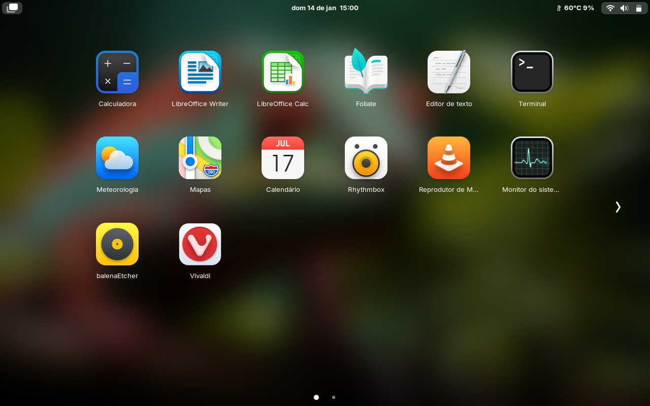
ZorinOS 17 brought new life to an old Macbook 2009. :muscle:

8 Likes

Looks amazing.
Can you share the wallpaper?

1 Like

Thanks, @littlekun :+1:

You can select the best resolution for you.

2 Likes

What icons are those?, I do like Vivaldi

1 Like

@djsedaw The original icon theme is this:

But, I changed some few icons.. Vivaldi, Virtual Box etc... and the folders theme. You can download "my" theme here:

1 Like

Thanks again for the Wallpaper :hugs:

1 Like

Superb! @littlekun

I have a darker Look now. I've found the Wallpaper and really liked that, so I had to change the Look, haha! But the Icons are not finally.

4 Likes

Delight 2 Icon Theme on elementary OS 7.1

2 Likes

Oh, that looks really nice with the Background Picture!

I have a Question when You allow: When you make your Icon Sets and you have different Color Versions. How do you change the Colors of the svg-Files? Do You make that manually one by one or do You use a Terminal command for that? Or do You use a Program?

I script it. I can change the colors of thousands of icons in seconds.

2 Likes

Solus Budgie 8)

2 Likes

Did you made The Script by yourself or it is some Open Source Stuff that is somwhere downloadable?

I ask because I want to change the Color from Your Delight Grey Theme. If you see my new Desktop Design above it is more black and a grey-ish white. So, I tought, that I could simply keep the white Parts of Your Icons and change the grey Parts to black. I installed Inkscape but there ist no Function to make Groupchanges. So I started to manually change the Color one by one. It is a pretty ... It is not the funniest Work, haha! To show You what I mean with the Change here are an Example:

Your Grey Icon:

The changed black Version:

Homemade script :slight_smile:
I suggest that you do not use pure black, but 80-90% black in Inkscape. Inkscape hex: #333333ff or #1a1a1aff. The outer ring of the icon theme I think should be grey (50%) to give contrast, but it's up to you.
I can convert a delight 2 icon theme for you if you want?

This is 80% black

3 Likes

That is realy nice! Thank You!

I use really 100% black (Hex #000000) to have the full Contrast with the white Parts. Look here:

It is an interesting Idea. But I would say the black outer Ring can stay because: Even when it ''disappears'' at a dark/black Background you have the inner white Ring with the strong Contrast. But when You think it would be a good Idea to make that outer Ring in grey for Contrast it is totaly okay for me.

One Contrast Thing could be a little Problem: the Folders. When they are simply black it could be difficult to see them on a dark Background. Maybe You can make a thin white Frame around them. That was an Idea that I have in my Head but I'm not sure if this will work and looks good. And I don't want to make any more Circumstances to You.