Converted icon theme to Green and Purple \o/
Conversions is done. Now to making presentation.
1 Like
Storm. Terrific Job!
1 Like
Superb! ![]()
1 Like

I like the contrast but still prefer the glowing effect from the Alien theme.
What about this, instead?

2 Likes
I like this one but the shadows are a bit too pronounced, could they be blurred or scatter a bit?
1 Like
Yes, definitely much better.
1 Like
When you realized that you made an graphic error in all your icons and have to go through them all again -_-
2 Likes
Problem fixed, but it took over hour. For the untrained eye this error seems unimportant - But I know it's there and I don't rest before it's fixed.
2 Likes
A sign of good craftsmanship ![]()
1 Like
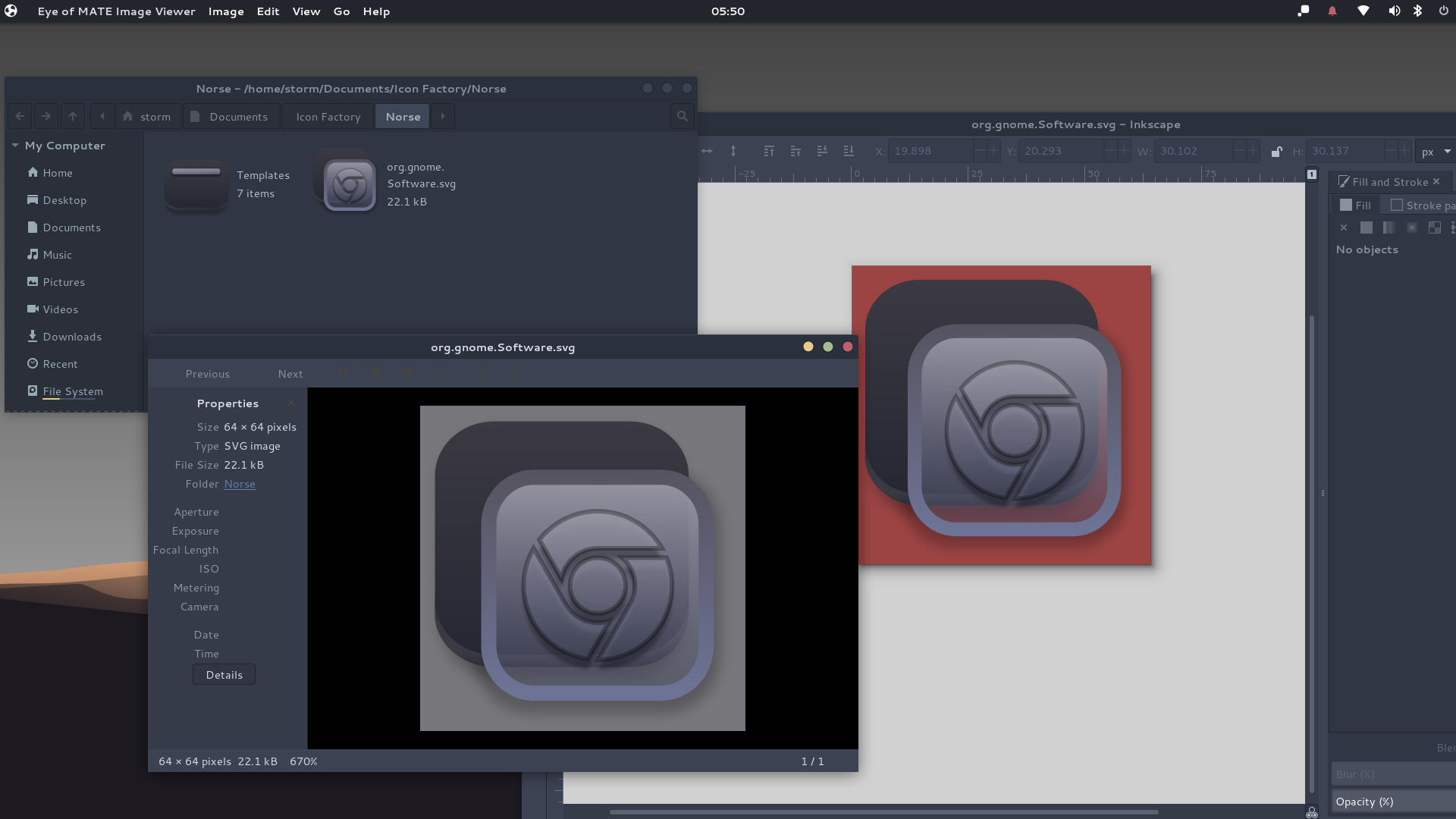
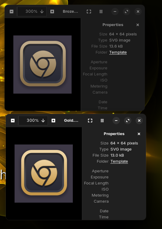
Can you send a screenshot with some folders or a grid with icons?
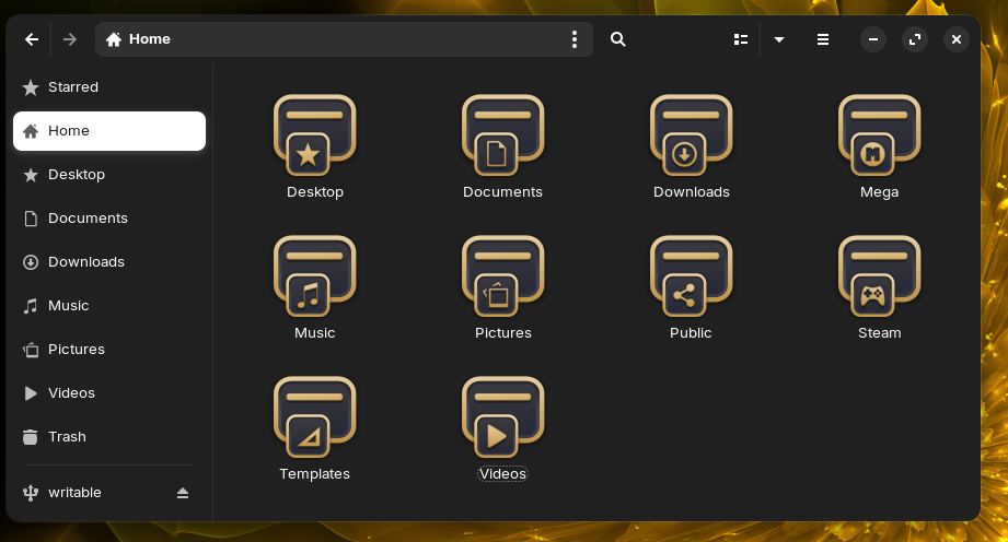
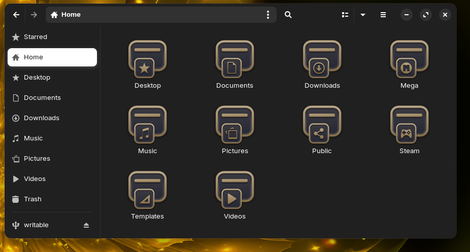
For me... the second one (Google Chrome icon) that is the first one (screenshots with folders) ![]() looks more like gold.
looks more like gold.
I agree. I prefer the second one, however, as it is more bright and visible.
1 Like