hmm... I do both it only takes some min. to change it via scripts.
1 Like

The first one for me is sharper to view?
It's sharper, but the second one is not bad either. ![]()
1 Like
The second is ... not golden enough ![]()
I have now 3 variations of gold....
3 Likes
If at some point you want to make icons with metal effect, this one have a good balance between colors/light/shadow.

But, in fact, I don't know if they would be as pleasant to the eyes as the ones you built. Your icons are so friendly-eye.
1 Like
You won't be able to please everyone ![]()
3 Likes
Silver. I can't seem to hit the bronze right - so no bronze.
2 Likes
Perfect!
The problem with metallic colors is that the texture defines the appearance of metallicity (Or how we identify it as metallic) more than the actual wavelength of light.
2 Likes
reach letter "E" in the apps.
Also is this gold or bronze?

It is whichever the viewer wants it to be. ![]()
I see it as bronze in normal light or gold in low light. ![]()
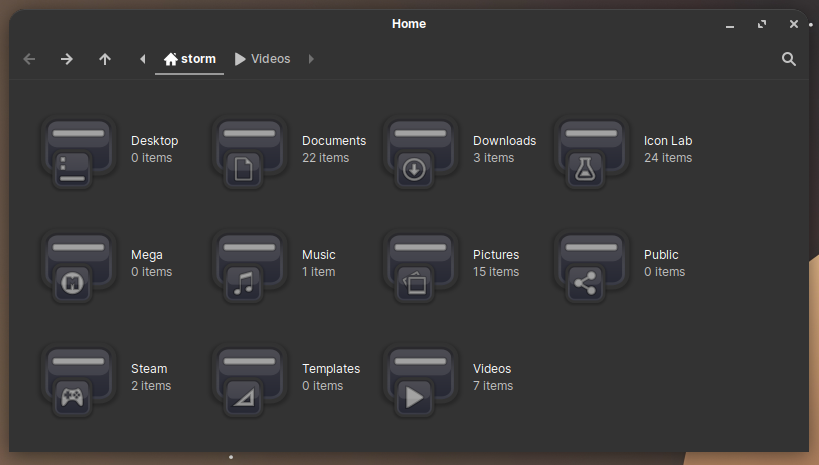
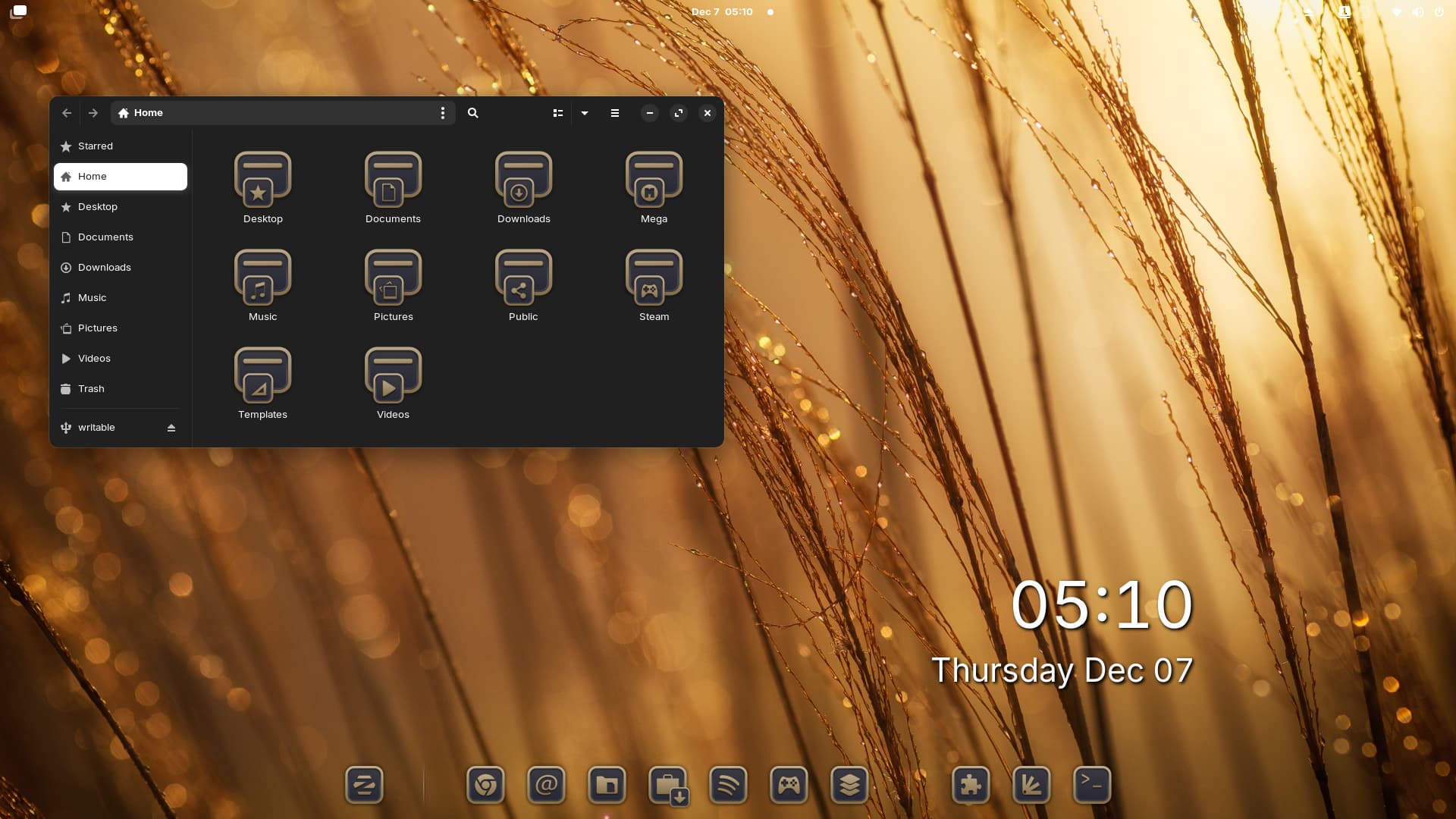
With more icons together is better to see, but I think it's bronze.
1 Like
I'm running a contest to win the Alien Icon theme - [Shop] Storm's Icon Collection - #7 by Storm
Also I'm half way through the apps icons of my Nordic Icon set.
1 Like
I am new here, but have to say you have great talent. Your icons are beautiful and practical. Very nice!
4 Likes

This I really like!
1 Like